4 Descriptive Statistics
We use descriptive statistics to describe our data.
- Who are our participants? (Summarizing demographic information)
- How long did participants take to read the vignettes we used to manipulate the independent variable?
- What was the average score on the dependent variable in the different conditions of the independent variable?
- Are our continuous variables normally distributed, or are they skewed?
- How much variability is there in our variables?
These are all questions that can be answered with descriptive statistics. The type of descriptive statistics appropriate for a given variable will depend on how that variable is measured (i.e., nominally, ordinally, or continuously). Below is the appropriate type of descriptive statistic(s) for variables with each type of measurement.
 Nominal Variables – Frequencies, the raw counts or the percentage of the total. If you want to see the frequencies at the intersection of two or more nominal variables, you can use the Frequencies option or Contingency Tables.
 Ordinal – Frequencies, the raw counts or the percentage of the total.
 Continuous – Measures of central tendency (mean, median, mode). Measures of variability (standard deviation, range). Measures of distribution (skewness, kurtosis) and normality (both helpful to understand your data but rarely reported). Standard error of the mean (a measure of mean dispersion) for creating figures.
You can get a wide variety of descriptive statistics from the following menu: Analyses tab → Exploration → Descriptives.
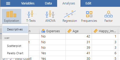
4.1 Frequencies
As mentioned above, frequencies are useful as descriptive statistics for nominal variables (also called categorical variables). Frequencies tell us how many participants are in each level (group) of the nominal variable.
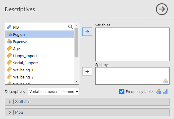
Select the Frequency tables option at the bottom right of the menu (checked blue in the picture below). Then select a nominal variable from the left window and either drag it or use the → button to move it to the Variables window.
Jamovi will automatically provide the N, missing data count, mean, median, standard deviation, minimum, and maximum value. However, since we are dealing with a nominal variable, these numbers are not necessarily meaningful (with the exception of N, the sample size for this variable). To remove them, expand the Statistics sub-menu and uncheck these measures (checked in blue below).
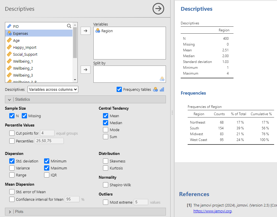
Unselecting those statistics will leave you with the following frequency table:
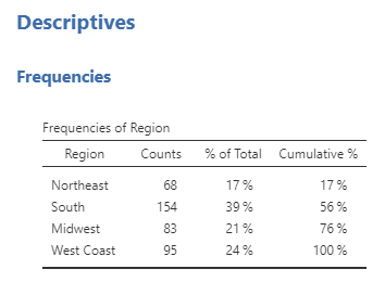
From this table, we can see that 83 of our participants live in the Midwest. Furthermore, the participants who live in the Midwest make up 21% of our sample.
Note. The percentages are rounded to no decimal places, which is not consistent with APA style. To round percentages to 2 decimal places, change Number Format to 4 dp in the settings menu. See Chapter 2 Jamovi Basics, Jamovi Settings.
After changing the decimal places in the settings menu, the frequency table will look like this:
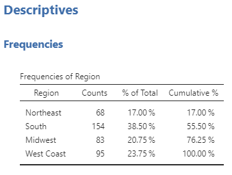
Now we can see the percentage of participants in our sample that live in the Midwest is 20.75%, this is how we would report the percentage in APA style.
4.2 Contingency Tables
Contingency tables (also known as cross-tabs) can be used to see the frequencies at the intersection of two nominal variables. For example, in our dataset we have two nominal variables: Region and Expenses (whether or not participants have enough money to cover their monthly expenses). If we wanted to know how many participants in our data live in the Midwest and have enough money to cover their monthly expenses, we could use either the Descriptives menu or Contingency Tables.
Contingency Tables using the Descriptives Menu
Select the Frequency tables option at the bottom right of the Descriptives menu (checked blue in the picture below). Select your first nominal variable from the left window and move it to the Variables window. Select your second nominal variable from the left window and move it to the Split by window.
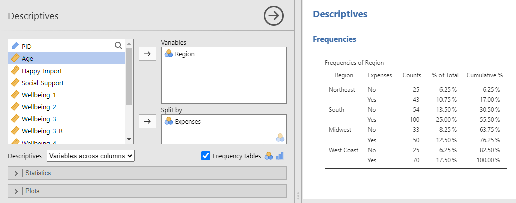
This table shows that 50 participants lived in the Midwest and reported having enough money to cover their monthly expenses in our dataset (row 6). Those 50 participants made up 12.50% of our sample.
Notes. Just as in the frequency above, jamovi automatically gives you several descriptive statistics that are used for continuous variables and, therefore, are not meaningful for these nominal variables. To remove them, expand the Statistics sub-menu and uncheck the statistics listed with a blue check. The frequency table here lists two decimal places for each percentage because we made changes to the jamovi setting. Specifically, we changed Number Format to 4 dp in the settings menu. See Chapter 2 Jamovi Basics, Jamovi Settings.
Contingency Tables using the Contingency Tables, Independent Samples Menu
The Descriptives menu will give you the basic counts for each condition at the intersection of the two nominal variables, and that condition’s percentage of the data as a whole. If you are interested in percentages of a subset of the data, then use the Frequencies → Independent Samples menu.
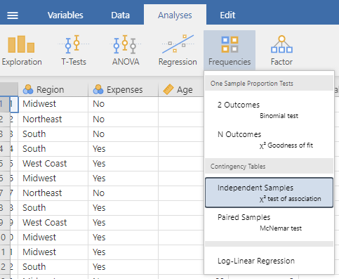
Move your first nominal variable to the Rows window and your second nominal variable to the Columns window. This is the same menu used for χ2 statistical tests. However, we are not interested in a statistical test for this example, we just want a more detailed contingency table. So, we will need to uncheck χ2 under Tests in the Statistics sub-menu (the blue-checked option below).
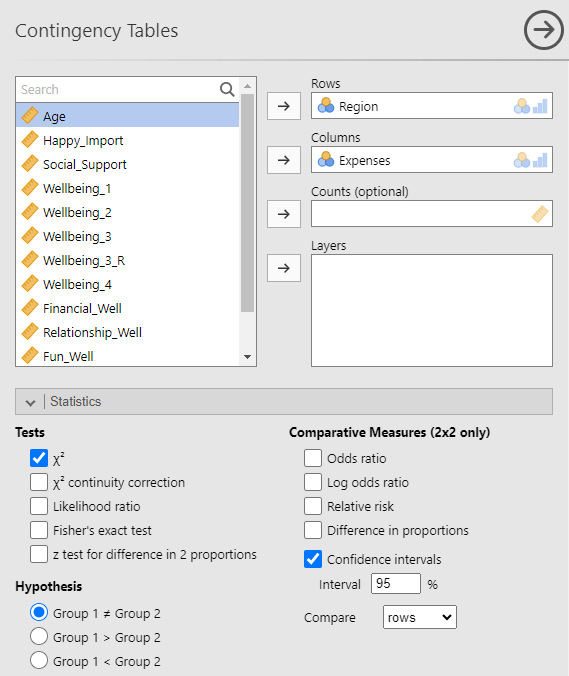
These basic settings will give the following table:
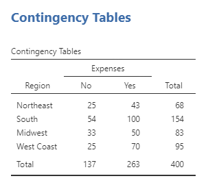
This table presents the same data as we previously saw in the table from using the Frequencies option in the Descriptive menu, although presented in a slightly different format. Again, we can see that there were 50 participants who lived in the Midwest and reported having enough money to cover their monthly expenses in our dataset (row 3, column 2). But what if we wanted to answer the question, “What percentage of Midwesterners in our sample can afford their monthly expenses relative to all the Midwesterners in our sample?” The answer to this question is the 50 participants who lived in the Midwest and reported having enough money to cover their monthly expenses, divided by the total number of participants from the Midwest. We could calculate this percentage manually, 50 ÷ (33 + 50). Or we can ask jamovi to calculate the percentages for us. Specifically, since the different regions are organized in rows and we want the percentage of Midwesterners in our sample who can afford their monthly expenses relative to all the Midwesterners (everyone in that region), we should look at the percentages across rows. To add the percentages across rows to the table, use the Cells sub-menu, and under Percentages select Row.
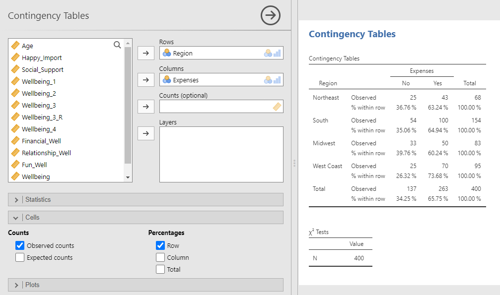
Now, in each cell, we can see the percentage of people who said “No” or “Yes” to the expenses question relative to the number of people in that region. The answer to the question, “What percentage of Midwesterners in our sample can afford their monthly expenses relative to all the Midwesterners in our sample?” is 60.24%.
Note. The contingency table here lists two decimal places for each percentage because we made changes to the jamovi setting. Specifically, we changed Number Format to 4 dp in the settings menu. See Chapter 2 Jamovi Basics, Jamovi Settings.
Now let’s consider the question, “Of the people who can afford their monthly expenses, what percentage live in the Midwest?”. The answer to this question is the 50 participants who lived in the Midwest and reported having enough money to cover their monthly expenses divided by the total number of participants who said they could afford their monthly expenses: 50 ÷ (43 + 100 + 50 + 70). The number of people who said “No” or “Yes” to the expenses question are organized in columns. Therefore, to ask jamovi to calculate the percentages, use the Cells sub-menu, but this time under Percentages select Columns.
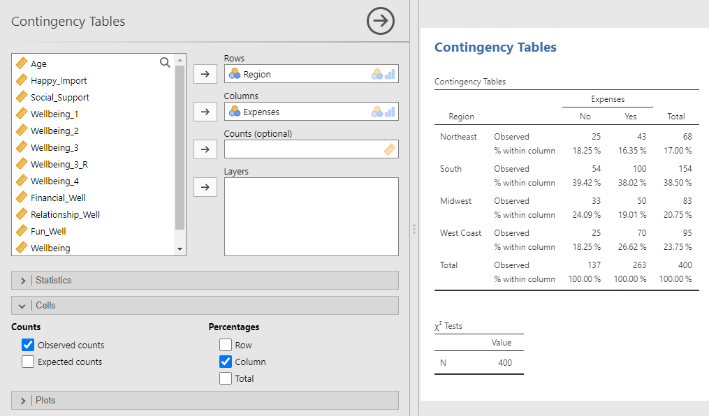
Now, in each cell, we can see the percentage of people in each region who said “No” or “Yes” to the expenses question relative to everyone who gave that same answer. The answer to the question “Of people who can afford their monthly expenses, what percentage live in the Midwest?” is 19.01%.
4.3 Measure of Central Tendency, Variability, and More
For continuous measures, we often want information about central tendency (e.g., mean, median, mode) and variability (e.g., standard deviation, range). We can get this information and more using the descriptive menu: Analyses tab → Exploration → Descriptives.
Select a continuous variable from the left window and either drag it or use the → button to move it to the Variables window.
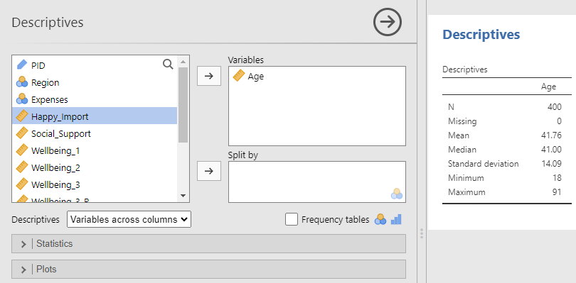
By default, jamovi will provide the N, missing data count, mean, median, standard deviation, minimum, and maximum value. Here we see the average age in our sample is 41.760.
Under the Statistics sub-menu, you can also ask for other summary statistics. For example, you can ask for the standard error of the mean (Std. error of Mean under Mean Dispersion), which is useful when making APA-style figures.
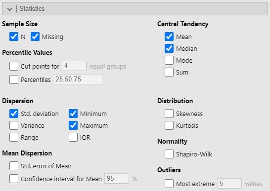
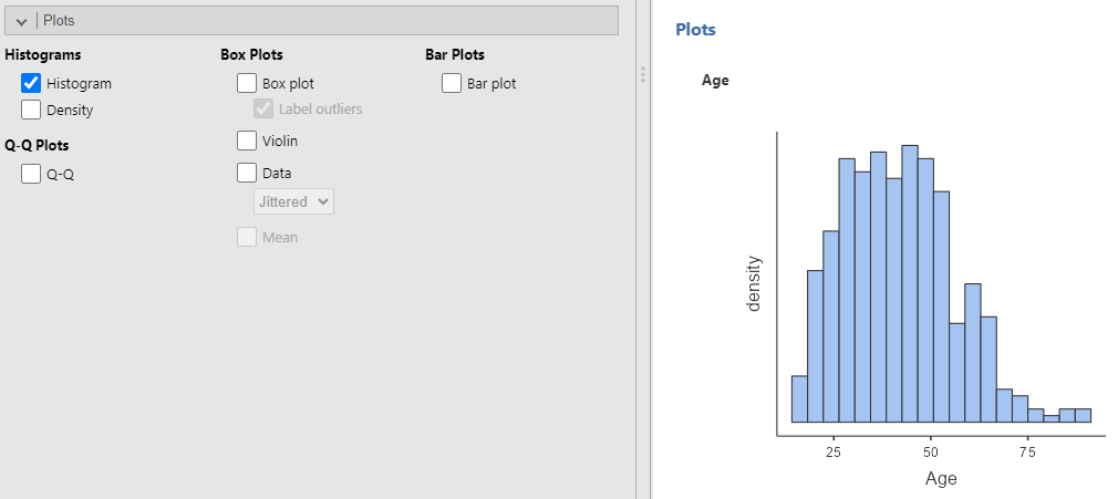
The Plots sub-menu also has several options for visualizing your data. For example, you can visualize the distribution of a variable by using the Plots sub-menu, and under Histograms, select Histogram.
4.4 Descriptives by Group
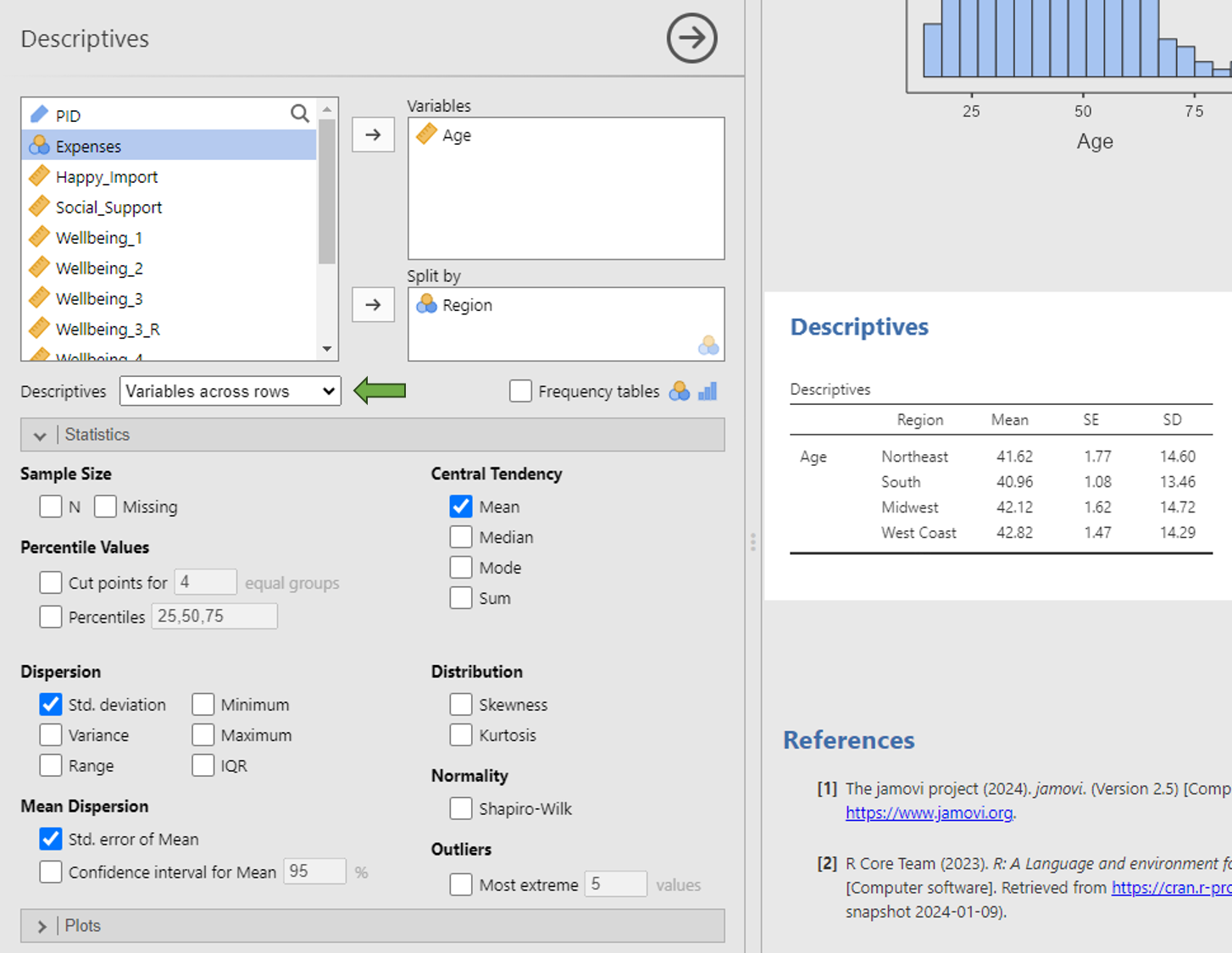
You can also get the above summary statistics broken up by groups (i.e., a nominal variable) by adding a nominal variable to the Split by window.
In this example, I’m asking for the mean, standard deviation, and standard error of the mean (common statistics needed for reporting results in APA style) of the age of participants in each of the four regions. I’ve also changed the Descriptives dropdown menu to Variables Across Rows so that the descriptives table is easier to read.
You can also visualize a variable’s data split by groups using the Plots sub-menu. Both Bar plot and Box plot can help you visualize whether a variable of interest changes across groups (such as looking at differences in a dependent variable across levels of an independent variable).
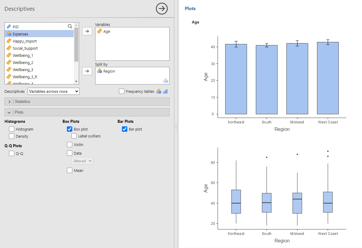
Note. Jamovi’s plots do not adhere to APA style and should not be used in APA-style student lab reports.
