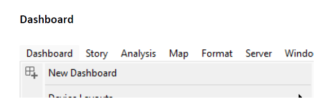
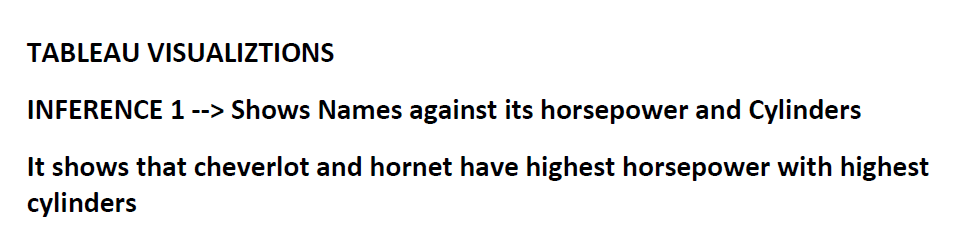
5 Tableau Visualization
TABLEAU
Create forecasting and Trend line charts that highlight something interesting inference in “Chicago_batteries dataset” using Tableau.
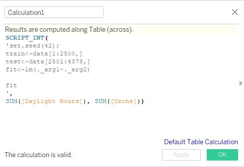
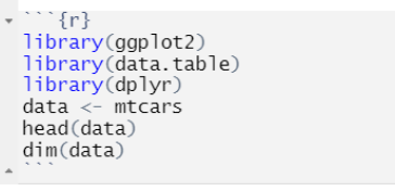
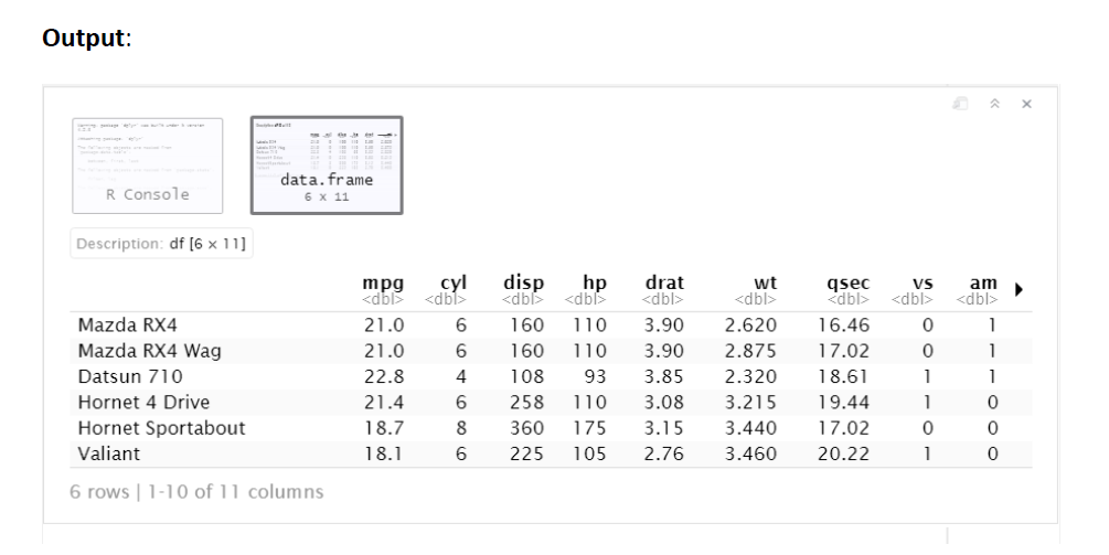
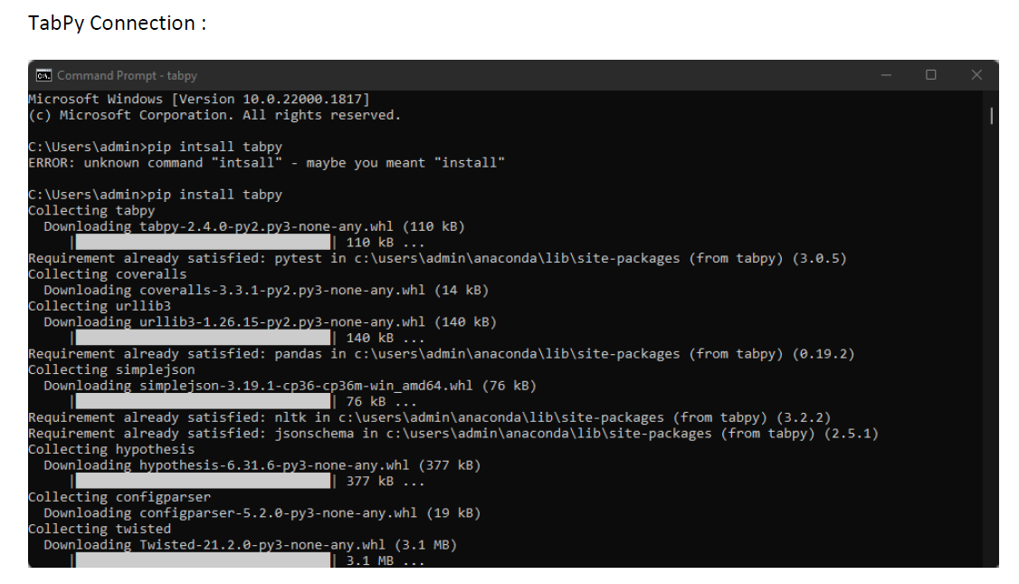
r-tableau integration:
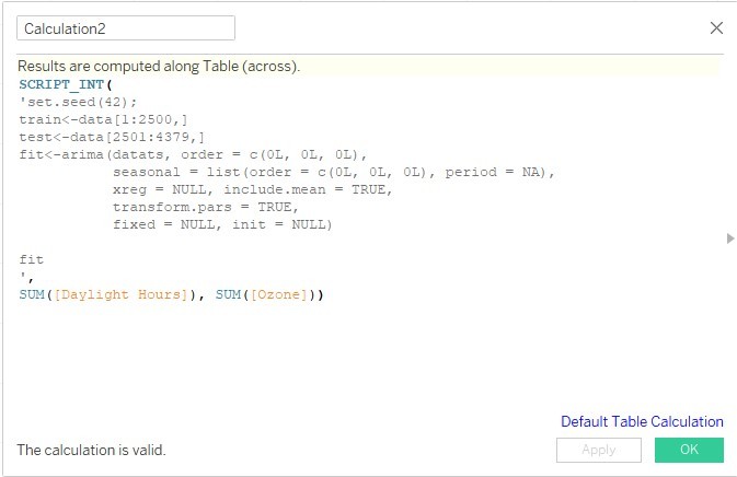
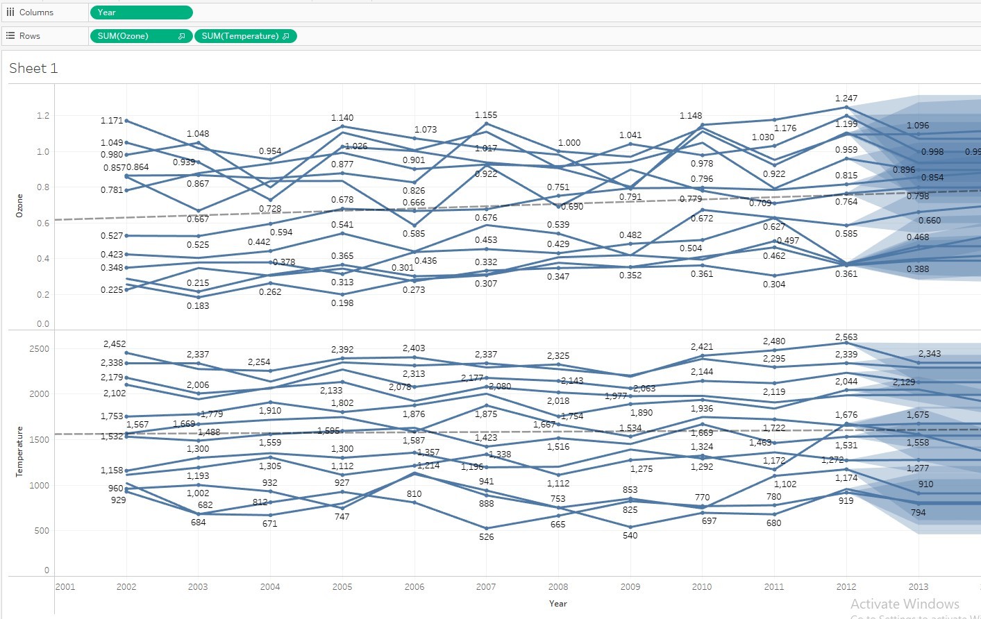
Fig: Highlighting trend for Ozone for each year from 2003 to 2013 and forecasting the prediction for 2014
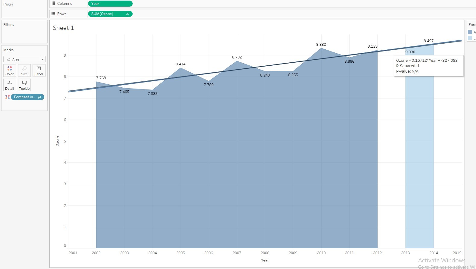
Inference: For each year, the level of ozone rises by a factor of 0.173016 with a pi value of 0.719736 and R-squared value of 0.0009635. The forecast prediction of ozone for the year 2014 is 9.497, an increase from the year 2013. There is a linear increase in ozone from 2003.
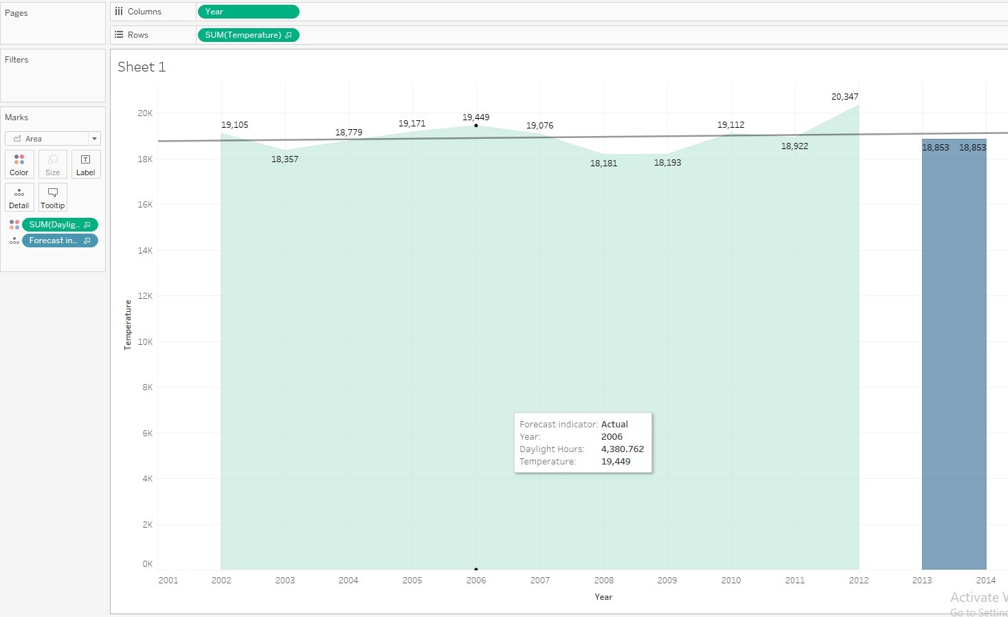
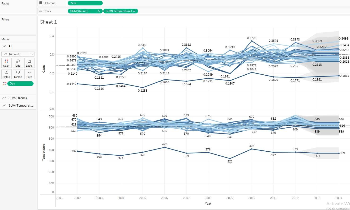
Fig: Highlighting trend for Temperature for each year from 2003 to 2013 and forecasting the prediction for 2014. Daylight hour is also used as a deciding fctor for comparison.
Inference: For each year, Both temperature and daylight hours has seen a continuous increase followed by a dip with the year 2012, temperature hitting an all time high of 20,347. For the year 2014, the temperature is predicted to significantly decrease to 18,853. Due to not so much changes in the temperature and daylight hours, the trend line is constant throughout the graph.
Fig: Forecast indicator using a heatmap to analyse change and estimation in temperature
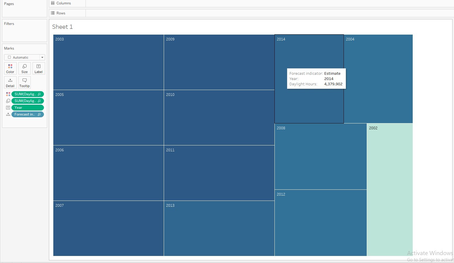
Inference: The brighter the color gets, the higher the daylight hour for that year
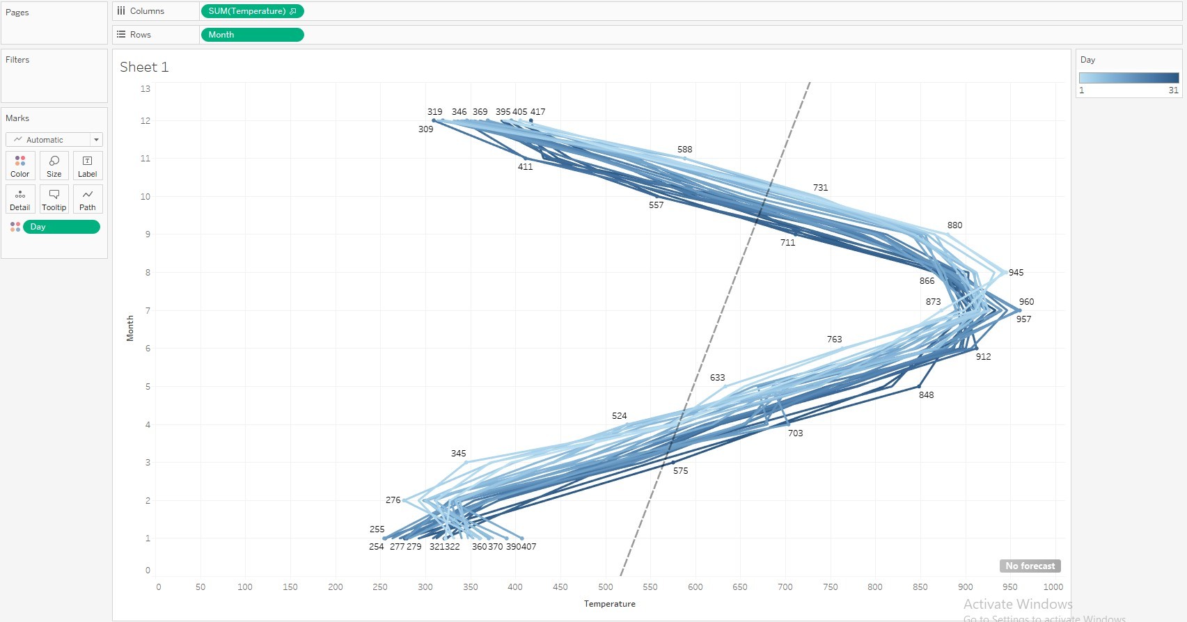
Fig: A trend and forecast analysis chart for temperature for each month of the year along with the trend line
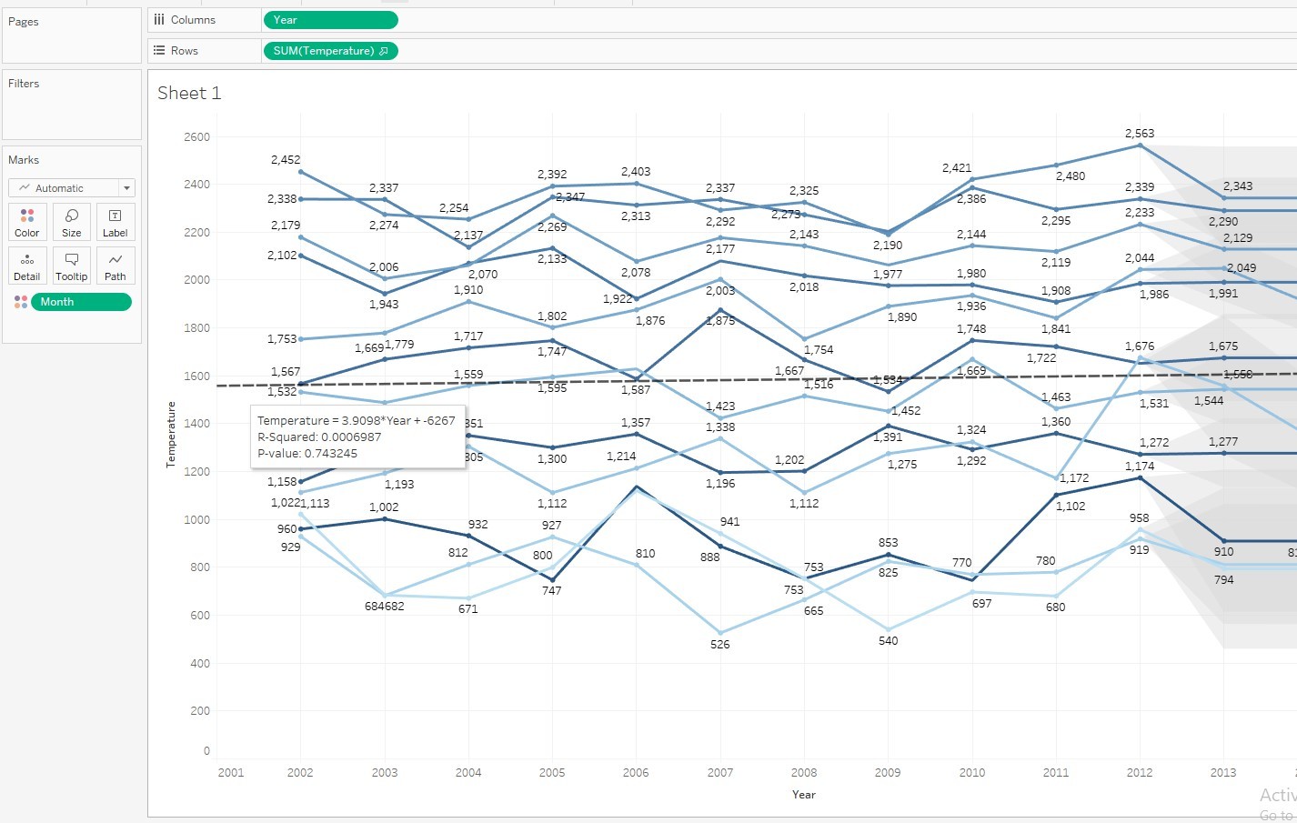
Inference: There is an increase in temperature starkly during certain months of the year particularly middle months of the year
Fig: Comparing temperature and ozone for rach year month wise
Inference: Both ozone and temperature show random increase and decrease month wise however there is a constant increase in ozone when done year wise without monthly interference.
Fig: Comparing temperature and ozone for year day wise
Inference: The Day 31 is distinctly having a lower temperature and ozone level for all the years starting from 2004 to 2013 .Both ozone and temperature show random increase and decrease day wise however there is a constant increase in ozone when done year wise without monthly interference.
Fig: Comparison of temperature and month and finding trends and forecast in them.
Case study 4:
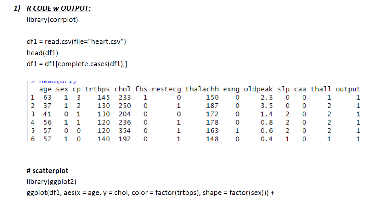
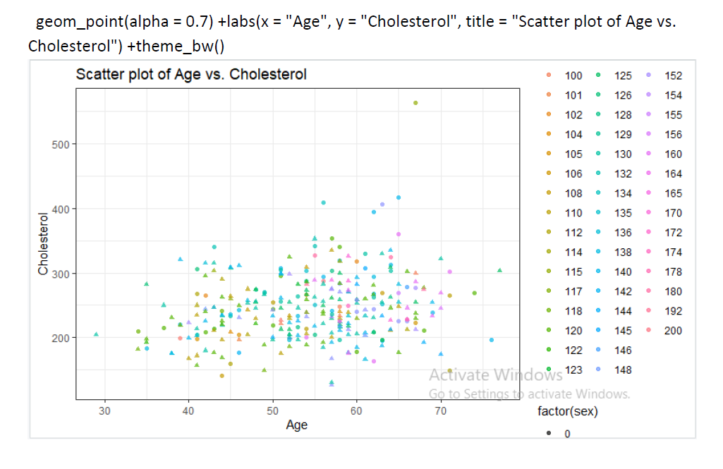
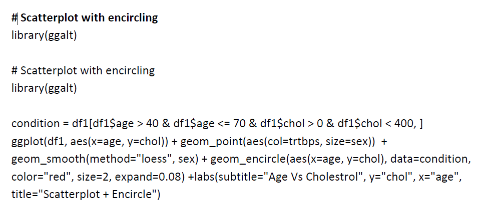
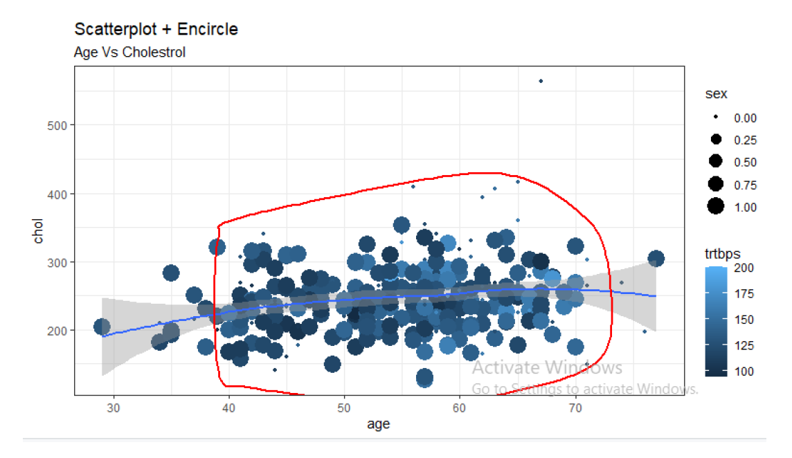
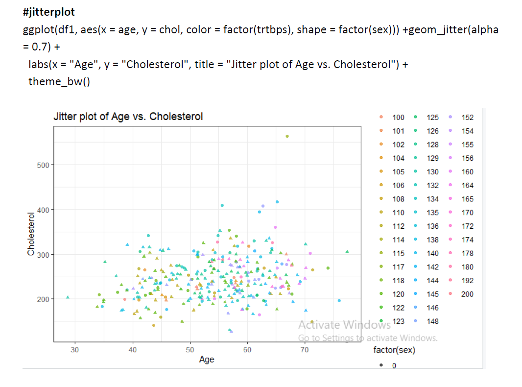
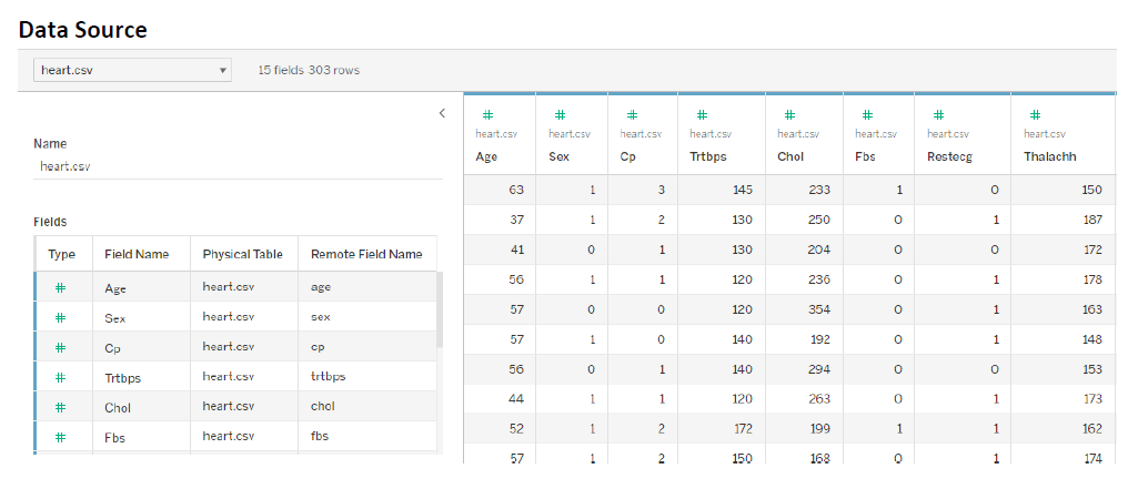
1) Visualize the scatter plot, (points should not overlap), Scatterplot With Encircling, Jitter Plot for “Heart dataset” with respect to chol – cholesterol. Use different color and shape for each plot. Implement this using R.
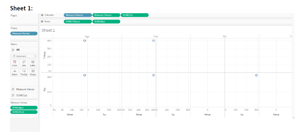
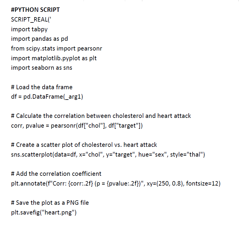
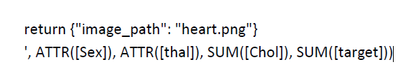
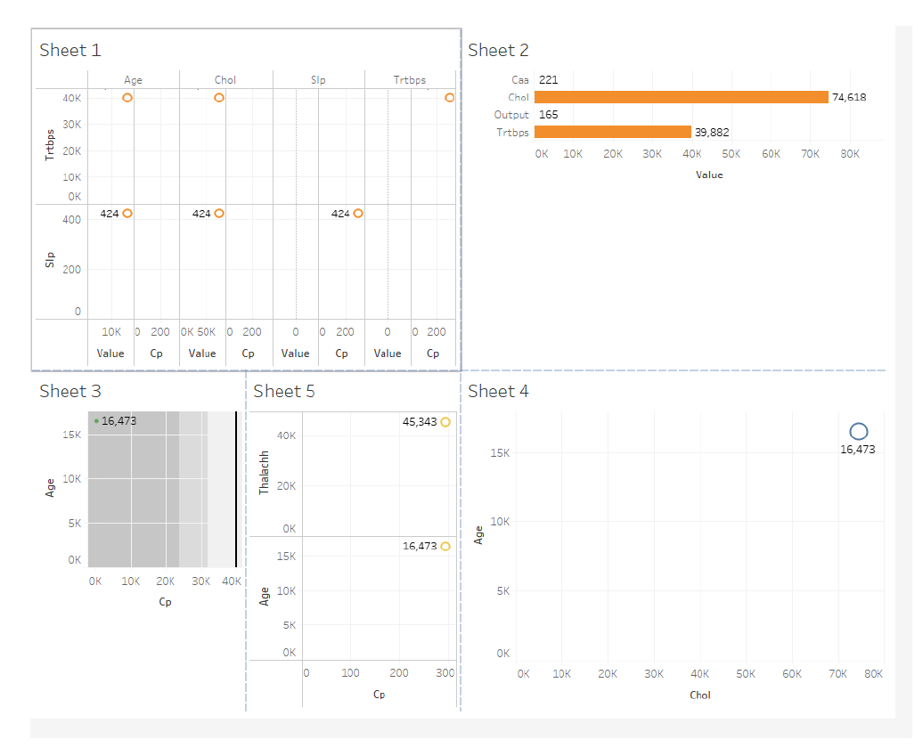
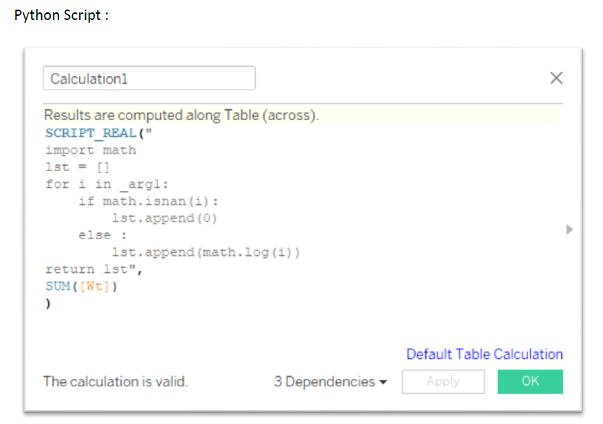
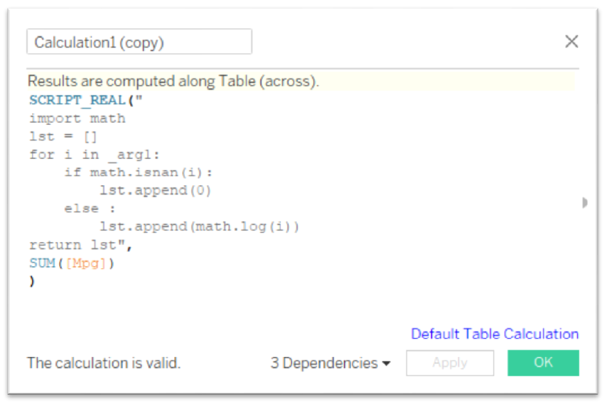
2) Explore the visual insight by Creating 5 Sheets with one Dashboard in tableau using the above dataset. Apply Tableau python integration to show the impact of heart attack based of cholesterol.
Case study 5:
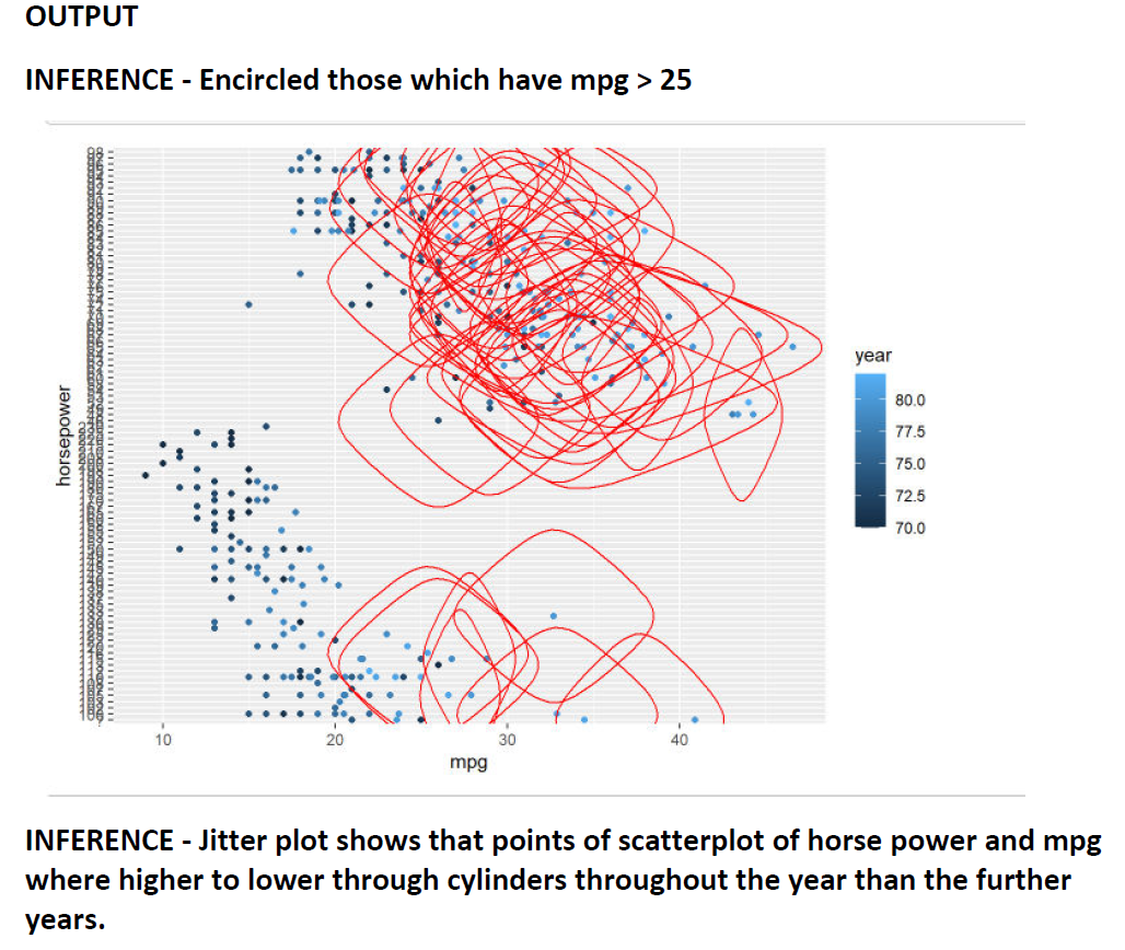
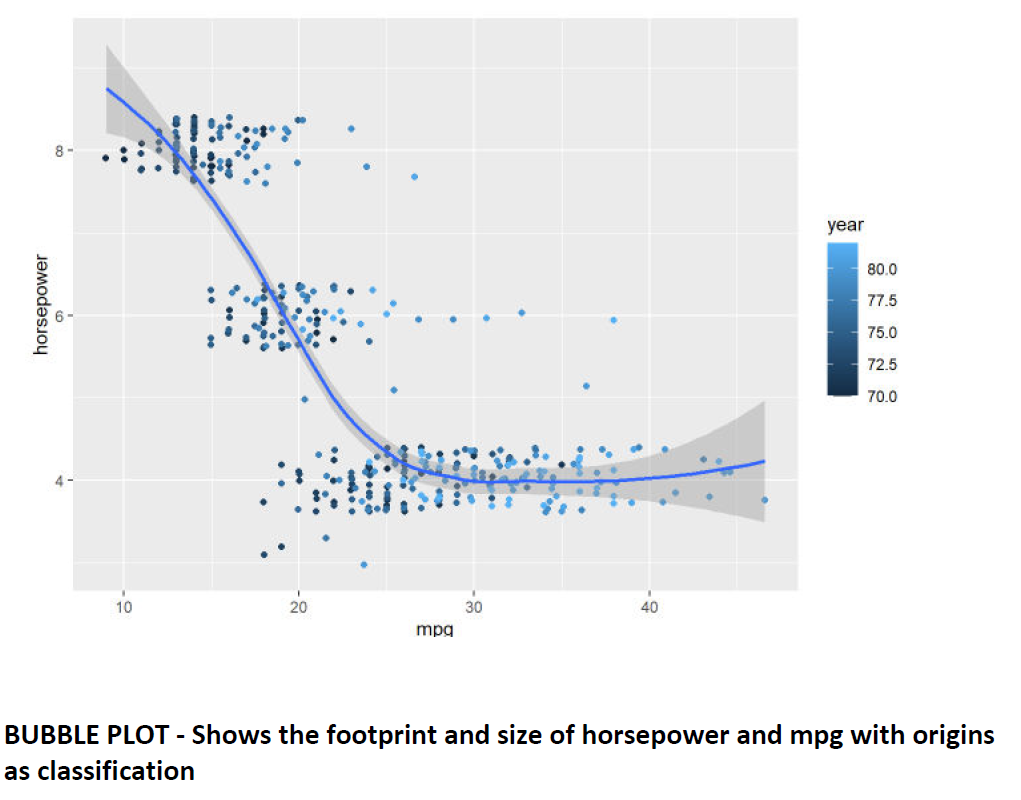
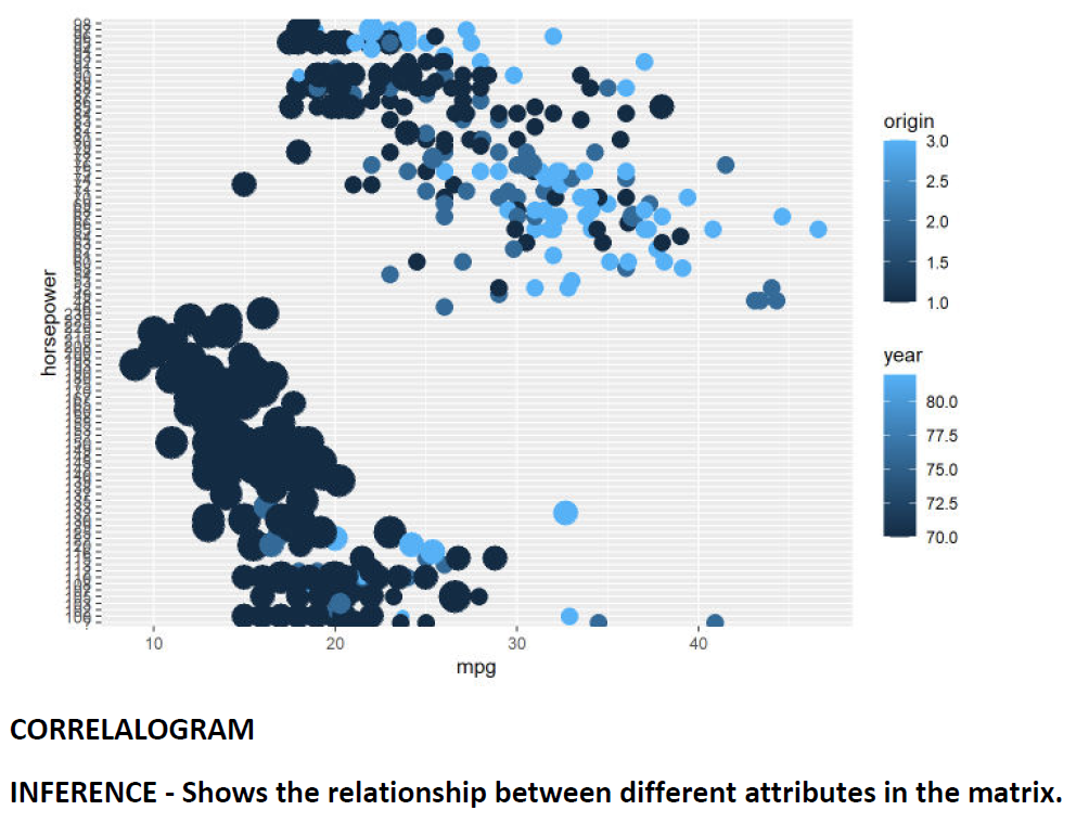
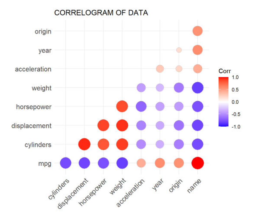
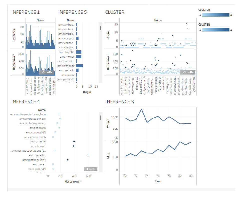
Implement using R – statistical modeling and Visualize a Scatterplot with Encircling, Jitter Plot, Bubble plot, Correlogram, Diverging Lollipop Chart for given “Auto dataset”.
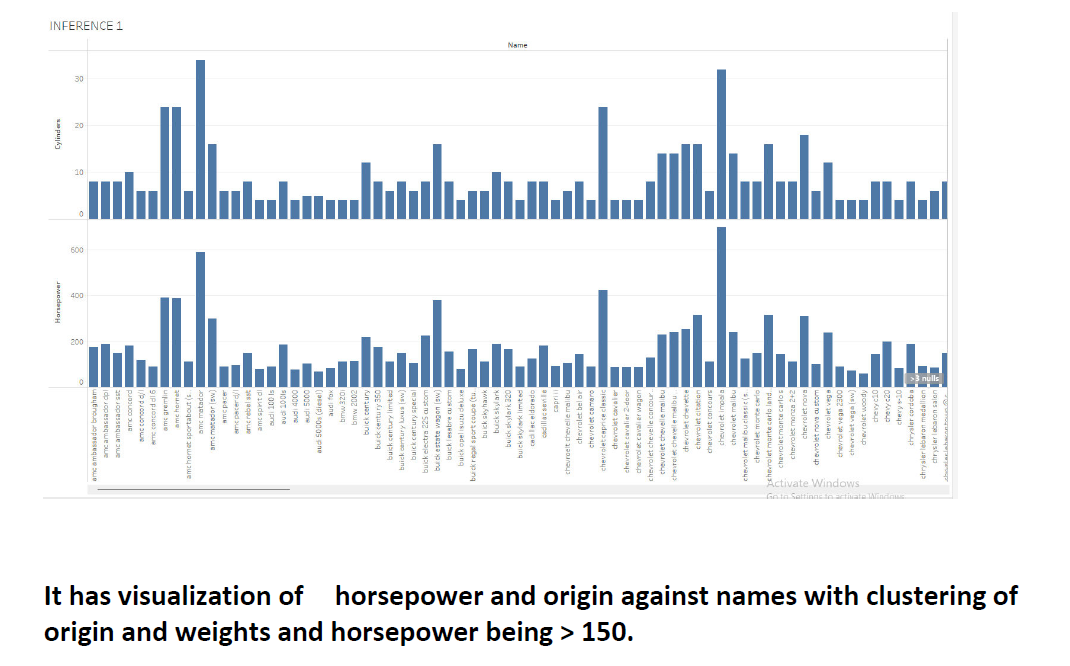
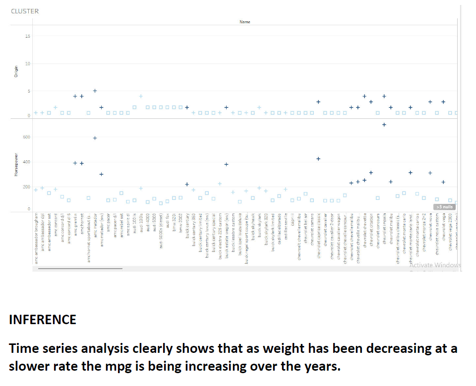
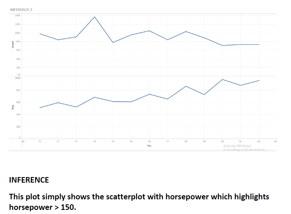
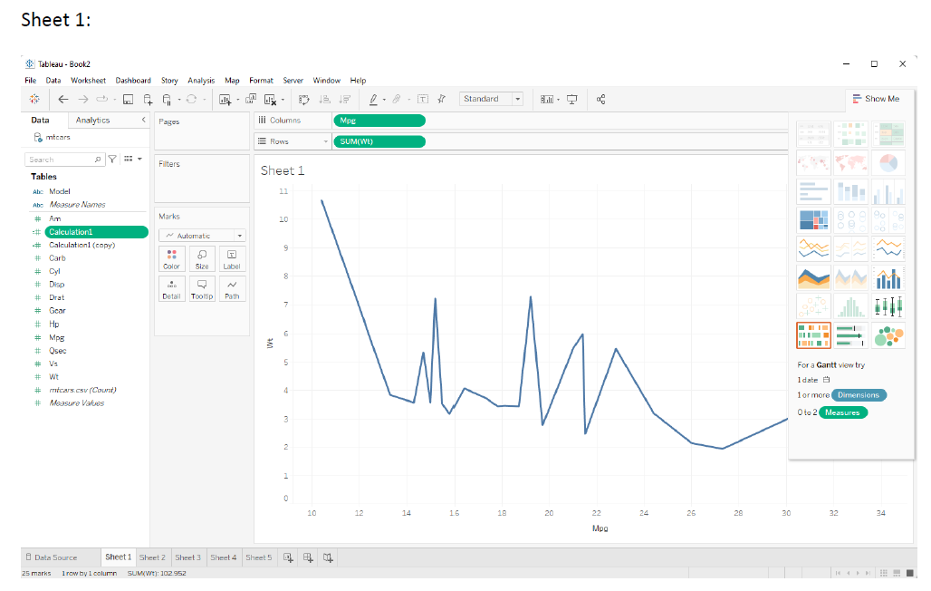
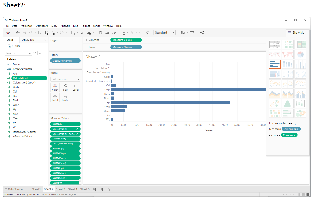
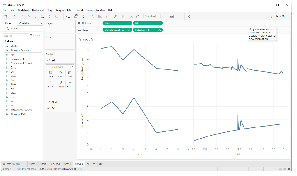
Apply Tableau R integration to understand the impact of horsepower with mpg and show the 5 different inferences.
Case Study 6:
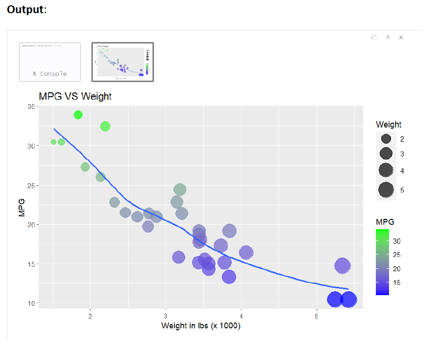
Use default “mtcars” dataset to make a scatterplot of “weight” and “mpg”. Change axes labels and give your plot a title. Set the alpha of all points to 0.7. Set the color of the points to the “mpg” variable (continuous). Also, set this color parameter so that high mpgs are colored green and low mpgs are colored blue. Title the legend” MPG”. Set the size of the points to the “wt” variable (continuous). Also, to make the small points more readable, set the range of sizes to go from 3-10. Title this legend” Weight”. Implement this visualization using R.
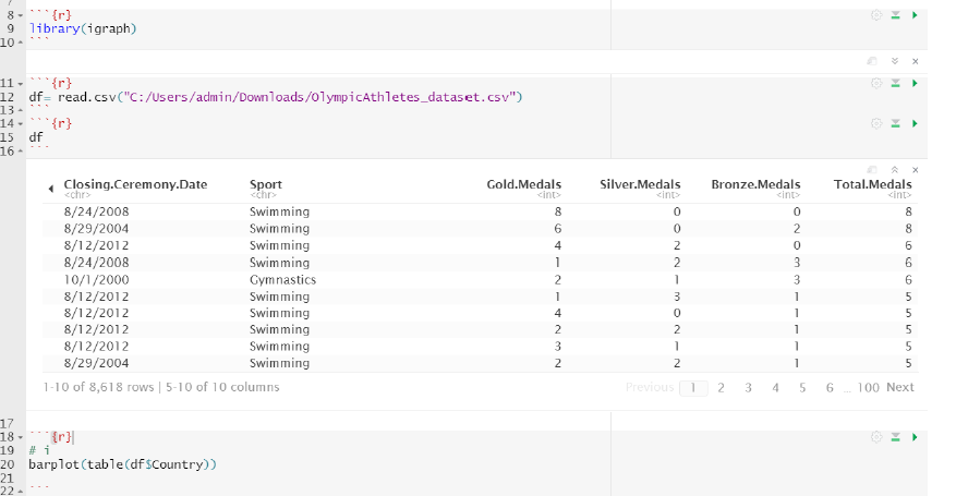
Case Study 7:
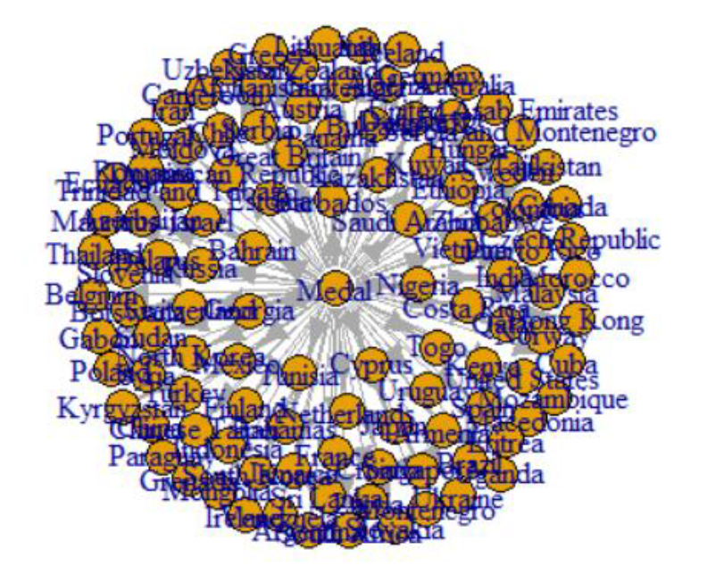
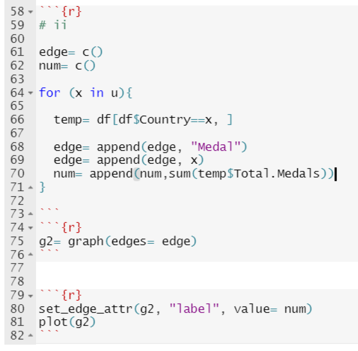
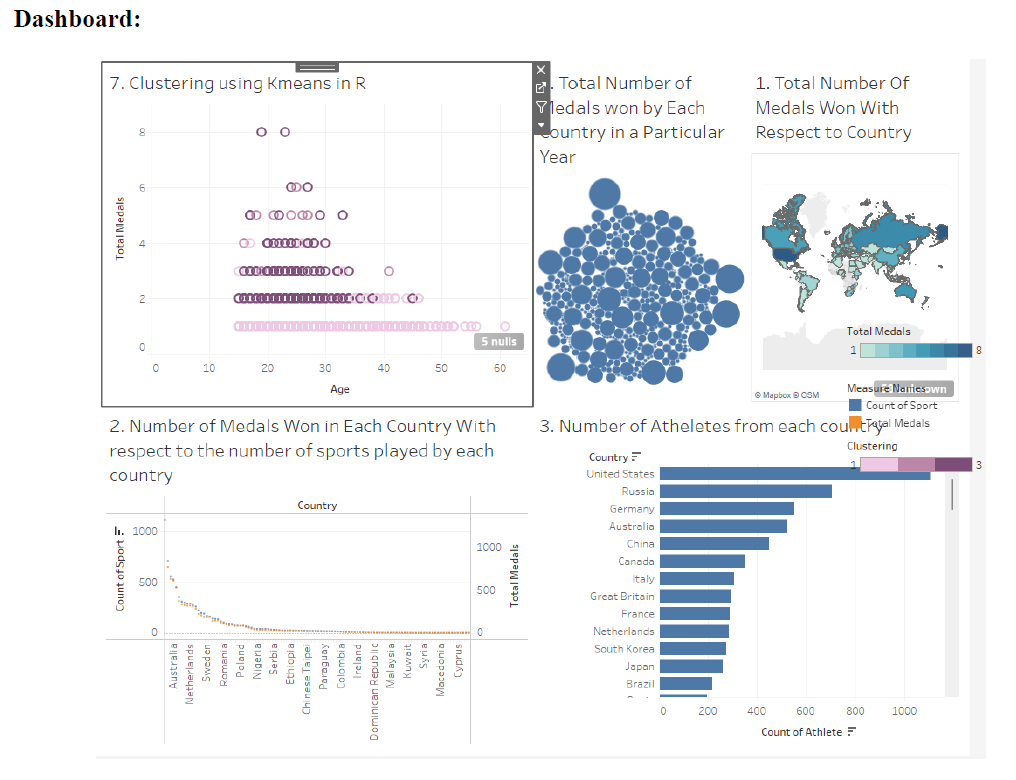
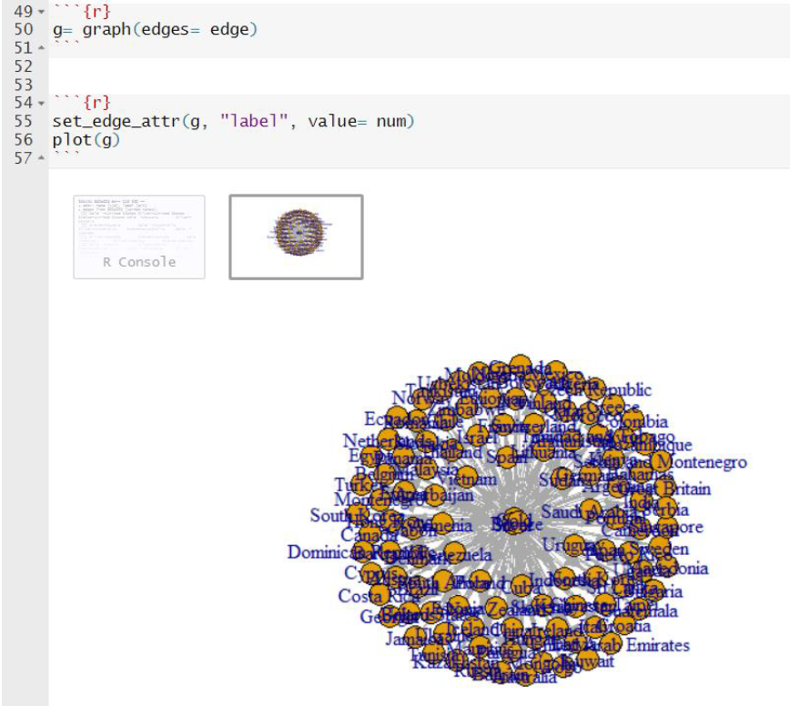
Explore the network visualization by considering the “Olympic Athletes ”_dataset, using R to conclude the following using igraph packages and visualizations
i. Different Countries with different medals and same country with different medals across all the years
ii. No. of models won by the same county with same model with same sports repeatedly
Explore the visual insight by Creating 5 Sheets with one Dashboard in tableau using the above dataset. Apply Tableau R integration to show the impact of specific sports with respect to specific country.
(ii)