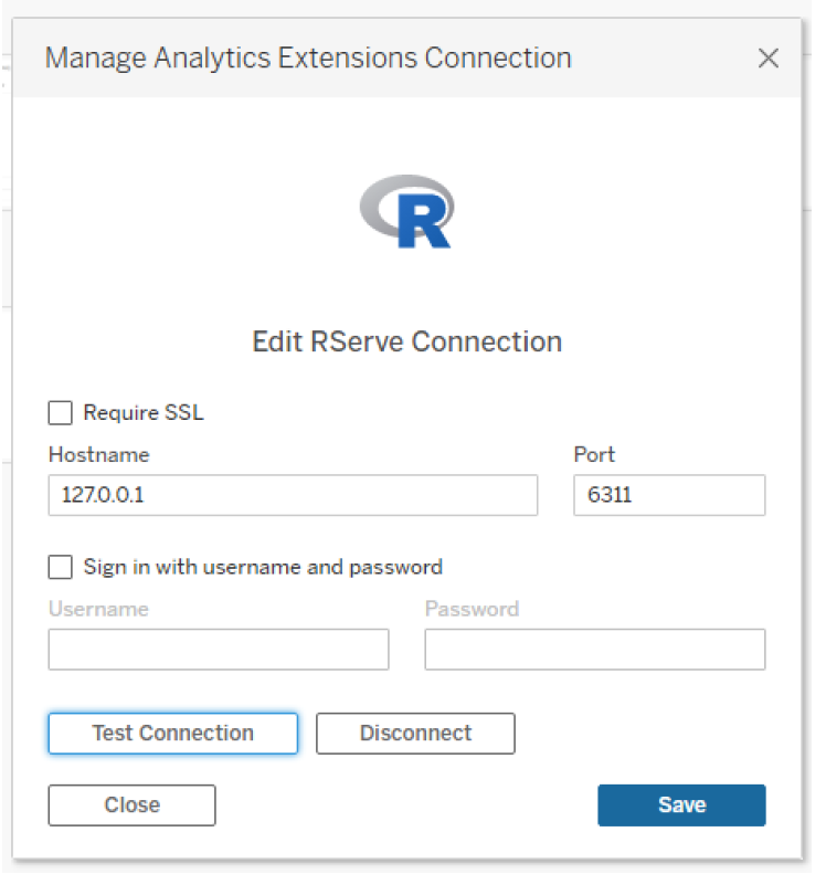
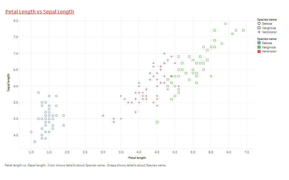
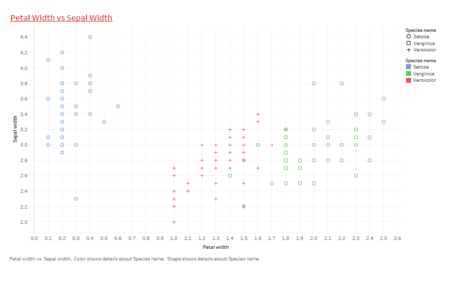
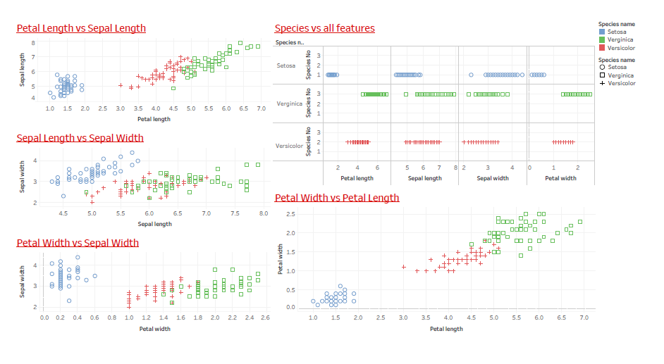
4 Connecting R and Tableau
R and Tableau

Case Study 2:
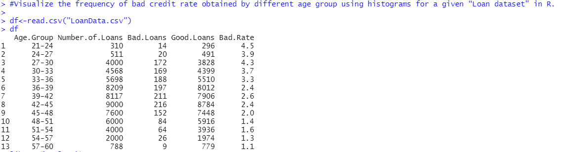
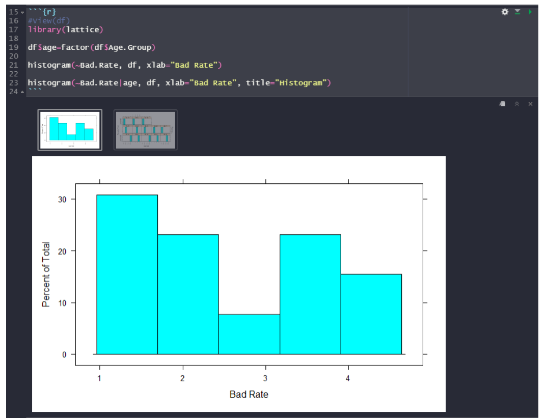
Visualize the frequency of bad credit rate obtained by different age group using histograms for a given “Loan dataset” in R.
#Visualize the frequency of bad credit rate obtained by different age group using histograms for a given “Loan dataset” in R.
df<-read.csv(“LoanData.csv”)
df
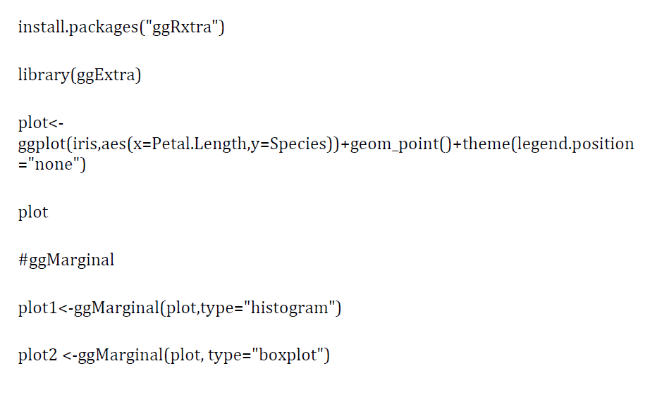
library(ggplot2)
ggplot(data=df, aes(x=Age.Group, y=Bad.Rate)) +geom_bar(stat=”identity”) + labs(x = “Age Group”, y = “Bad Credit Rate”)
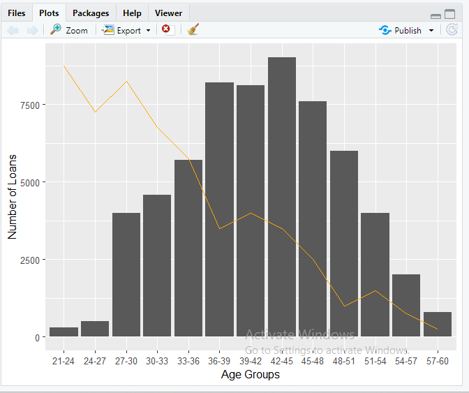
ggplot(df, aes(x=Age.Group))+ geom_bar(aes(y=Number.of.Loans),stat=”identity”)+ geom_line(aes(y=(Bad.Rate-1)*2500, group = 1),stat=”identity”,color=”orange”)+
labs(x=”Age Groups”,y=”Number of Loans”)
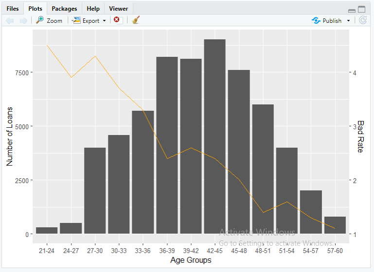
ggplot(df, aes(x=Age.Group))+
geom_bar(aes(y=Number.of.Loans),stat=”identity”)+
geom_line(aes(y=(Bad.Rate-1)*2500, group = 1),stat=”identity”, color=”orange”)+
labs(x=”Age Groups”,y=”Number of Loans”)+
scale_y_continuous(sec.axis=sec_axis(~.*0.0004+1,name=”Bad Rate”))
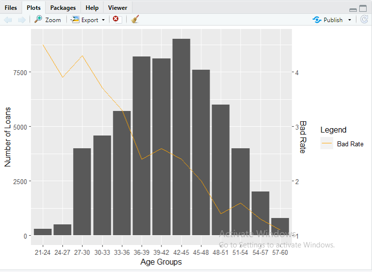
ggplot(df, aes(x=Age.Group))+
geom_bar(aes(y=Number.of.Loans),stat=”identity”)+
geom_line(aes(y=(Bad.Rate-1)*2500, group = 1, color = “Bad Rate”),stat=”identity”,
show.legend=TRUE)+labs(x=”Age Groups”,y=”Number of Loans”)+
scale_color_manual(name = “Legend”, values = c(“Bad Rate” = “orange”))+
scale_y_continuous(sec.axis=sec_axis(~.*0.0004+1,name=”Bad Rate”))
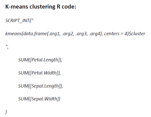
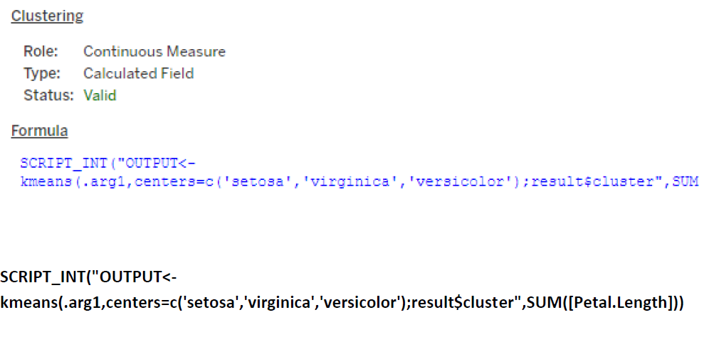
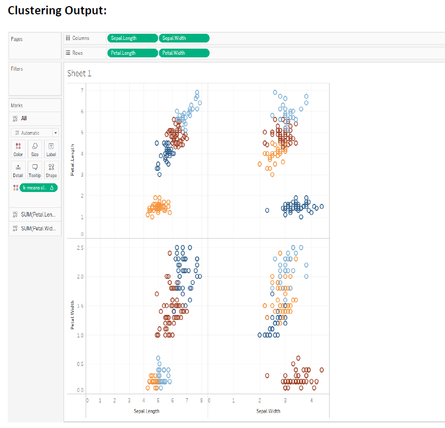
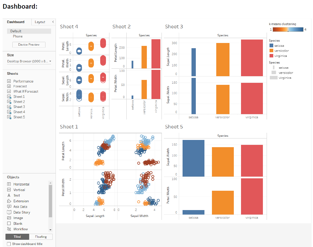
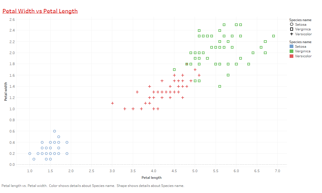
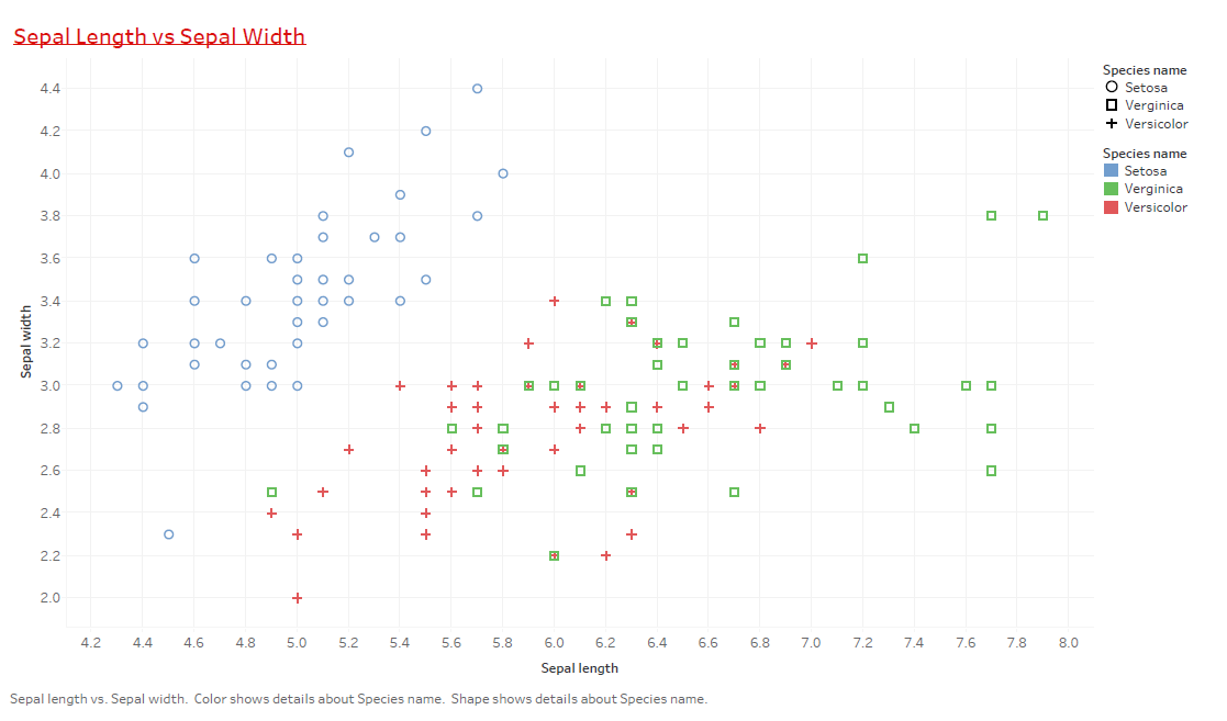
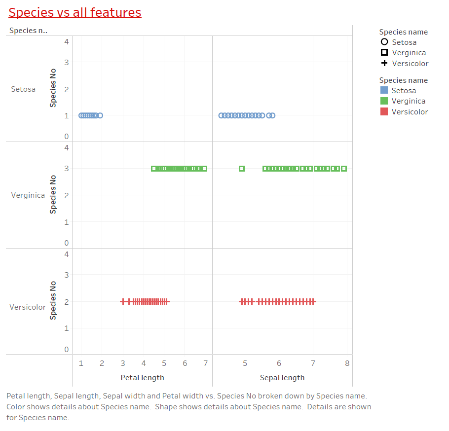
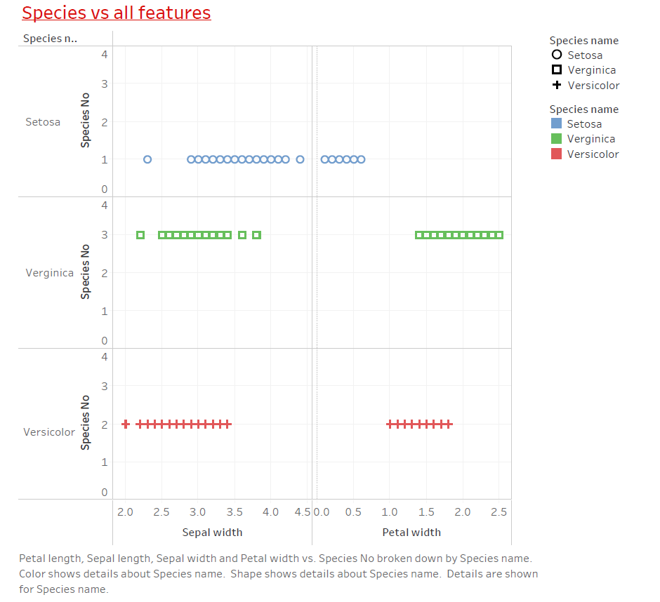
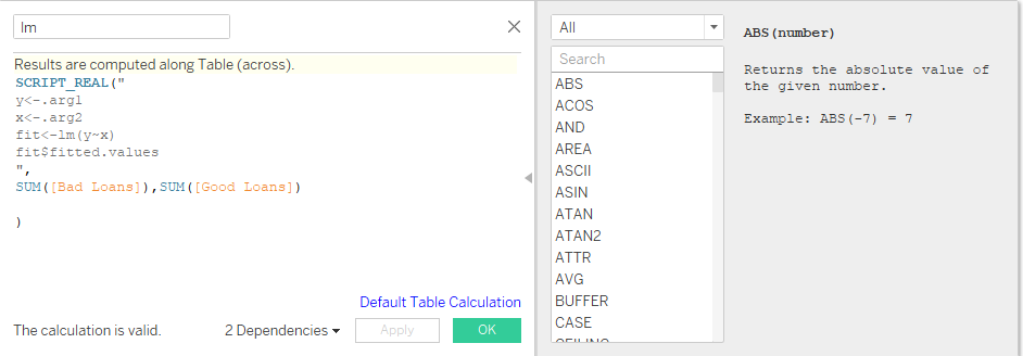
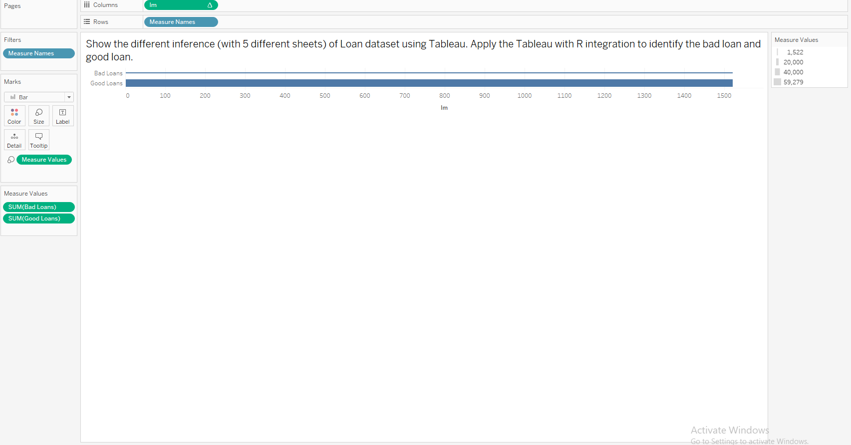
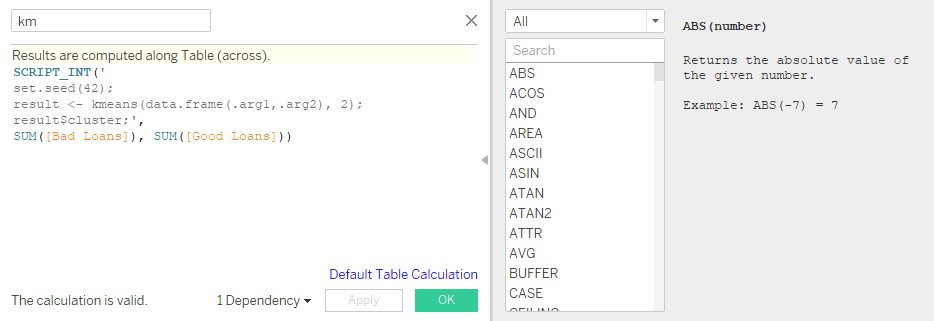
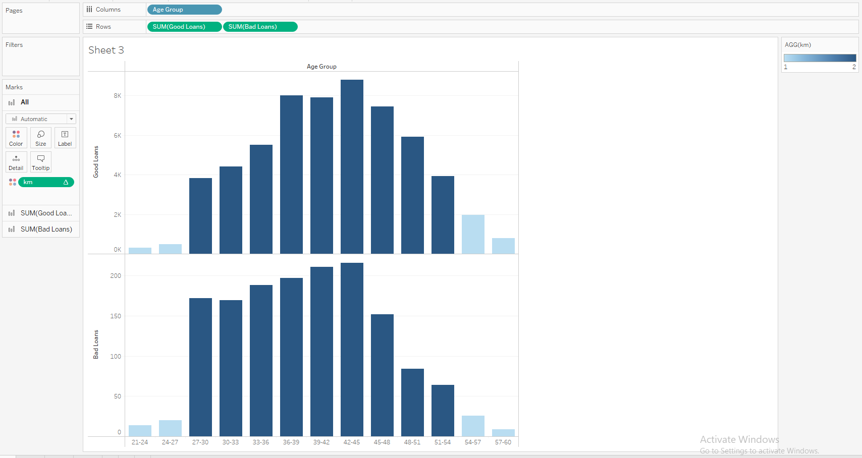
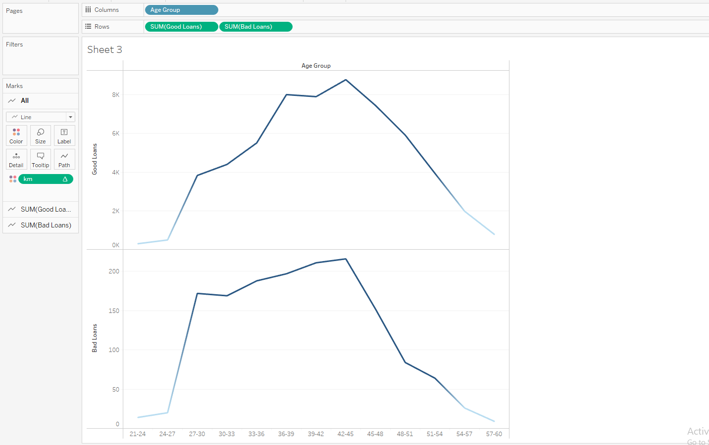
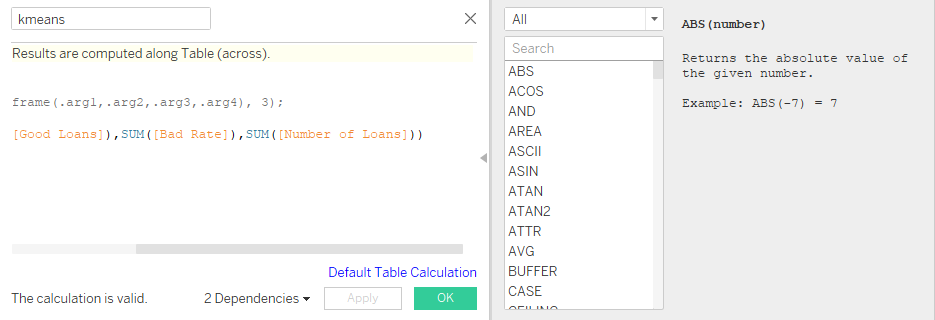
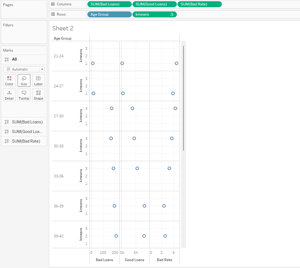
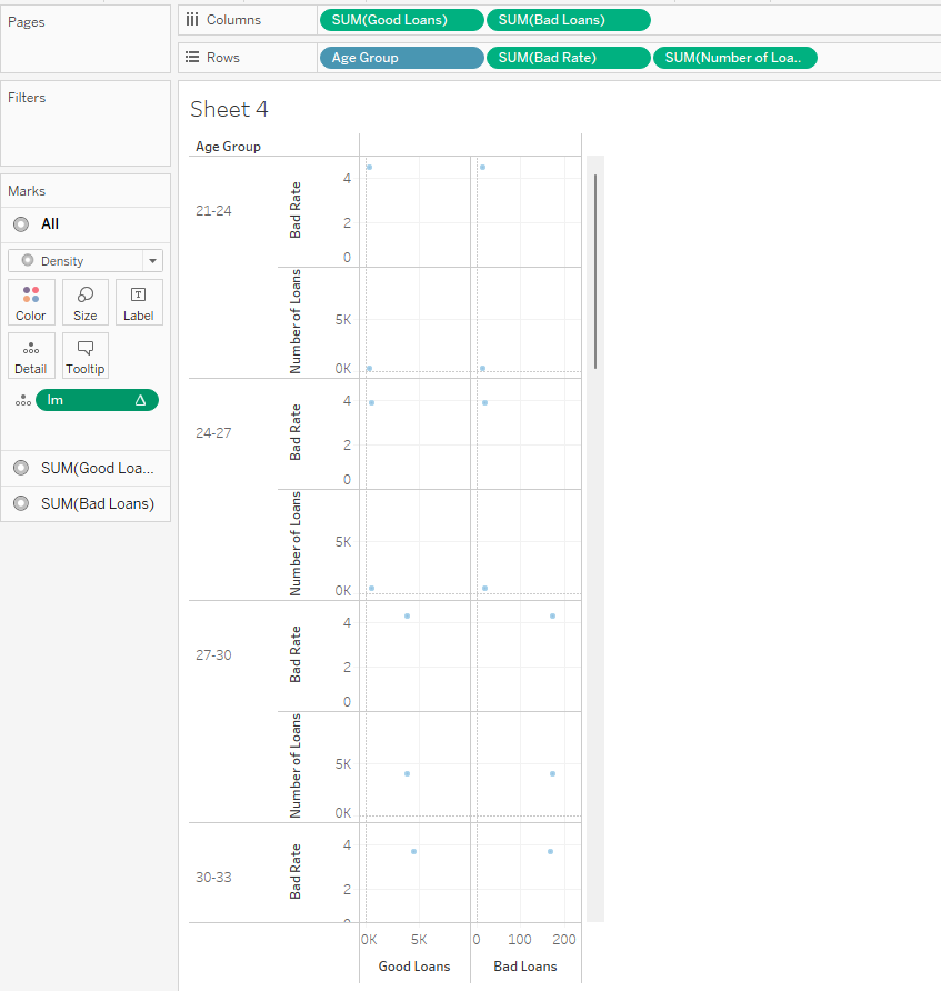
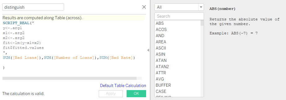
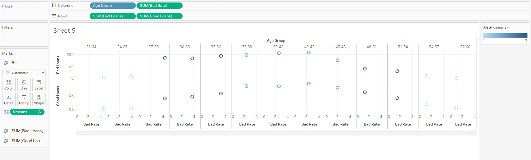
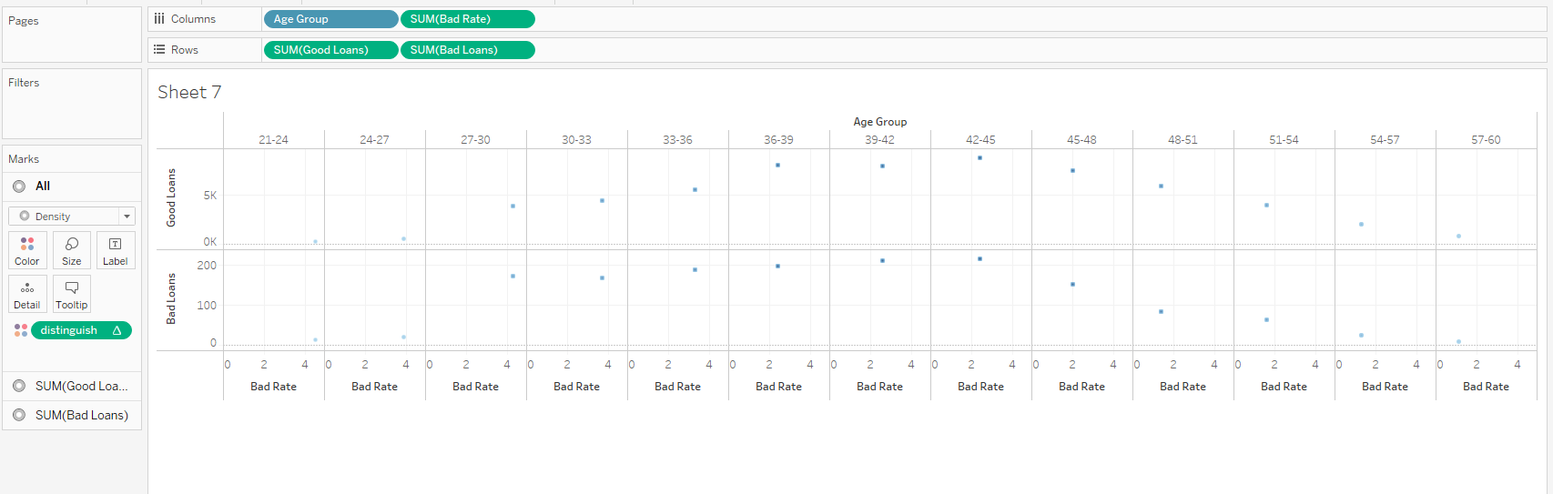
Show the different inference (with 5 different sheets) of Loan dataset using Tableau. Apply the Tableau with R integration to identify the bad loan and good loan.
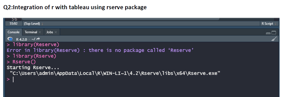
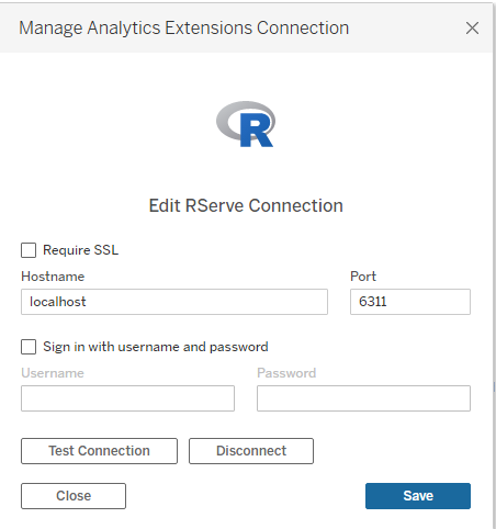
Integrating R with Tableau
Case Study 3:
Create Time series data visualizations using suitable statistical model and explore
the “Chicago_batteries” dataset using R. Create forecasting and Trend line charts that
highlight something interesting inference in “Chicago_batteries dataset” using Tableau.
Rstudio CODE:
#Create Time series data visualizations using suitable statistical model and explore the “Chicago_batteries” dataset using R. Create forecasting and Trend line charts that highlight something interesting inference in “Chicago_batteries dataset” using Tableau.
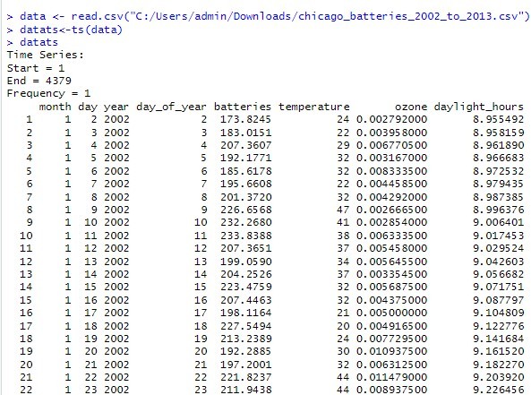
data <- read.csv(“C:/Users/admin/Downloads/chicago_batteries_2002_to_2013.csv”)
library(tseries) library(forecast) library(TTR) library(dplyr) library(lattice)
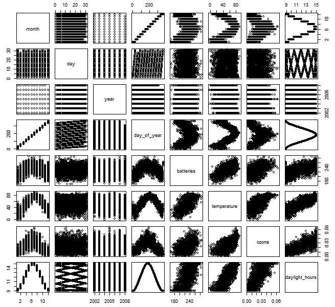
xyplot(data$ozone~data$daylight_hours|factor(data$month), data, xlab=”daylight_hours, ylab=”ozone, group=”day”)
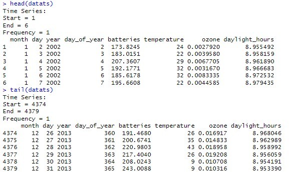
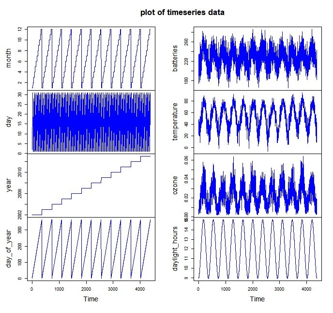
datats<-ts(data)
plot.ts(datats, main=”plot of timeseries data”, col=”blue”) na.omit(datats)
datalogts<-log(datats)
plot.ts(datalogts, main=”plot of log of timeseries data”, col=”blue”)
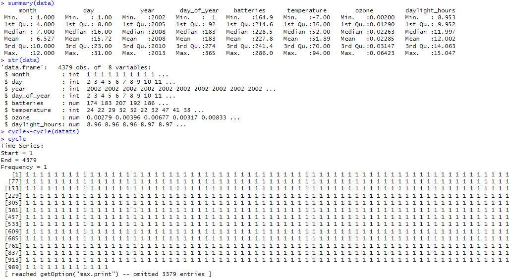
summary(data) str(data) library(TTR) library(dplyr) cycle
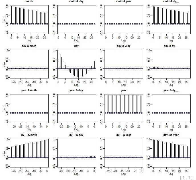
xyplot(cycle~data$month) acf(datats) pacf((datats))
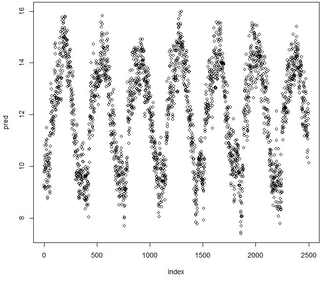
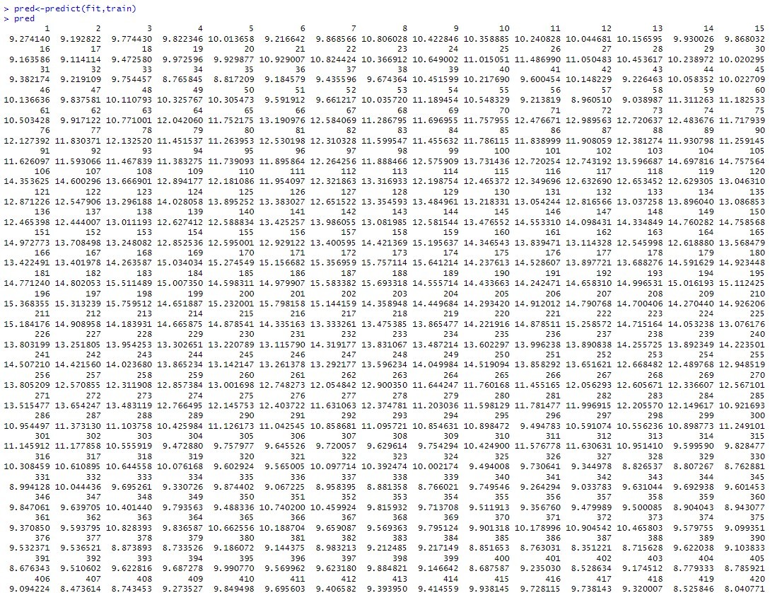
train<-data[1:2500,] test<-data[2501:4379,]
fit<-arima(datats, order = c(0L, 0L, 0L), seasonal = list(order = c(0L, 0L, 0L), period = NA), xreg = NULL, include.mean = TRUE, transform.pars = TRUE, fixed = NULL, init = NULL)
pred<-predict(fit,train) plot(pred)
plot(train)
Exploring the data:
datats<-ts(data)
plot.ts(datats, main=”plot of timeseries data”, col=”blue”)
pred<-predict(fit,train) plot(pred)
#Plotting values of dataset
acf(datats)