3 Visualization using R Programming
R programming
Exercise with Solution
#1.Look at Orange using either head or as.tibble() (you’ll have to run library(tidyverse) for that second option). What type of data are each of the columns?
Solution:
dataSet=Orange
head(dataSet)
## Tree age circumference
## 1 1 118 30
## 2 1 484 58
## 3 1 664 87
## 4 1 1004 115
## 5 1 1231 120
## 6 1 1372 142
#Dataset orange has 3 columns Tree,age,circumference with all integer values
#2.Find the mean, standard deviation, and standard error of tree circumference
Solution:
mean(dataSet$circumference)
## [1] 115.8571
sd(dataSet$circumference)
## [1] 57.48818
sd(dataSet$circumference)/sqrt(length(dataSet$circumference))
## [1] 9.717276
#3.Make a linear model which describes circumference (the response) as a function of age (the predictor). Save it as an object with <-, then print the object out by typing its name. What do those coefficients mean?
Solution:
linearM=lm(dataSet$circumference ~ dataSet$age)
linearM
##
## Call:
## lm(formula = dataSet$circumference ~ dataSet$age)
##
## Coefficients:
## (Intercept) dataSet$age
## 17.3997 0.1068
#Intecept variable tells us that where the linear models cut at y and the other coefficent is the slope
#4.Make another linear model describing age as a function of circumference. Save this as a different object.
Solution:
linearAge=lm(dataSet$age ~ dataSet$circumference)
linearAge
##
## Call:
## lm(formula = dataSet$age ~ dataSet$circumference)
##
## Coefficients:
## (Intercept) dataSet$circumference
## 16.604 7.816
#5.Call summary() on both of your model objects. What do you notice?
summary(linearM)
##
## Call:
## lm(formula = dataSet$circumference ~ dataSet$age)
##
## Residuals:
## Min 1Q Median 3Q Max
## -46.310 -14.946 -0.076 19.697 45.111
##
## Coefficients:
## Estimate Std. Error t value Pr(>|t|)
## (Intercept) 17.399650 8.622660 2.018 0.0518 .
## dataSet$age 0.106770 0.008277 12.900 1.93e-14 ***
## —
## Signif. codes: 0 ‘***’ 0.001 ‘**’ 0.01 ‘*’ 0.05 ‘.’ 0.1 ‘ ‘ 1
##
## Residual standard error: 23.74 on 33 degrees of freedom
## Multiple R-squared: 0.8345, Adjusted R-squared: 0.8295
## F-statistic: 166.4 on 1 and 33 DF, p-value: 1.931e-14
summary(linearAge)
##
## Call:
## lm(formula = dataSet$age ~ dataSet$circumference)
##
## Residuals:
## Min 1Q Median 3Q Max
## -317.88 -140.90 -17.20 96.54 471.16
##
## Coefficients:
## Estimate Std. Error t value Pr(>|t|)
## (Intercept) 16.6036 78.1406 0.212 0.833
## dataSet$circumference 7.8160 0.6059 12.900 1.93e-14 ***
## —
## Signif. codes: 0 ‘***’ 0.001 ‘**’ 0.01 ‘*’ 0.05 ‘.’ 0.1 ‘ ‘ 1
##
## Residual standard error: 203.1 on 33 degrees of freedom
## Multiple R-squared: 0.8345, Adjusted R-squared: 0.8295
## F-statistic: 166.4 on 1 and 33 DF, p-value: 1.931e-14
#6.Does this mean that trees growing makes them get older? Does a tree getting older make it grow larger? Or are these just correlations?
Solution:
plot(dataSet$circumference ~ dataSet$age)
abline(linearM)
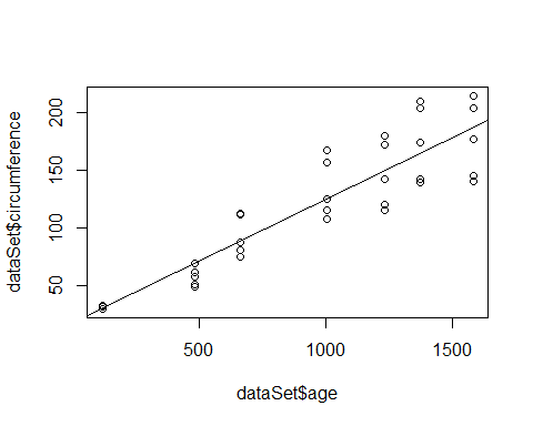
#its a correlation that older trees are generally bigger in size
#7.Does the significant p value prove that trees growing makes them get older? Why not?
Solution:
cor.test(dataSet$age, dataSet$circumference, method = “pearson”)
##
## Pearson’s product-moment correlation
##
## data: dataSet$age and dataSet$circumference
## t = 12.9, df = 33, p-value = 1.931e-14
## alternative hypothesis: true correlation is not equal to 0
## 95 percent confidence interval:
## 0.8342364 0.9557955
## sample estimates:
## cor
## 0.9135189
#From the above, we get the conclusion that if the P-Value for our values is Significant then the values to #be randomised is significant. Hence, significant p value does not prove that trees growing makes them get #older.
Practice Problems
Forecasting
Problem 1:
Auto sales at Carmen’s Chevrolet are shown below. Develop a 3-week moving average.
|
Week |
Auto Sales |
|
1 |
8 |
|
2 |
10 |
|
3 |
9 |
|
4 |
11 |
|
5 |
10 |
|
6 |
13 |
|
7 |
– |
Problem 2:
Carmen’s decides to forecast auto sales by weighting the three weeks as follows:
|
Weights Applied |
Period |
|
3 |
Last week |
|
2 |
Two weeks ago |
|
1 |
Three weeks ago |
|
6 |
Total |
Problem 3:
A firm uses simple exponential smoothing with to forecast demand. The forecast for the week of January 1 was 500 units whereas the actual demand turned out to be 450 units. Calculate the demand forecast for the week of January 8.
Problem 4:
Exponential smoothing is used to forecast automobile battery sales. Two values of are examined, and Evaluate the accuracy of each smoothing constant. Which is preferable? (Assume the forecast for January was 22 batteries.) Actual sales are given below:
|
Month |
Actual Battery Sales |
Forecast |
|
January |
20 |
22 |
|
February |
21 |
|
|
March |
15 |
|
|
April |
14 |
|
|
May |
13 |
|
|
June |
16 |
|
Problem 5:
Use the sales data given below to determine: (a) the least squares trend line, and (b) the predicted value for 2013 sales.
|
Year |
Sales (Units) |
|
2006 |
100 |
|
2007 |
110 |
|
2008 |
122 |
|
2009 |
130 |
|
2010 |
139 |
|
2011 |
152 |
|
2012 |
164 |
To minimize computations, transform the value of x (time) to simpler numbers. In this case, designate year 2006 as year 1, 2007 as year 2, etc.
Problem 6:
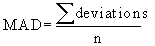
Given the forecast demand and actual demand for 10-foot fishing boats, compute the tracking signal and MAD.
|
Year |
Forecast Demand |
Actual Demand |
|
1 |
78 |
71 |
|
2 |
75 |
80 |
|
3 |
83 |
101 |
|
4 |
84 |
84 |
|
5 |
88 |
60 |
|
6 |
85 |
73 |
Problem: 7
Over the past year Meredith and Smunt Manufacturing had annual sales of 10,000 portable water pumps. The average quarterly sales for the past 5 years have averaged: spring 4,000, summer 3,000, fall 2,000, and winter 1,000. Compute the quarterly index.
Problem: 8
Using the data in Problem 7, Meredith and Smunt Manufacturing expects sales of pumps to grow by 10% next year. Compute next year’s sales and the sales for each quarter.
Solutions
Problem 1:
|
Week |
Auto Sales |
Three-Week Moving Average |
|
1 |
8 |
|
|
2 |
10 |
|
|
3 |
9 |
|
|
4 |
11 |
(8 + 9 + 10) / 3 = 9 |
|
5 |
10 |
(10 + 9 + 11) / 3 = 10 |
|
6 |
13 |
(9 + 11 + 10) / 3 = 10 |
|
7 |
– |
(11 + 10 + 13) / 3 = 11 1/3 |
Problem 2:
|
Week |
Auto Sales |
Three-Week Moving Average |
|
1 |
8 |
|
|
2 |
10 |
|
|
3 |
9 |
|
|
4 |
11 |
[(3*9) + (2*10) + (1*8)] / 6 = 9 1/6 |
|
5 |
10 |
[(3*11) + (2*9) + (1*10)] / 6 = 10 1/6 |
|
6 |
13 |
[(3*10) + (2*11) + (1*9)] / 6 = 10 1/6 |
|
7 |
– |
[(3*13) + (2*10) + (1*11)] / 6 = 11 2/3 |
Problem 3:
Problem 4:
|
Month |
Actual Battery Sales |
Rounded Forecast with a =0.8 |
Absolute Deviation with a =0.8 |
Rounded Forecast with a =0.5 |
Absolute Deviation with a =0.5 |
|
January |
20 |
22 |
2 |
22 |
2 |
|
February |
21 |
20 |
1 |
21 |
0 |
|
March |
15 |
21 |
6 |
21 |
6 |
|
April |
14 |
16 |
2 |
18 |
4 |
|
May |
13 |
14 |
1 |
16 |
3 |
|
June |
16 |
13 |
3 |
14.5 |
1.5 |
|
|
|
|
|
|
|
|
|
|
|
∑ = 15 |
|
∑ = 16.5 |
|
|
2.5 |
|
2.75 |
||
Based on this analysis, a smoothing constant of a = 0.8 is preferred to that of a = 0.5 because it has a smaller MAD.
Problem 5:
|
Year |
Time Period (X) |
Sales (Units) (Y) |
X2 |
XY |
|
2006 |
1 |
100 |
1 |
100 |
|
2007 |
2 |
110 |
4 |
220 |
|
2008 |
3 |
122 |
9 |
366 |
|
2009 |
4 |
130 |
16 |
520 |
|
2010 |
5 |
139 |
25 |
695 |
|
2011 |
6 |
152 |
36 |
912 |
|
2012 |
7 |
164 |
49 |
1148 |
|
|
|
|
|
|
Therefore, the least squares trend equation is:
To project demand in 2013, we denote the year 2013 as and:
Sales in
Problem 6:
|
Year |
Forecast Demand |
Actual Demand |
Error |
RSFE |
|
1 |
78 |
71 |
-7 |
-7 |
|
2 |
75 |
80 |
5 |
-2 |
|
3 |
83 |
101 |
18 |
16 |
|
4 |
84 |
84 |
0 |
16 |
|
5 |
88 |
60 |
-28 |
-12 |
|
6 |
85 |
73 |
-12 |
-24 |
|
Year |
Forecast Demand |
Actual Demand |
|Forecast Error| |
Cumulative Error |
MAD |
Tracking Signal |
|
1 |
78 |
71 |
7 |
7 |
7.0 |
-1.0 |
|
2 |
75 |
80 |
5 |
12 |
6.0 |
-0.3 |
|
3 |
83 |
101 |
18 |
30 |
10.0 |
+1.6 |
|
4 |
84 |
84 |
0 |
30 |
7.5 |
+2.1 |
|
5 |
88 |
60 |
28 |
58 |
11.6 |
-1.0 |
|
6 |
85 |
73 |
12 |
70 |
11.7 |
-2.1 |
Problem 7:
Sales of 10,000 units annually divided equally over the 4 seasons is and the seasonal index for each quarter is: spring summer fall winter
Problem 8:
Next years sales should be 11,000 pumps Sales for each quarter should be 1/4 of the annual sales the quarterly index.
Exercise 1. DRINKING WATER MONITORING AND FORECASTING USING R
Aim:
To perform analysis on drinking water dataset and use R to do time series forecasting on the data by analyzing, monitoring and plotting the obtained forecast
Problem Statement:
Getting enough water every day is important for one’s health. Drinking water can prevent dehydration, a condition that can cause unclear thinking, result in mood change, cause your body to overheat, and lead to constipation and kidney stones. It is critical to examine the amount of water consumed on a regular basis in order to determine how much water has been consumed and to enhance water consumption if it is too low or vice versa.
Dataset:
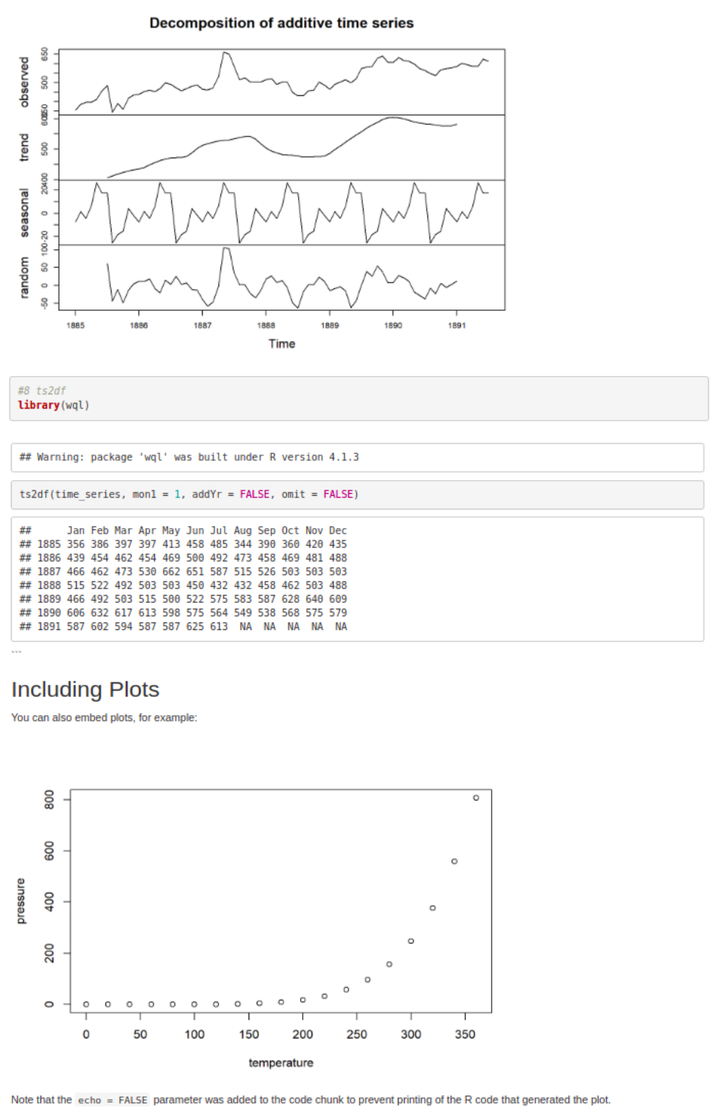
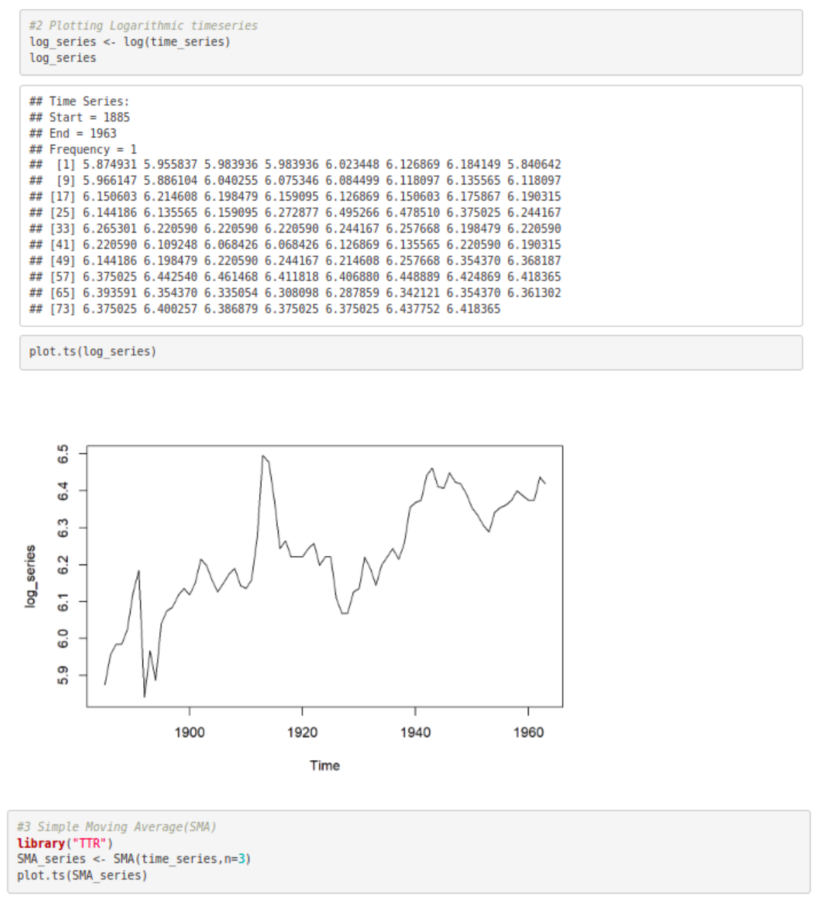
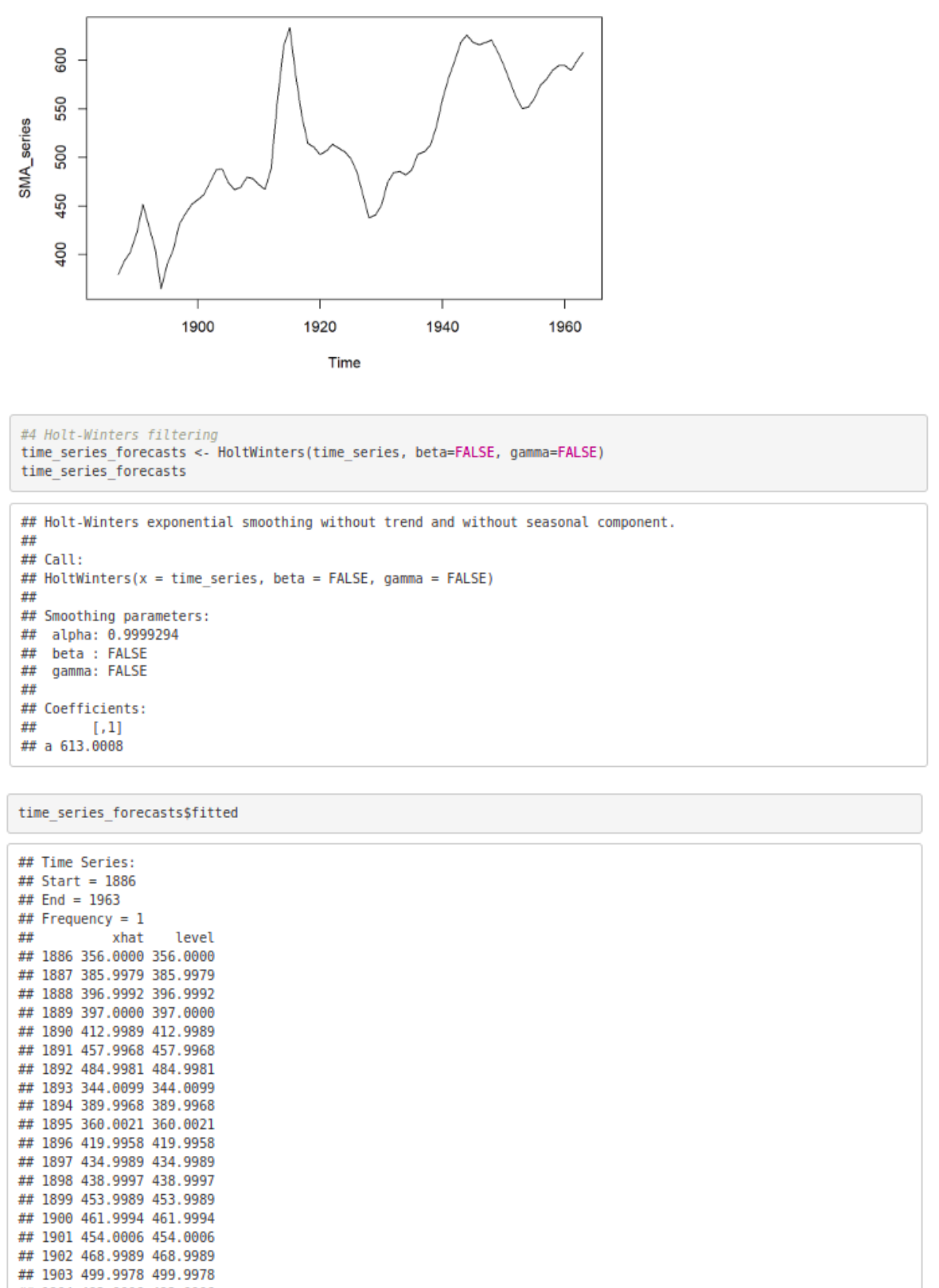
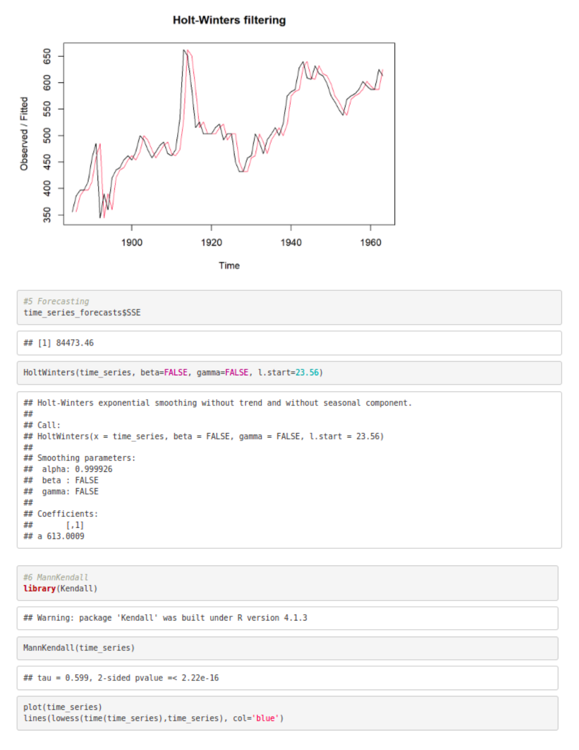
The dataset https://raw.githubusercontent.com/jbrownlee/Datasets/master/ yearly-water-usage.csv which consists of annual water consumption in Baltimore from 1885 to 1963 (unit used is liters per capita per day), is used to analyze and monitor drinking water. Time series forecasting using SMA, Holt-Winter filtering, MannKendall and data visualization are performed using the same.
Procedure:
- Install necessary libraries like Kendall, wql, etc.
- Import the dataset downloaded from https://raw.githubusercontent.com/ jbrownlee/Datasets/master/yearly-water-usage.csv
Plot data as time series
Plot logarithmic time series
Plot SMA(Simple Moving Average) and view the time series output
Use Holt – Winters filtering and view the time series output
Forecast based on Holt – Winters
Calculate Mann-Kendall test of trend on time series and visualize the output
Perform decomposition of Additive time series
Plot decomposition of Additive time series
Convert time series to dataframe using ts2df.
CODE:
#R version 4.1.2 (2021-11-01)
#RStudio version 1.2.1335
#Program Execution
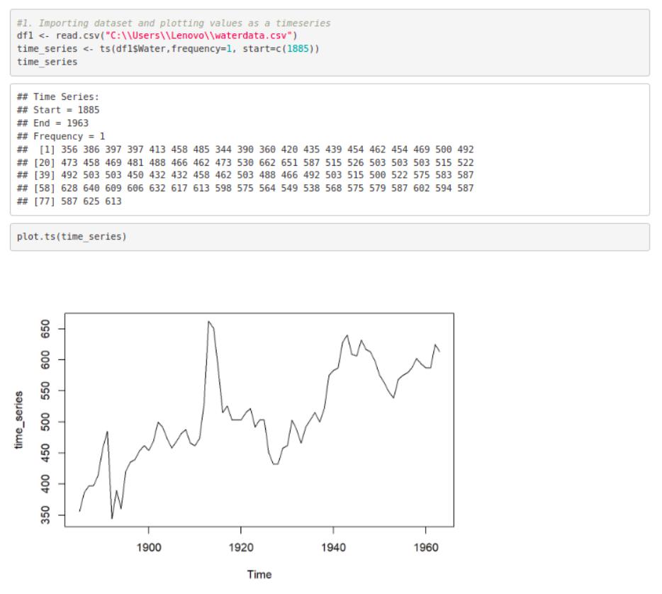
#1. Importing dataset and plotting values as a timeseries
df1 <- read.csv(“C:\\Users\\Lenovo\\waterdata.csv”)
time_series <- ts(df1$Water,frequency=1, start=c(1885))
time_series
plot.ts(time_series)
#2 Plotting Logarithmic timeseries
log_series <- log(time_series)
log_series
plot.ts(log_series)
#3 Simple Moving Average(SMA)
library(“TTR”)
SMA_series <- SMA(time_series,n=3)
plot.ts(SMA_series)
#4 Holt-Winters filtering
time_series_forecasts <- HoltWinters(time_series, beta=FALSE, gamma=FALSE)
time_series_forecasts
time_series_forecasts$fitted
plot(time_series_forecasts)
#5 Forecasting
time_series_forecasts$SSE
HoltWinters(time_series, beta=FALSE, gamma=FALSE, l.start=23.56)
#6 MannKendall
library(Kendall)
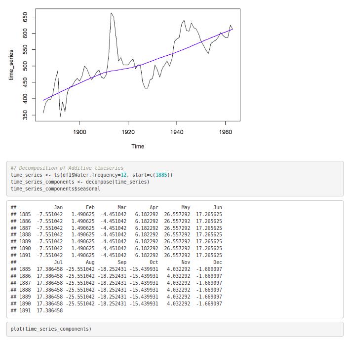
plot(time_series)
lines(lowess(time(time_series),time_series), col=’blue’)
#7 Decomposition of Additive timeseries
time_series <- ts(df1$Water,frequency=12, start=c(1885)) time_series_components <- decompose(time_series) time_series_components$seasonal
plot(time_series_components)
 OUTPUT:
Exercise 2: IoT BASED HEALTH MONITORING USING R
Aim:
To formulate an IOT based healthcare application – prediction of possibility of heart attack using Generalized Linear model, Random forest and Decision trees in R
Problem Statement:
Heart disease has received a lot of attention in medical research as one of the many life-threatening diseases. The diagnosis of heart disease is a difficult task which when automated can offer better predictions about the patient’s heart condition so that further treatment can be made effective. The signs, symptoms, and physical examination of the patient are usually used to make a diagnosis of heart disease. Resting blood pressure, cholesterol, age, sex, type of chest pain, fasting blood sugar, ST depression, and exercise-induced angina can all help to predict the likelihood of having a heart attack. Using models like Decision trees, Random forest and GLM to train on the given dataset and view the predicted class – 0 = less chance of heart attack, 1 = more chance of heart attack.
Procedure:
Import the packages Rplot, RColorBrewer, Rattle and randomForest
Download and read the dataset from Kaggle : https://www.kaggle.com/ datasets/nareshbhat/health-care-data-set-on-heart-attack-possibility
View the statistics of the variables in the dataset using function “summary”.
Analyse the data, specific to resting blood pressure
Using the “cor” function, find the correlation between resting blood pressure and age
Construct a Logistic regression model using GLM and view the output plots
Encode the target values into categorical values
Split the dataset into training and testing data in the ratio 70 : 30
Construct a decision tree model 10.Target variable is categorised based on resting blood pressure, serum cholesterol and maximum heart rate achieved
Plot the decision tree and view the output
Devise a Random forest model based on the relationship between resting blood pressure, old peak and chest pain type
View the confusion matrix and importance of each predictor
CODE:
#Ex1- IOT based healthcare application using Generalized Linear model, Random forest and Decision trees in R
#R version 3.3.2 (2016-10-31)
#RStudio version 1.2.1335
# Loading all the necessary Libraries
library(rpart) #used for building classification and regression trees.
library(rpart.plot)
 library(RColorBrewer) # help you choose sensible colour schemes for figures library(rattle) # provides a collection of utilities functions for a data scientist. library(randomForest) #Used to create and analyse random forests.
# Loading the dataset
data = read.csv(“heart_health.csv”)
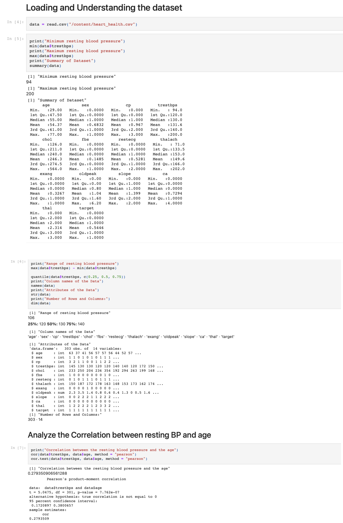
Analyzing the data in the dataset print(“Minimum resting blood pressure”) min(data$trestbps) print(“Maximum resting blood pressure”) max(data$trestbps)
print(“Summary of Dataset”) summary(data)
print(“Range of resting blood pressure”) max(data$trestbps) – min(data$trestbps) quantile(data$trestbps, c(0.25, 0.5, 0.75)) print(“Column name of the Data”) names(data)
print(“Attributes of the Data”) str(data)
print(“Number of Rows and Columns:”) dim(data)
# Analyze the Correlation between resting BP and age
print(“Correlation between the resting blood pressure and the age”)
cor(data$trestbps, data$age, method = “pearson”)
cor.test(data$trestbps, data$age, method = “pearson”)
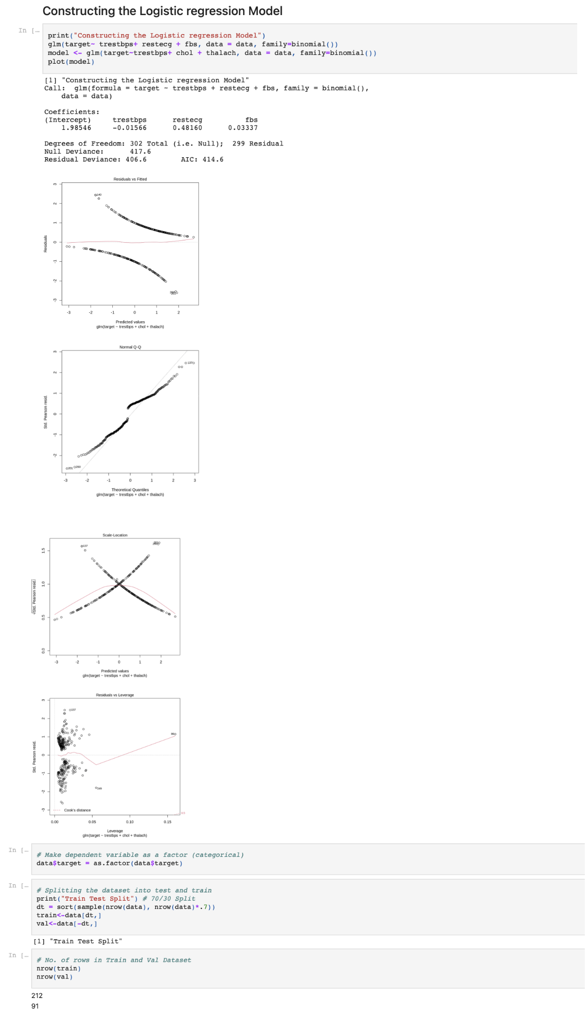
# Constructing the GLM
print(“Constructing the Logistic regression Model”)
glm(target~ trestbps+ restecg + fbs, data = data, family=binomial())
model <- glm(target~trestbps+ chol + thalach, data = data, family=binomial())
plot(model)
Make dependent variable as a factor (categorical) data$target = as.factor(data$target)
Splitting the dataset into test and train print(“Train Test Split”) # 70/30 Split
dt = sort(sample(nrow(data), nrow(data)*.7)) train<-data[dt,]
val<-data[-dt,] nrow(train) nrow(val)
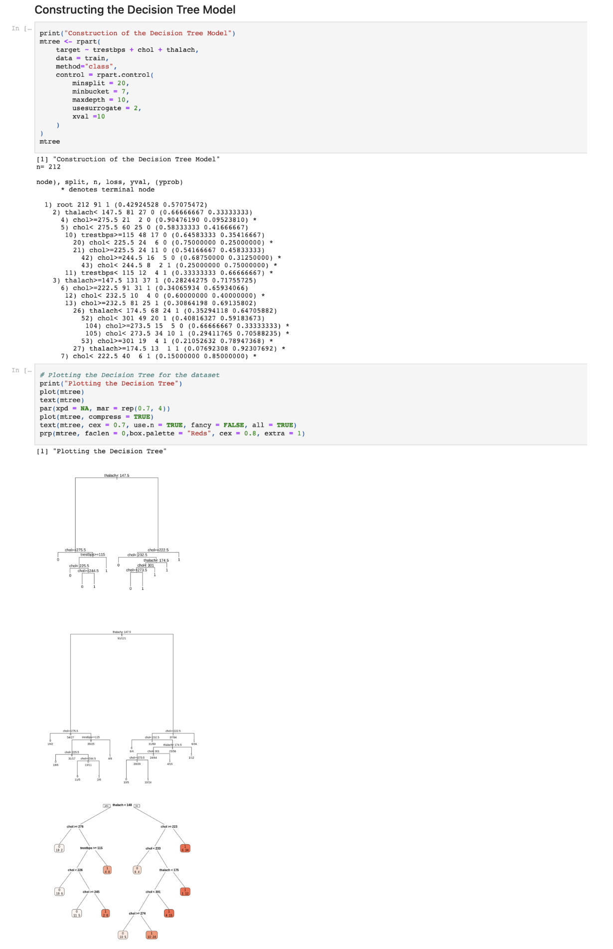
Constructing the Decision Tree Model print(“Construction of the Decision Tree Model”) mtree <- rpart(target ~ trestbps + chol + thalach, data = train, method=”class”,
control = rpart.control(minsplit = 20, minbucket = 7, maxdepth = 10, usesurrogate = 2,
xval =10))
mtree
Plotting the Decision Tree for the dataset print(“Plotting the Decision Tree”) plot(mtree)
text(mtree)
par(xpd = NA, mar = rep(0.7, 4)) plot(mtree, compress = TRUE)
text(mtree, cex = 0.7, use.n = TRUE, fancy = FALSE, all = TRUE) prp(mtree, faclen = 0,box.palette = “Reds”, cex = 0.8, extra = 1)
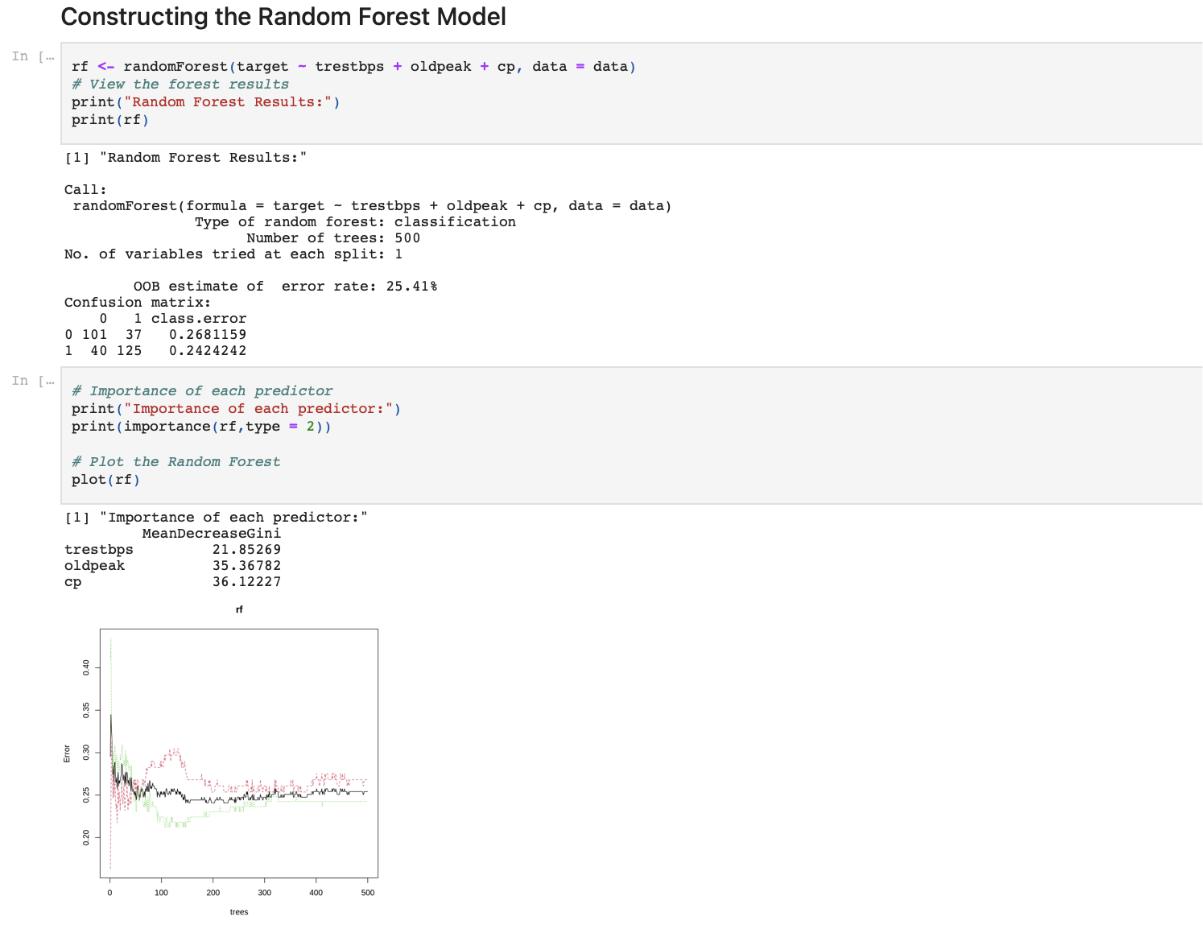
Constructing the Random Forest model
rf <- randomForest(target ~ trestbps + oldpeak + cp, data = data)
View the forest results print(“Random Forest Results:”)
Importance of each predictor print(“Importance of each predictor:”) print(importance(rf,type = 2))
Plot the Random Forest
plot(rf)
#Conclusion
#Models like Decision trees, Random forest and GLM were trained on the given dataset and the predictions were visualised successfully
 OUTPUT:
Exercise 3: TRAFFIC PATTERN RECOGNITION USING R
Aim:
To formulate an IOT based Traffic pattern recognition using Decision tree, correlation study, Naïve Bayes classification and Time series forecasting in R
Problem Statement:
The term “traffic patterns recognition” refers to the process of recognising a user’s current traffic pattern, which can be applicable to transportation planning, location-based services, social networks, and a range of other applications.
Dataset:
Using the dataset from Kaggle https://www.kaggle.com/datasets/utathya/smart-city-traffic-patterns called “Smart City traffic patterns”, perform pattern recognition and prediction using Decision Tree classifiers and Naïve Bayes classification. Moreover, time series analysis and simple moving average, Arima and exponential smoothing are performed.
Procedure:
Import required packages after installing
Load and read the data set
Pre-process the data appropriately
Use summary method to see the characteristics of the data set
Use the Simple Moving Average forecasting model and visualize the output
Use the Exponential smoothing forecasting model and see the output
Use the Arima forecasting model and view the output
Get the correlation between the columns
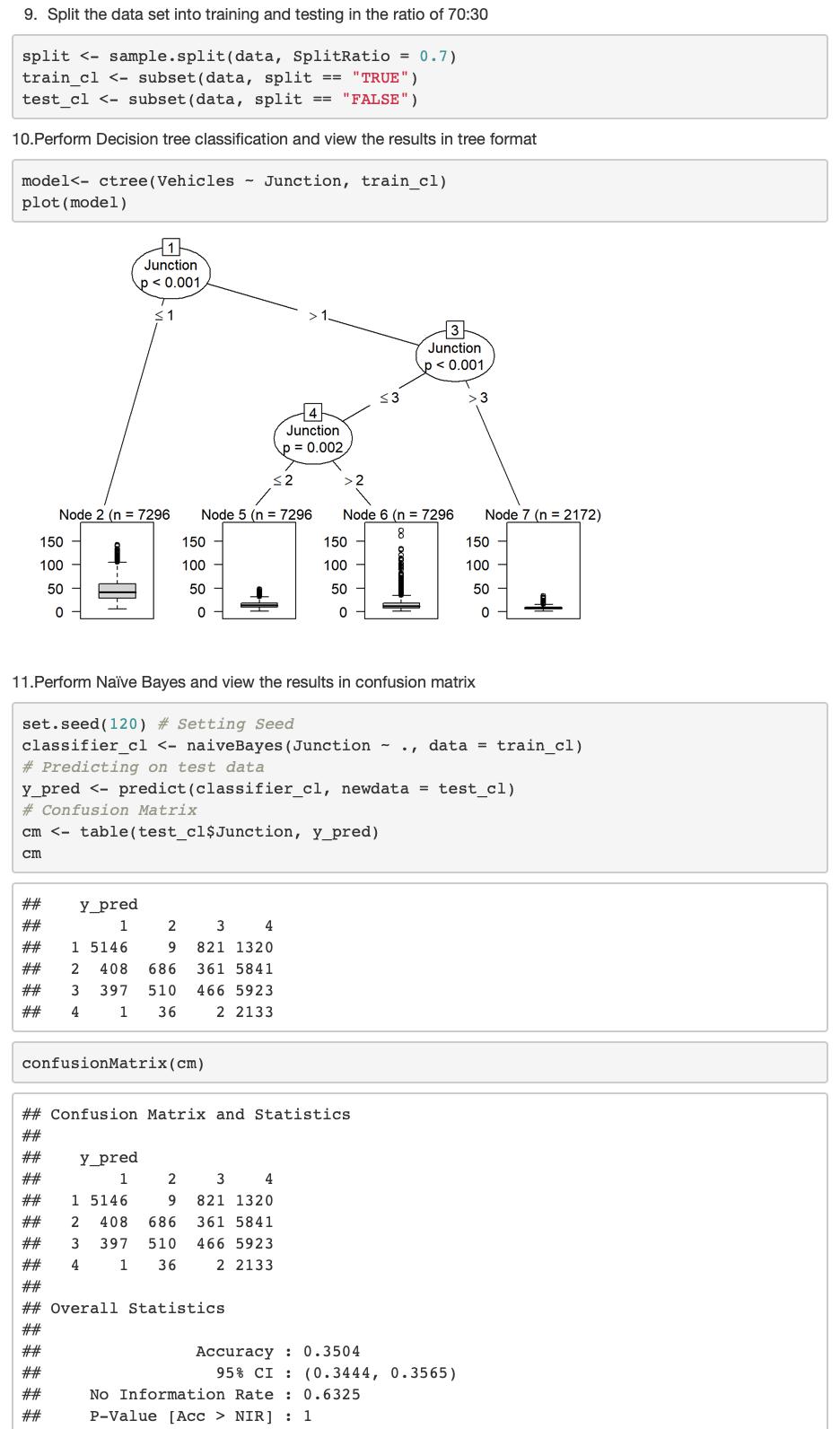
Split the data set into training and testing in the ratio of 70:30
Perform Decision tree classification and view the results in tree format
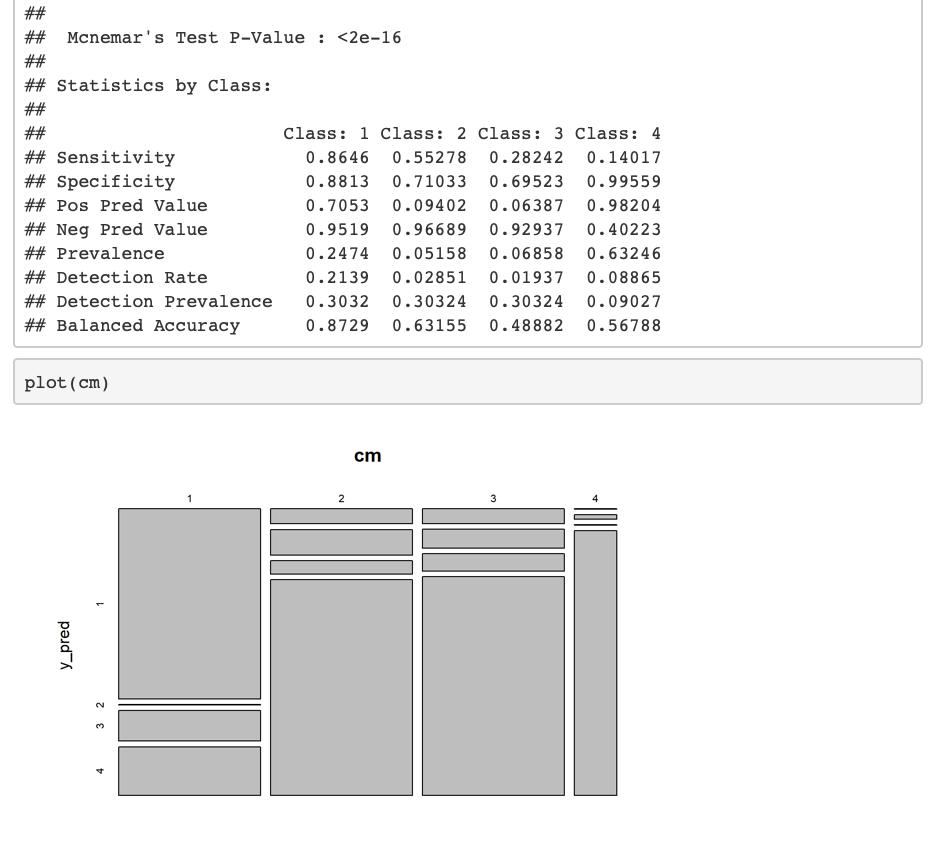
Perform Naïve Bayes and view the results in confusion matrix
CODE:
#R version 3.6.1
#RStudio version 1.2.1335
#Import required packages after installing
library(“e1071”)
library(“caTools”)
library(“caret”)
library(“party”)
library(“dplyr”)
library(“magrittr”)
library(“TTR”)
library(“data.table”)
#Load the data set
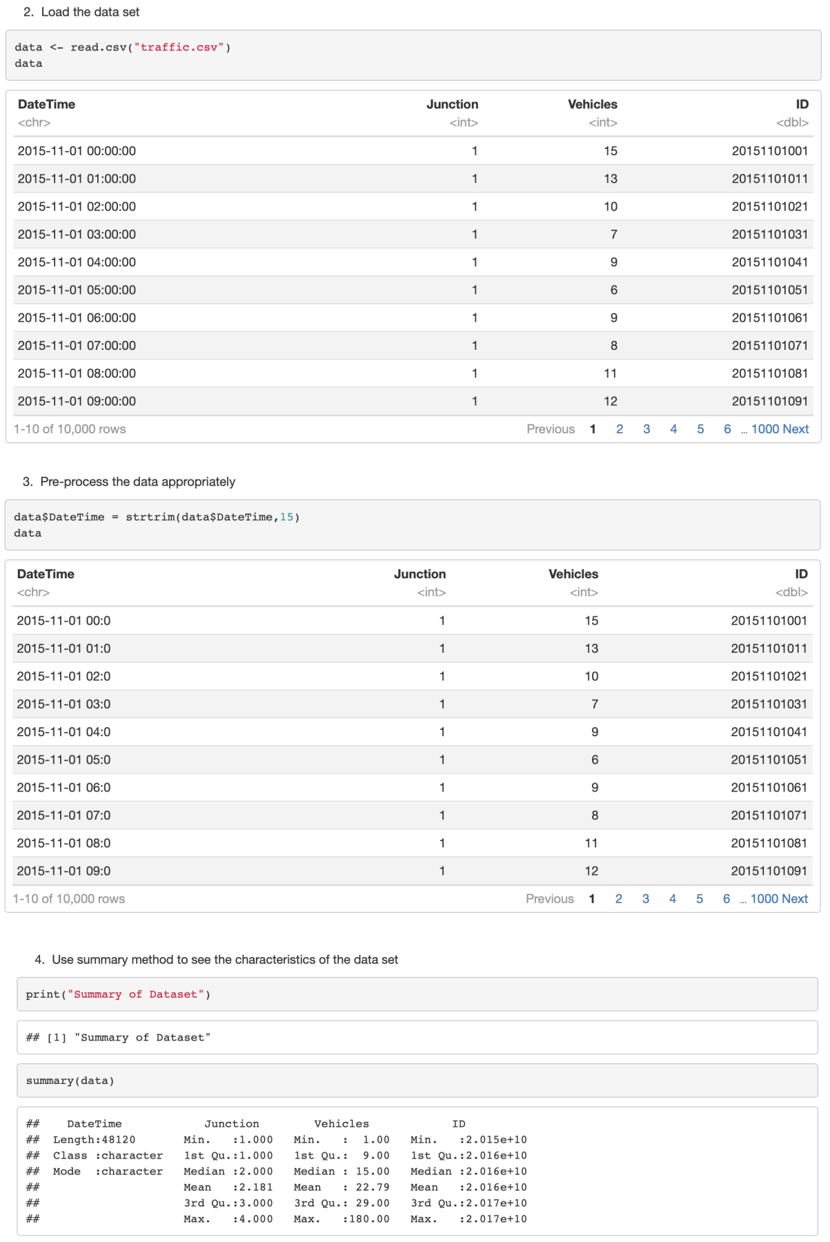
data <- read.csv(“traffic.csv”)
#Pre-process the data appropriately
data$DateTime = strtrim(data$DateTime,15)
data
#Use summary method to see the characteristics of the data set
print(“Summary of Dataset”)
summary(data)
# correlation study
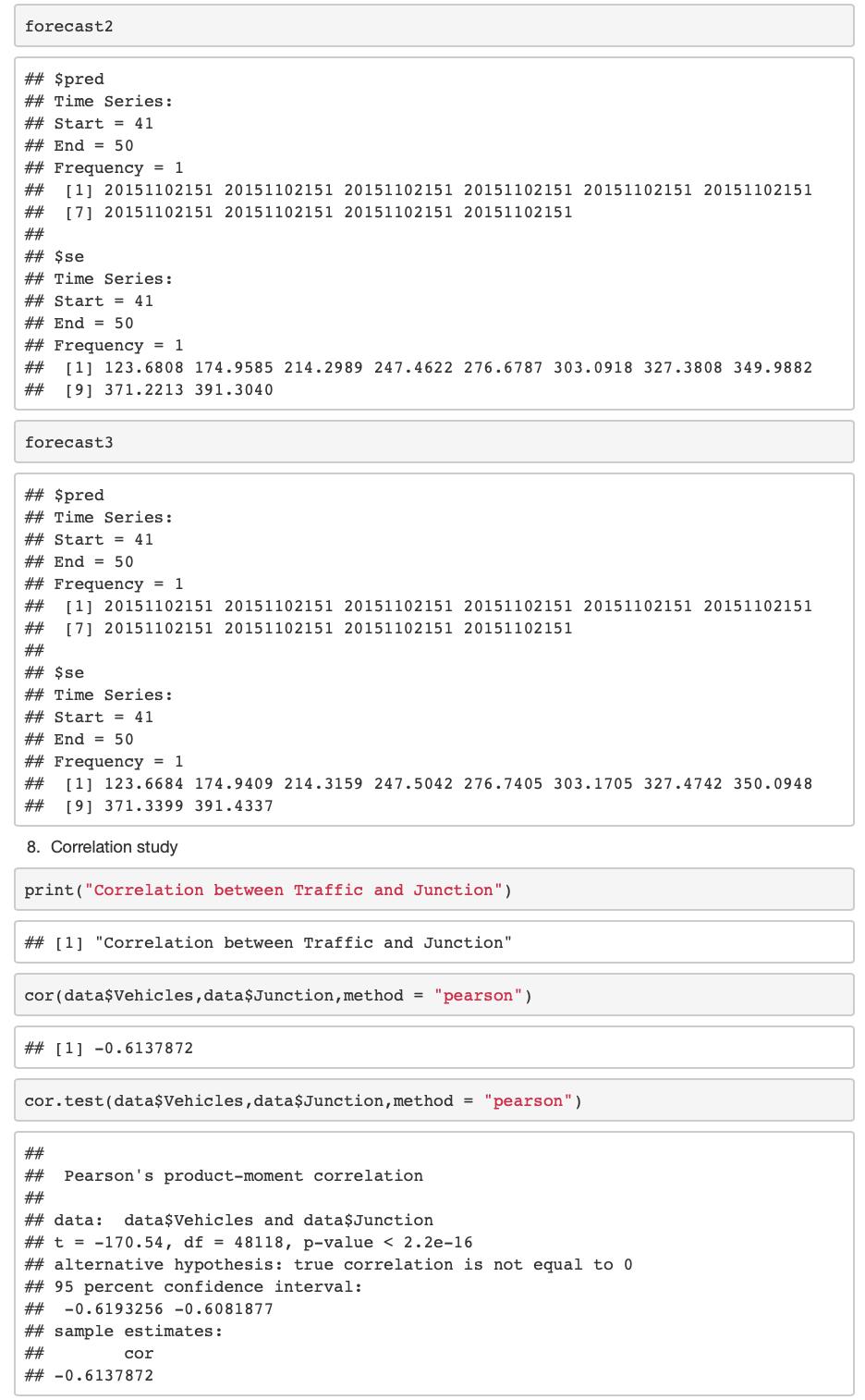
print(“Correlation between Traffic and Junction”)
cor(data$Vehicles,data$Junction,method = “pearson”)
cor.test(data$Vehicles,data$Junction,method = “pearson”)
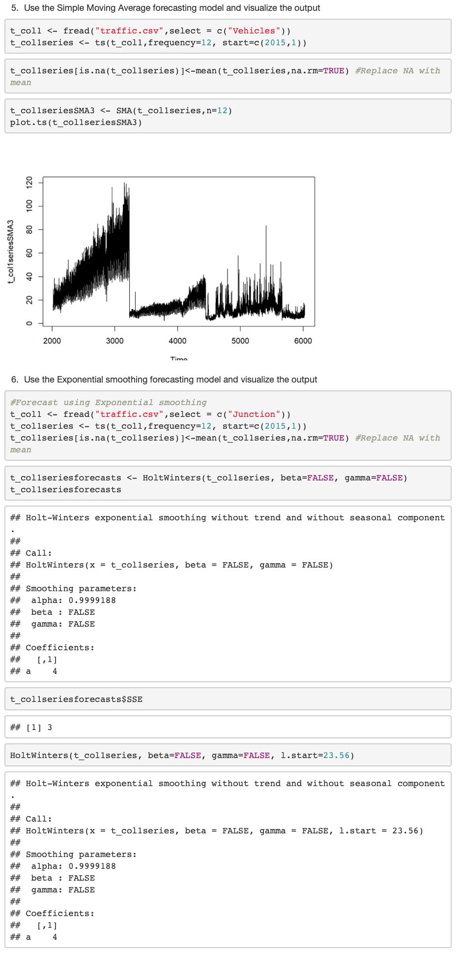
#Use the Simple Moving Average forecasting model and visualize the output t_col1 <- fread(“traffic.csv”,select = c(“Vehicles”))
t_col1series <- ts(t_col1,frequency=12, start=c(2015,1))
t_col1series[is.na(t_col1series)]<-mean(t_col1series,na.rm=TRUE) #Replace NA with mean
t_col1seriesSMA3 <- SMA(t_col1series,n=12)
plot.ts(t_col1seriesSMA3)
#Use the Exponential smoothing forecasting model and visualize the output t_col1 <- fread(“traffic.csv”,select = c(“Junction”))
t_col1series <- ts(t_col1,frequency=12, start=c(2015,1))
t_col1series[is.na(t_col1series)]<-mean(t_col1series,na.rm=TRUE) #Replace NA with mean
t_col1seriesforecasts <- HoltWinters(t_col1series, beta=FALSE, gamma=FALSE)
t_col1seriesforecasts
t_col1seriesforecasts$SSE
HoltWinters(t_col1series, beta=FALSE, gamma=FALSE, l.start=23.56)
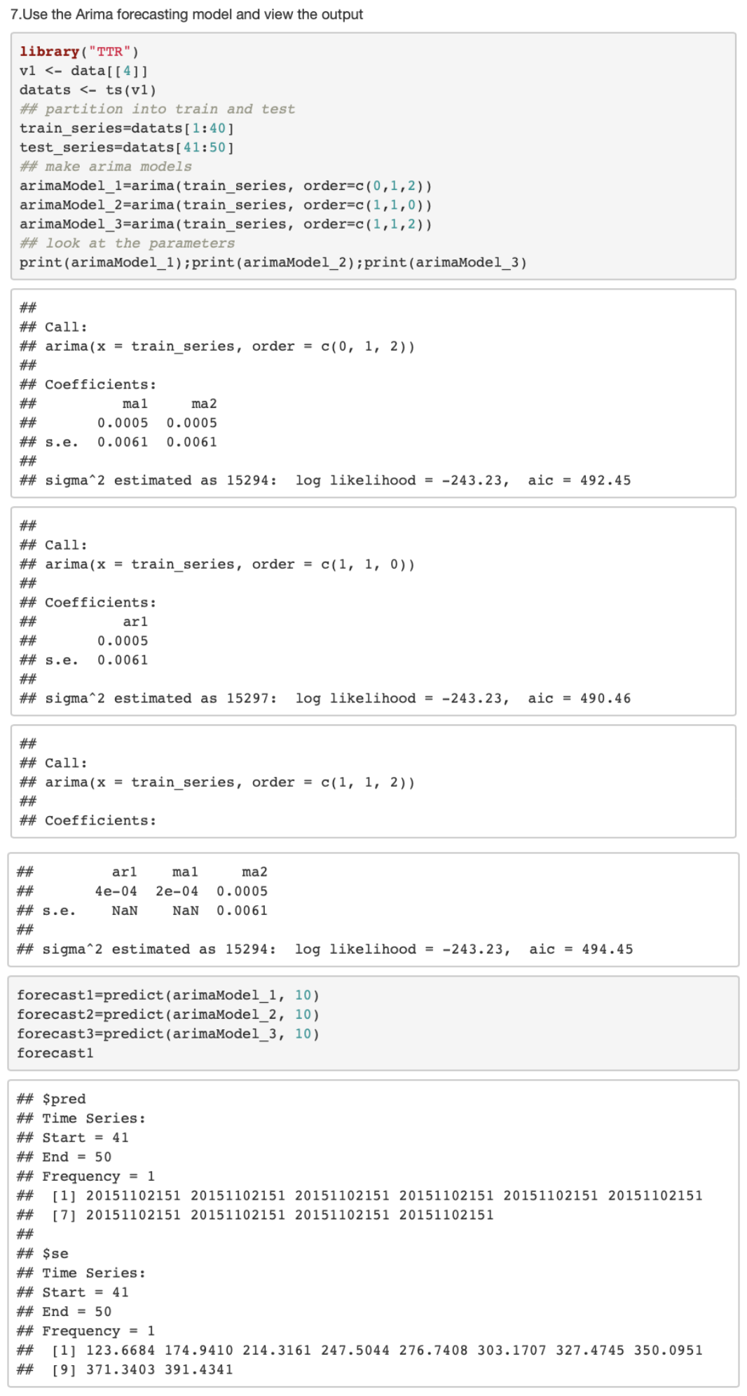
#Use the Arima forecasting model and view the output library(“TTR”)
v1 <- data[[4]]
datats <- ts(v1)
partition into train and test train_series=datats[1:40] test_series=datats[41:50]
make arima models
arimaModel_1=arima(train_series, order=c(0,1,2))
arimaModel_2=arima(train_series, order=c(1,1,0))
arimaModel_3=arima(train_series, order=c(1,1,2))
## look at the parameters
print(arimaModel_1);print(arimaModel_2);print(arimaModel_3)
#Split the data set into training and testing in the ratio of 70:30
split <- sample.split(data, SplitRatio = 0.7)
train_cl <- subset(data, split == “TRUE”)
test_cl <- subset(data, split == “FALSE”)
#Perform Decision tree classification and view the results in tree format model<- ctree(Vehicles ~ Junction, train_cl) plot(model)
#Perform Naïve Bayes and view the results in confusion matrix set.seed(120) # Setting Seed
classifier_cl <- naiveBayes(Junction ~ ., data = train_cl)
# Predicting on test data
y_pred <- predict(classifier_cl, newdata = test_cl)
# Confusion Matrix
cm <- table(test_cl$Junction, y_pred)
cm
confusionMatrix(cm)
plot(cm)
#Conclusion
Traffic pattern recognition with Decision trees, correlation study, Naïve Bayes classification and Time series forecasting was successfully implemented and visualised using R
Exercise 4: POWER DATAANALYSIS AND VISUALISATION FOR PROJECT IN HOME POWER IN RASPBERRY PI USING R
AIM:
To perform analysis on power data collected using Raspberry Pi and use R to do time series forecasting on the data by analyzing it and plotting the obtained forecast
PROBLEM STATEMENT:
The data on household power consumption can not only show the current state of household power consumption, but it can also bring awareness to the power sector, assisting in the understanding of power supply. With the proliferation of smart electricity metres and the widespread deployment of electricity producing technology such as solar panels, there is a lot of data about electricity usage available.
The Kaggle Dataset named “Household Electric Power Consumption” present in the link “https://www.kaggle.com/datasets/uciml/electric-power-consumption-data-set“, is a multivariate time series of power-related variables that can be used to model and even forecast future electricity consumption. Time series forecasting, exploratory data analytics and data visualization is performed using the same.
PROCEDURE:
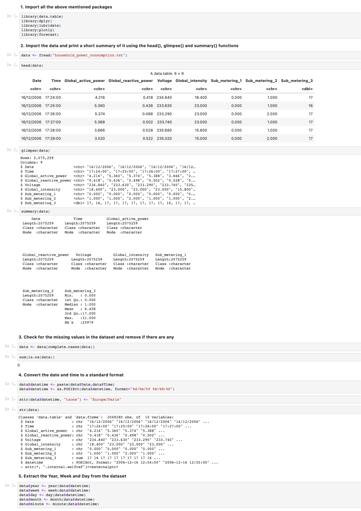
Import the table, dplyr, lubridate, plotly and forecast packages
Import the data and print a short summary of it using the head(), glimpse() and summary() functions.
Check for the missing values in the dataset and remove if there are any.
Convert the date and time to a standard format.
Extract the Year, Week and Day from the dataset.
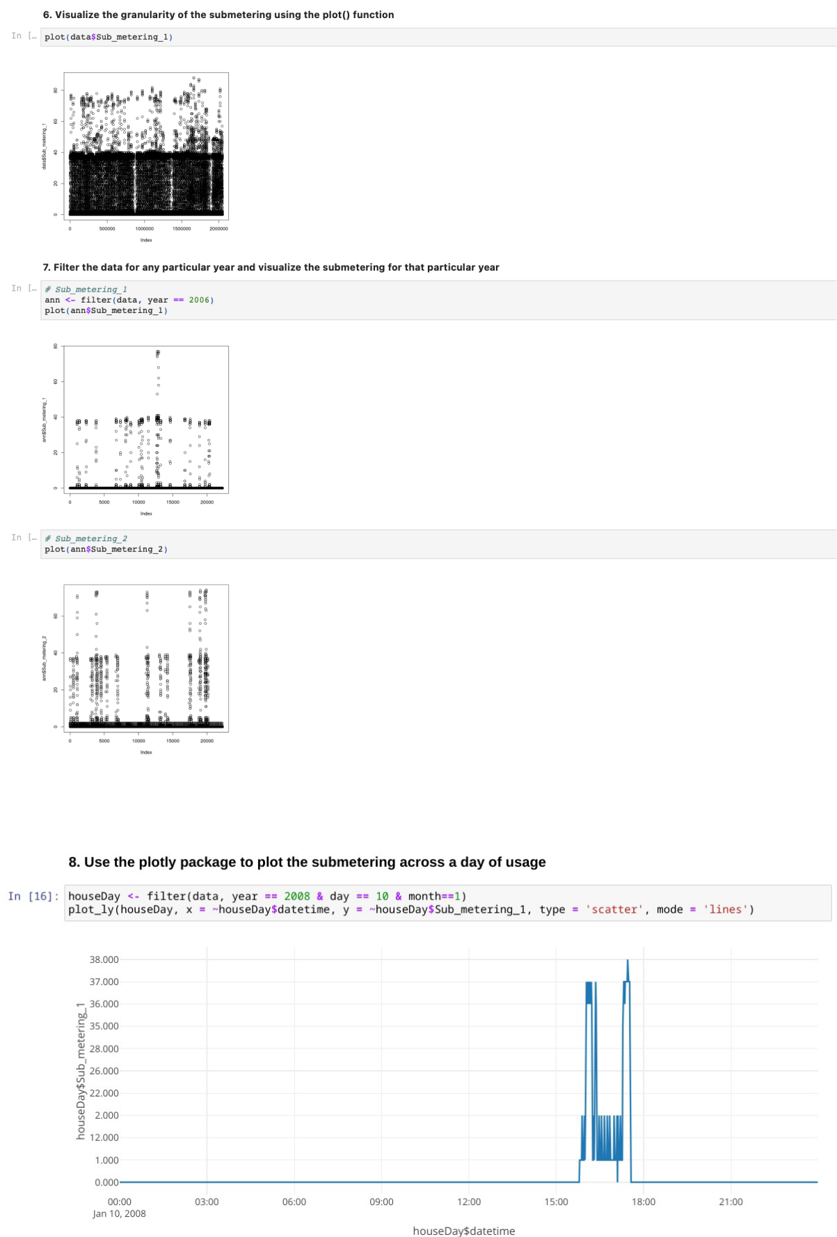
Visualize the granularity of the submetering using the plot() function
Filter the data for any particular year and visualize the submetering for that particular year.
Use the plotly package to plot the submetering across a day of usage.
Reduce the number of observations for that day and again plot the graph using plotly.
For the time series analysis extract the weekly time series data for all the submeters and plot them.
Fit the time series data into a time series linear regression model.
View the summary of the model.
Plot the forecast for all 3 submeters.
CODE:
#R version 3.6.1
#RStudio version 1.2.1335
Import Packages library(data.table)
library(lubridate)
library(plotly)
library(forecast)
# Import Data
data <- fread(“household_power_consumption.txt”)
head(data)
glimpse(data)
summary(data)
# Data Preprocessing
data <- data[complete.cases(data)]
sum(is.na(data))
data$datetime <- paste(data$Date,data$Time)
data$datetime <- as.POSIXct(data$datetime, format=”%d/%m/%Y %H:%M:%S”) attr(data$datetime, “tzone”) <- “Europe/Paris” str(data)
data$year <- year(data$datetime)
data$week <- week(data$datetime)
data$day <- day(data$datetime)
data$month <- month(data$datetime)
data$minute <- minute(data$datetime)
Data Visualization plot(data$Sub_metering_1) ann <- filter(data, year == 2006) plot(ann$Sub_metering_1) plot(ann$Sub_metering_2) plot(ann$Sub_metering_3)
houseDay <- filter(data, year == 2008 & day == 10 & month==1)
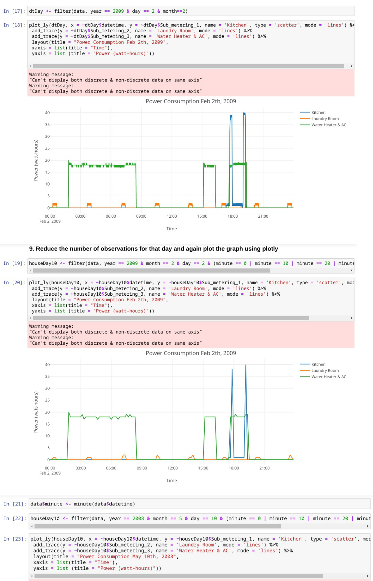
plot_ly(houseDay, x = ~houseDay$datetime, y = ~houseDay$Sub_metering_1, type = ‘scatter’, mode = ‘lines’)
dtDay <- filter(data, year == 2009 & day == 2 & month==2)
plot_ly(dtDay, x = ~dtDay$datetime, y = ~dtDay$Sub_metering_1, name = ‘Kitchen’, type = ‘scatter’, mode = ‘lines’) %>%
add_trace(y = ~dtDay$Sub_metering_2, name = ‘Laundry Room’, mode = ‘lines’) %>%
add_trace(y = ~dtDay$Sub_metering_3, name = ‘Water Heater & AC’, mode = ‘lines’) %>%
layout(title = “Power Consumption Feb 2th, 2009”,
xaxis = list(title = “Time”),
yaxis = list (title = “Power (watt-hours)”))
houseDay10 <- filter(data, year == 2009 & month == 2 & day == 2 & (minute == 0 | minute == 10 | minute == 20 | minute == 30 | minute == 40 | minute == 50))
plot_ly(houseDay10, x = ~houseDay10$datetime, y = ~houseDay10$Sub_metering_1, name = ‘Kitchen’, type = ‘scatter’, mode = ‘lines’) %>%
add_trace(y = ~houseDay10$Sub_metering_2, name = ‘Laundry Room’, mode = ‘lines’) %>%
add_trace(y = ~houseDay10$Sub_metering_3, name = ‘Water Heater & AC’, mode = ‘lines’) %>%
layout(title = “Power Consumption Feb 2th, 2009”, xaxis = list(title = “Time”),
yaxis = list (title = “Power (watt-hours)”))
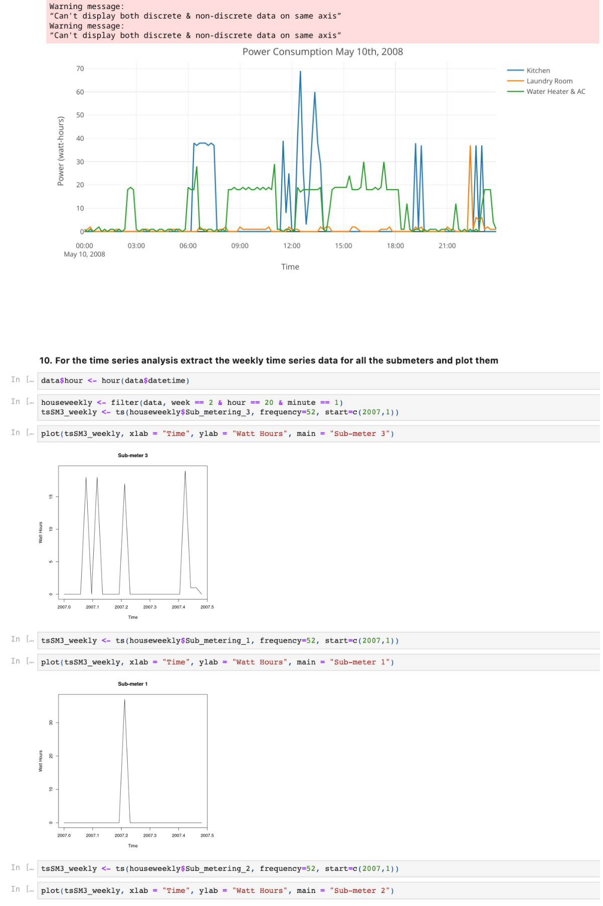
data$minute <- minute(data$datetime)
houseDay10 <- filter(data, year == 2008 & month == 5 & day == 10 & (minute == 0 |
minute == 10 | minute == 20 | minute == 30 | minute == 40 | minute == 50))
plot_ly(houseDay10, x = ~houseDay10$datetime, y = ~houseDay10$Sub_metering_1,
name = ‘Kitchen’, type = ‘scatter’, mode = ‘lines’) %>%
add_trace(y = ~houseDay10$Sub_metering_2, name = ‘Laundry Room’, mode = ‘lines’) %>%
add_trace(y = ~houseDay10$Sub_metering_3, name = ‘Water Heater & AC’, mode = ‘lines’) %>%
layout(title = “Power Consumption May 10th, 2008”, xaxis = list(title = “Time”),
yaxis = list (title = “Power (watt-hours)”))
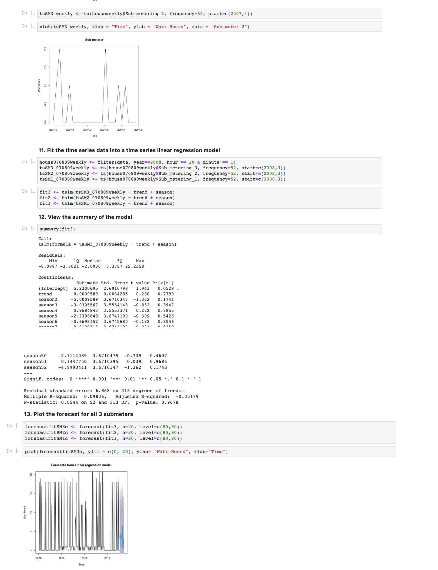
# Time Series Analysis
data$hour <- hour(data$datetime)
houseweekly <- filter(data, week == 2 & hour == 20 & minute == 1)
tsSM3_weekly <- ts(houseweekly$Sub_metering_3, frequency=52, start=c(2007,1))
plot(tsSM3_weekly, xlab = “Time”, ylab = “Watt Hours”, main = “Sub-meter 3”)
tsSM3_weekly <- ts(houseweekly$Sub_metering_1, frequency=52, start=c(2007,1))
plot(tsSM3_weekly, xlab = “Time”, ylab = “Watt Hours”, main = “Sub-meter 1”)
tsSM3_weekly <- ts(houseweekly$Sub_metering_2, frequency=52, start=c(2007,1))
plot(tsSM3_weekly, xlab = “Time”, ylab = “Watt Hours”, main = “Sub-meter 2”)
house070809weekly <- filter(data, year==2008, hour == 20 & minute == 1)
tsSM3_070809weekly <- ts(house070809weekly$Sub_metering_3, frequency=52,
start=c(2008,3))
tsSM2_070809weekly <- ts(house070809weekly$Sub_metering_2, frequency=52, start=c(2008,3))
tsSM1_070809weekly <- ts(house070809weekly$Sub_metering_1, frequency=52, start=c(2008,3))
fit3 <- tslm(tsSM3_070809weekly ~ trend + season)
fit2 <- tslm(tsSM2_070809weekly ~ trend + season)
fit1 <- tslm(tsSM1_070809weekly ~ trend + season)
summary(fit3)
forecastfitSM3c <- forecast(fit3, h=20, level=c(80,90))
forecastfitSM2c <- forecast(fit2, h=20, level=c(80,90))
forecastfitSM1c <- forecast(fit1, h=20, level=c(80,90))
plot(forecastfitSM3c, ylim = c(0, 20), ylab= “Watt-Hours”, xlab=”Time”)
plot(forecastfitSM2c, ylim = c(0, 20), ylab= “Watt-Hours”, xlab=”Time”)
plot(forecastfitSM1c, ylim = c(0, 20), ylab= “Watt-Hours”, xlab=“Time”)
#Conclusion
Time series forecasting, exploratory data analytics and data visualization using the Household Electric Power Consumption dataset was successfully implemented and visualised using R
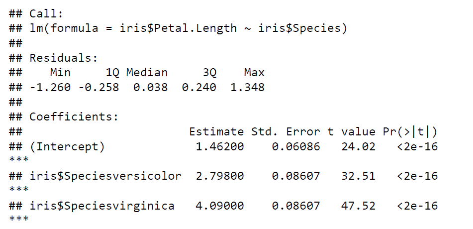
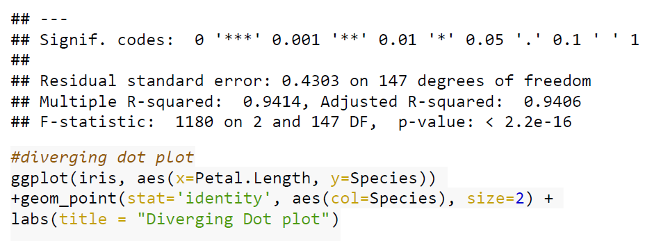
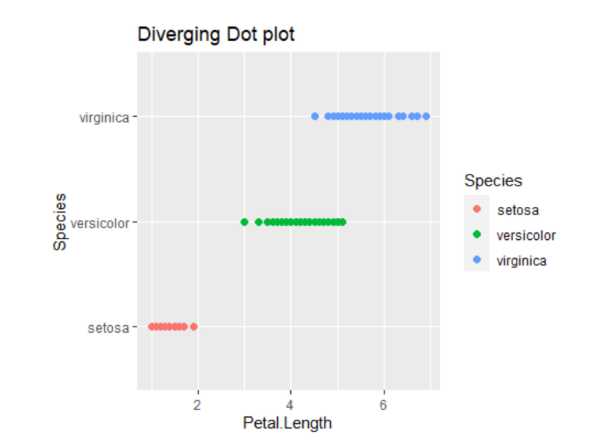
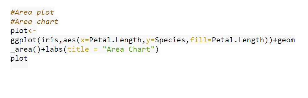
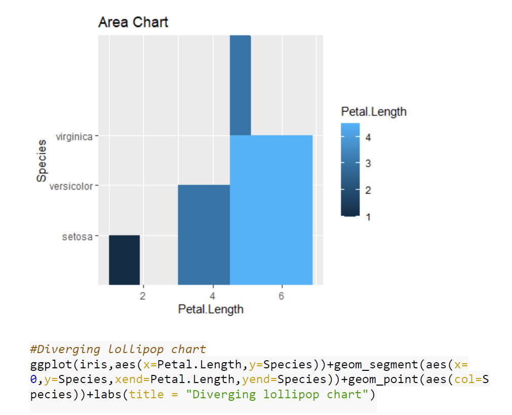
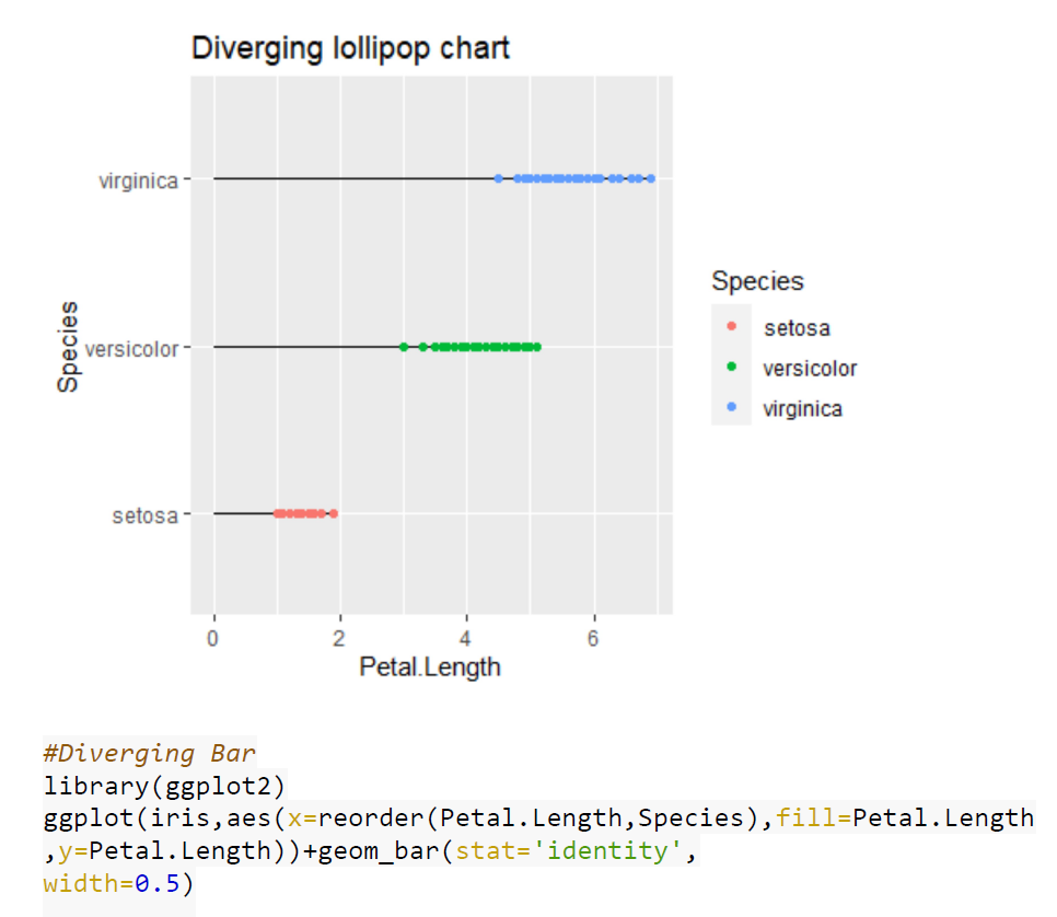
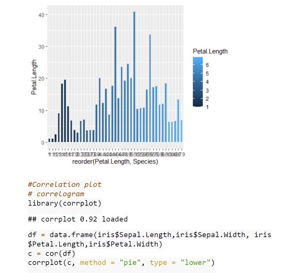
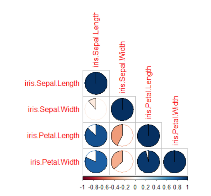
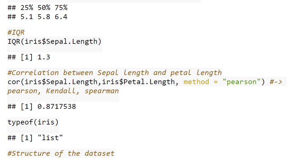
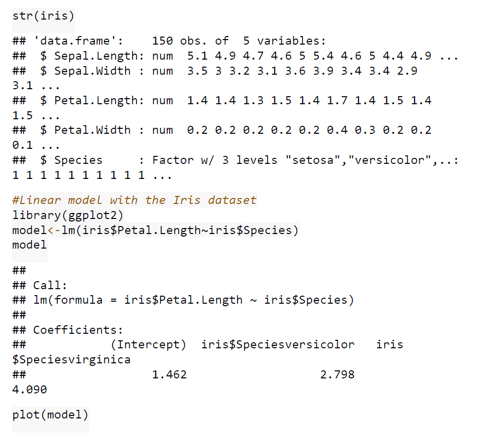
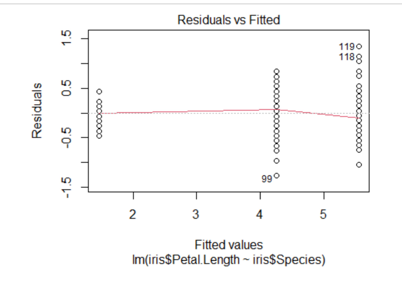
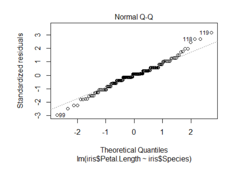
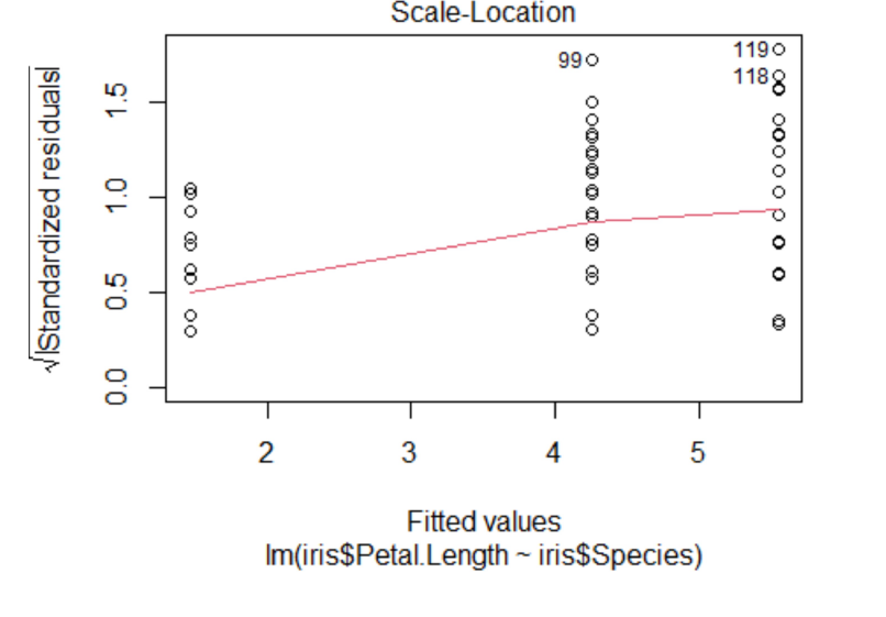
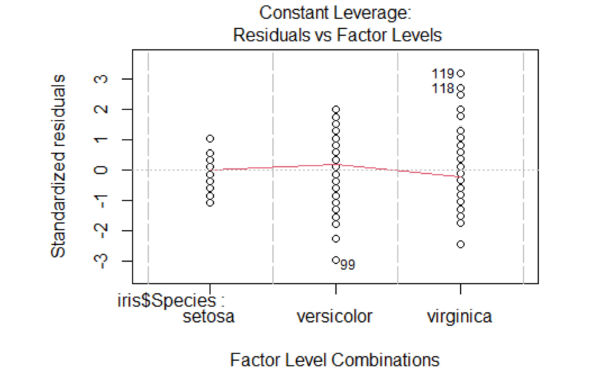
Case Studies 1: Use ggplot2 in R to visualize the distribution of petal length with respect to Species in default iris dataset. And apply correlation plot (Marginal Histogram / Boxplot, Correlogram, Diverging bars, Diverging Lollipop Chart, Diverging Dot Plot and Area Chart) in R to show the correlation among the all petal width and sepal width attributes in Iris dataset.
Create Sheets with one Dashboard in tableau to explore the above dataset. Apply R and Tableau integration to group the species type based on the attributes and show the results with visual impact.
 /
/