7 Knime Analytics – Case Studies
Case Study 1:
AIM: To create an application to preprocess and analyze data (in this case video game sales) using various nodes from Knime.
THEORY:
CSV Files are a mine of data and information. However, even they possess data only in the raw form which is not of much use. Graphical outputs such as pie charts and histograms give a very good clue about the trend in the various patterns of the dataset. Knime is a tool that lets the user pre-process and analyse data and then display it in graphical format
NODES REQUIRED:
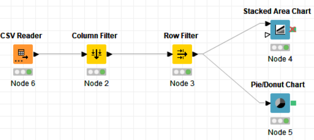
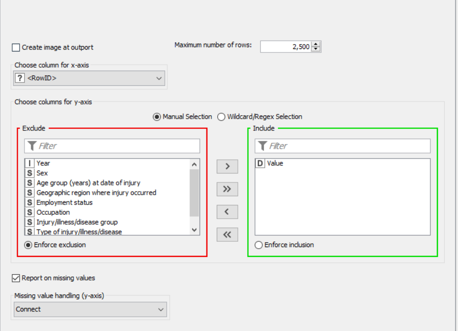
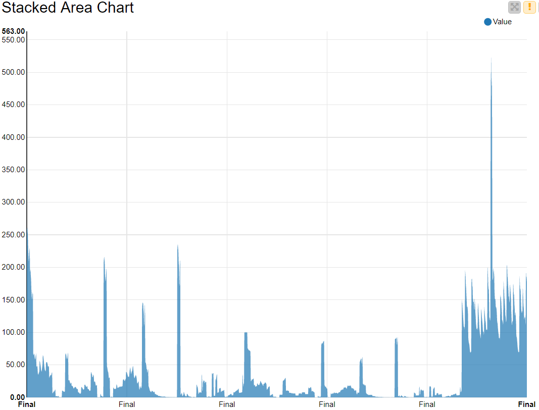
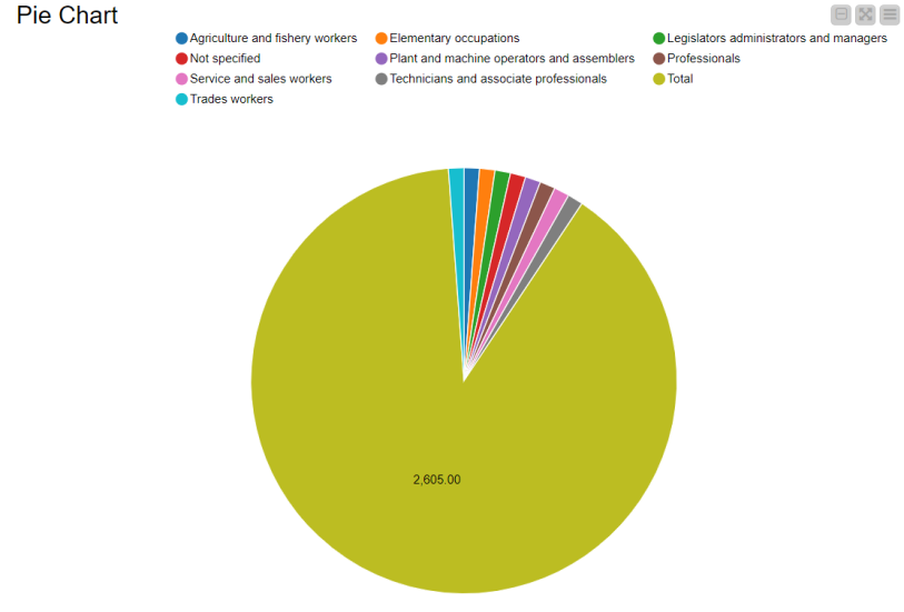
The nodes required here are the csv root node with the .csv file, a column filter and row filter to filter out unnecessary values, and output nodes such as pie chart and stacked area chart. The data is preprocessed up to the row filter after which it is graphically represented.
FLOW DIAGRAM DESIGN:
Flow1:
Flow 2:
PROCEDURE:
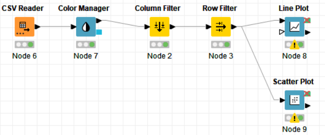
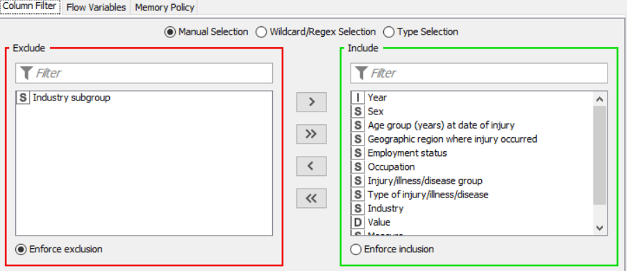
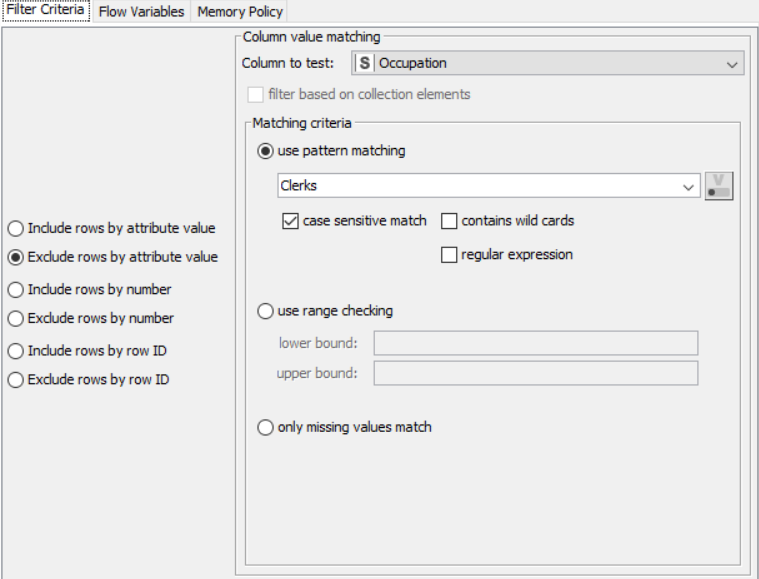
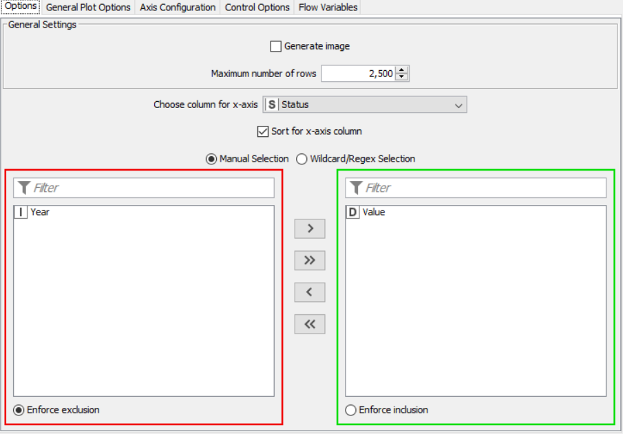
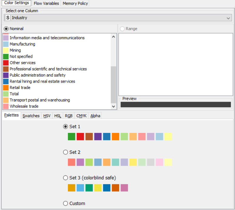
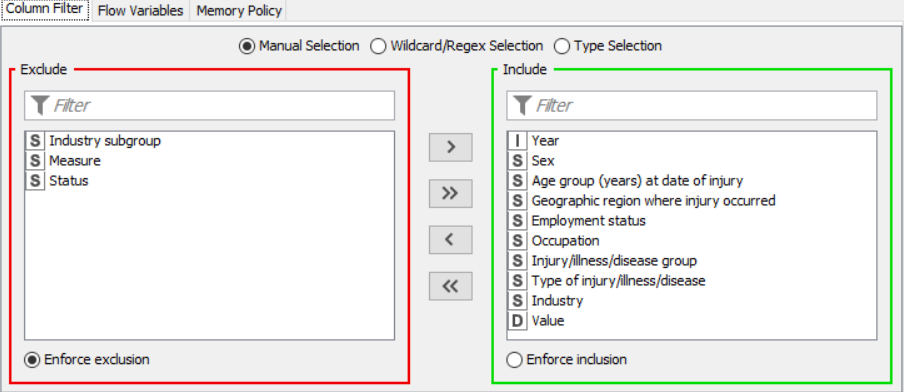
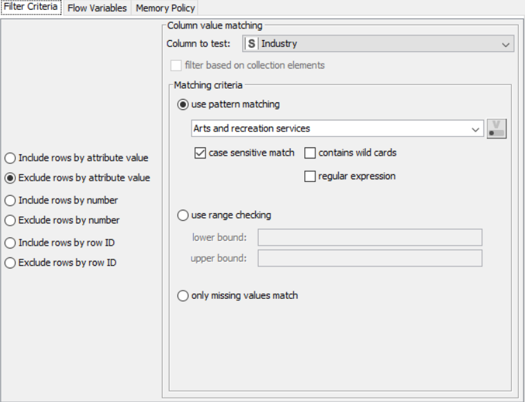
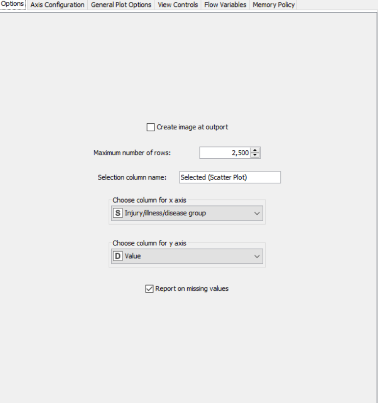
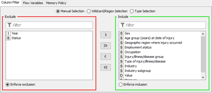
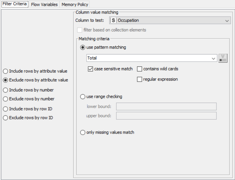
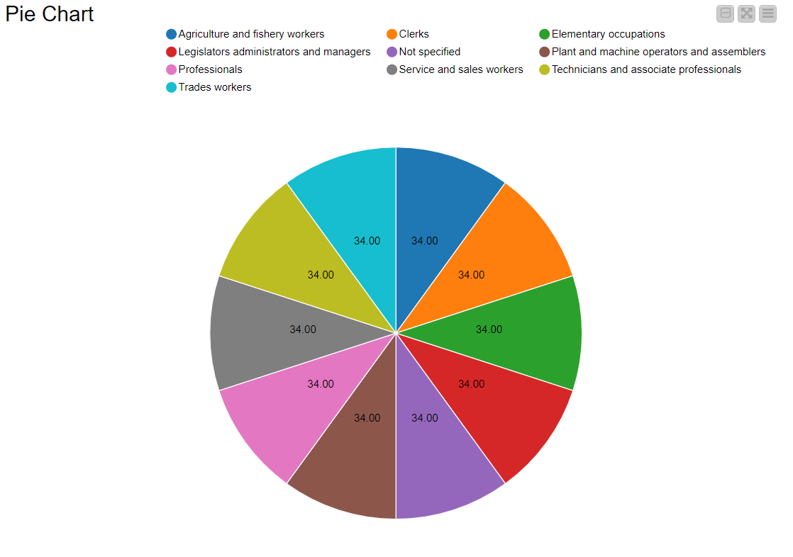
Drag the .csv file into Knime to create and initialize the CSV Reader node. If necessary, create a color manager node and choose color for specified column. Create a column filter, connect it to the color manager and filter the industry subgroup column. Connect said node to a row filter where all rows having arts as an industry is removed by using pattern matching. Pass the processed data to the pie chart node where it is segregated by occupation and the stack area chart node as well as scatter plot and line plot nodes where the value is displayed.
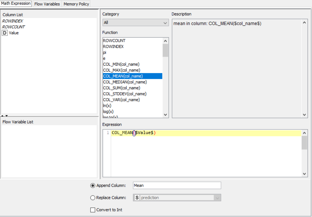
PROPERTIES SET FOR EACH NODE WITH EXPLANATION:
Flow 1:
Flow 2:
OUTPUT:
SNAPSHOTS:
Flow 1:
Flow 2:
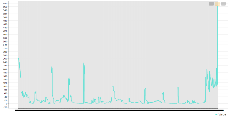
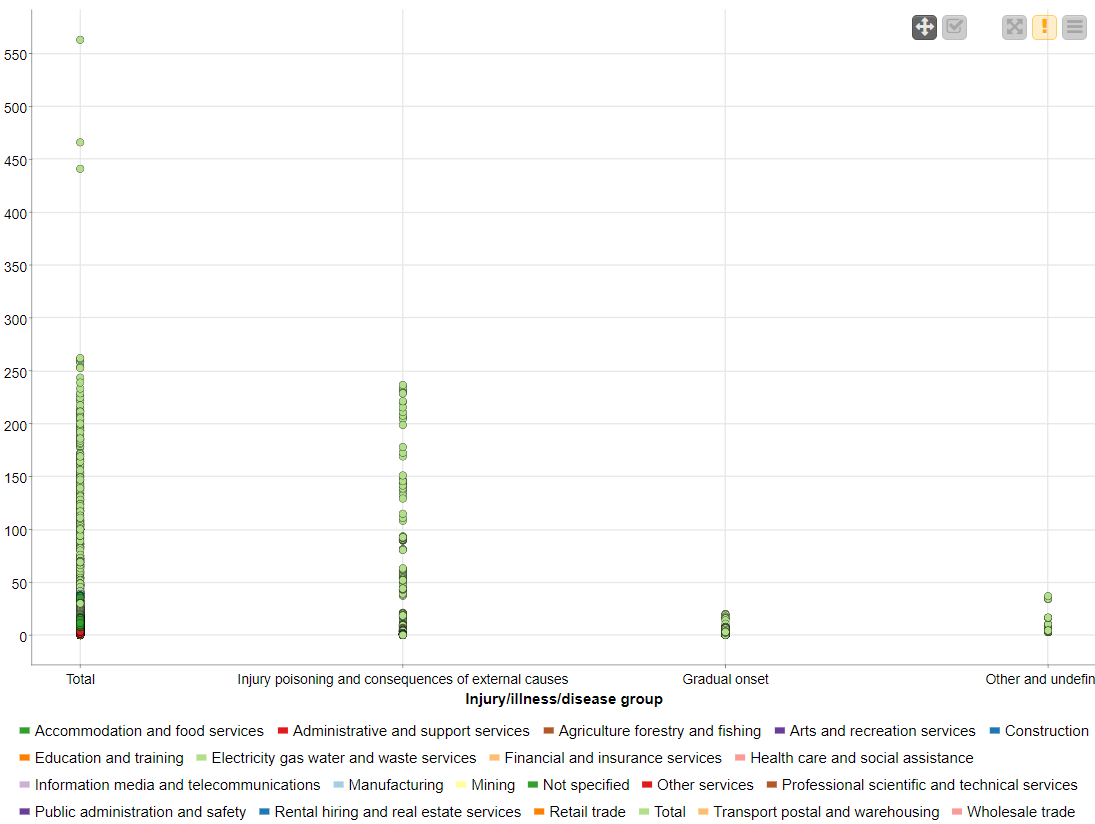
RESULT:
The CSV data from the file was preprocessed and displayed using various graphical outputs.
Knime Rule Engine
AIM: To create an application to preprocess and analyze data (in this case video game sales) using various nodes from Knime.
THEORY:
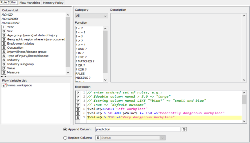
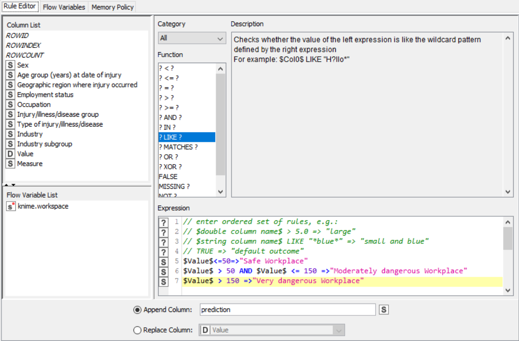
CSV Files are a mine of data and information. However, even they possess data only in the raw form which is not of much use. Graphical outputs such as pie charts and histograms give a very good clue about the trend in the various patterns of the dataset. Knime is a tool that lets the user pre-process and analyse data and then display it in graphical format. The rule engine node in knime takes a list of user-defined rules and tries to match themto each row in the input table. If a rule matches, its outcome value is added into a new column. The first matching rule in order of definition determines the outcome.
ALGORITHM:
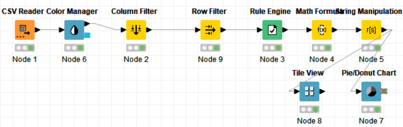
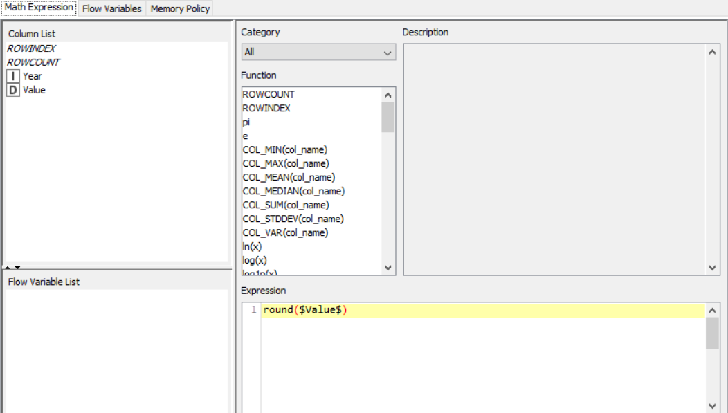
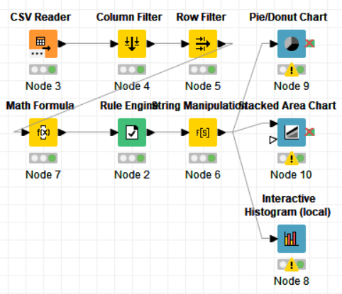
The nodes required here are the csv root node with the .csv file, a rule engine node, math formula and string manipulation nodes for numerical and string data respectively, and output nodes such as line plot and sunburst chart. The data is preprocessed, sent to the rule engine where values are classified, changed using the math and string nodes after which it is graphically represented.
FLOW DIAGRAM DESIGN:
Flow1:

Flow 2:
PROCEDURE:
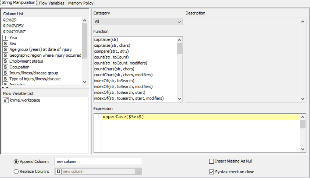
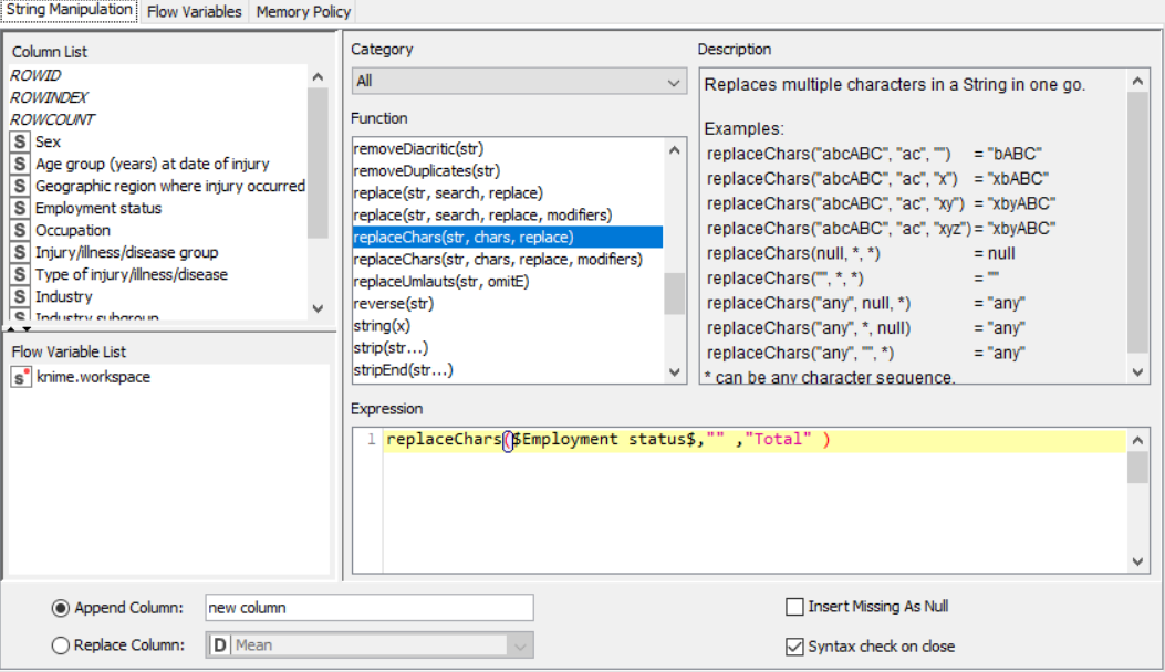
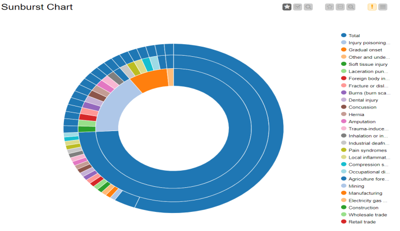
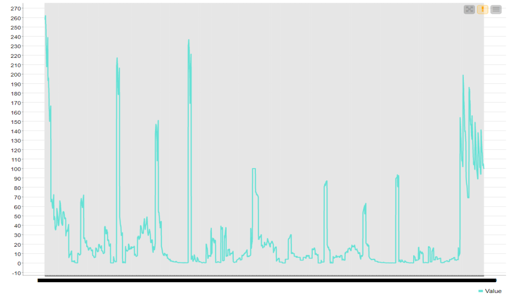
Drag the .csv file into knime to create and initialize the CSV Reader node. If necessary, create a color manager node and choose color for specified column. Create a column filter, connect it to the color manager and filter the industry subgroup column. Connect this to a rule engine node, where specific conditions can be set. This is then sent to the Math Formula node where mathematical operations can be applied to the columns. Next, the String Manipulation node carries out string operations on designated columns. Pass the processed data to the pie chart node where it is segregated by occupation and the sunburst chart node as well as line plot node where the value is displayed.
PROPERTIES SET FOR EACH NODE:
Flow 1:
Flow 2:
OUTPUT:
SNAPSHOTS:
Flow 1:
Flow :
RESULT:
The CSV data from the file was preprocessed using the rule engine and then displayed using various graphical outputs.
Application with Knime/ Video Game Sales Analytics
AIM: To create an application to preprocess and analyze data (in this case video game sales) using various nodes from Knime.
THEORY:
CSV Files are a mine of data and information. However, even they possess data only in the raw form which is not of much use. In this case, the .csv file taken contains information about video game sales with columns such as regional sales, game genre, critics score and rating. These columns contain missing values as well and needs to be properly processed to be of use. Graphical outputs such as pie charts and histograms give a very good clue about the trend in the various patterns in the video game industry.
ALGORITHM:
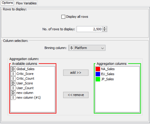
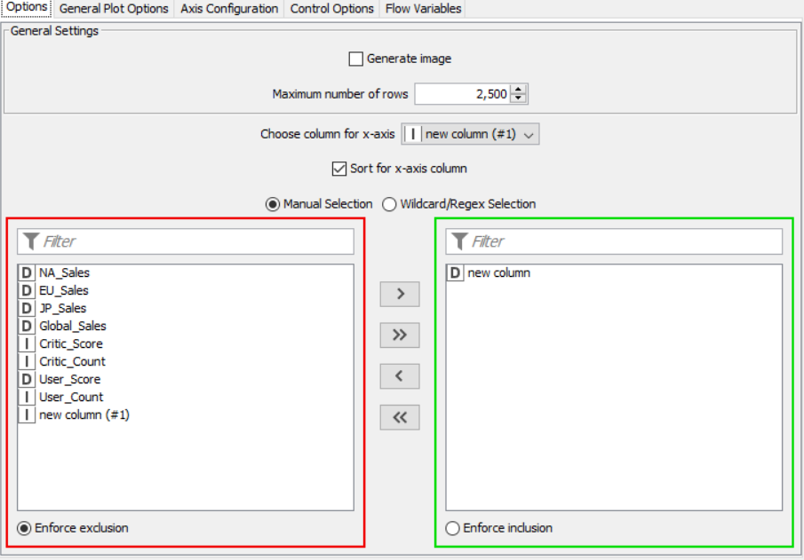
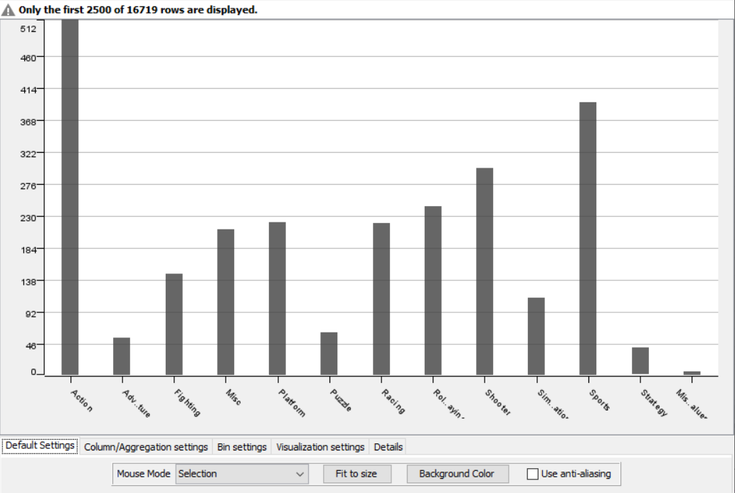
The nodes required here are the csv root node with the .csv file, a column filter and row filter to filter out unnecessary values, math formula node for calculating an average rating for games from both critics and users, a rule engine to classify the game based on the ratings, a string manipulator to convert the year into a number and finally output nodes such as pie chart, interactive histogram and stacked area chart. The data is preprocessed up to the row engine after which it is graphically represented
FLOW DIAGRAM DESIGN:
PROCEDURE:
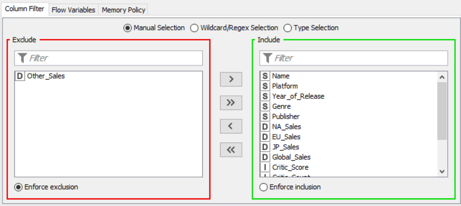
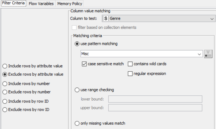
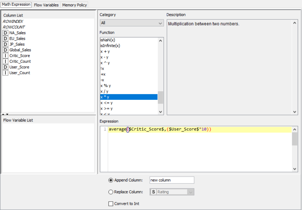
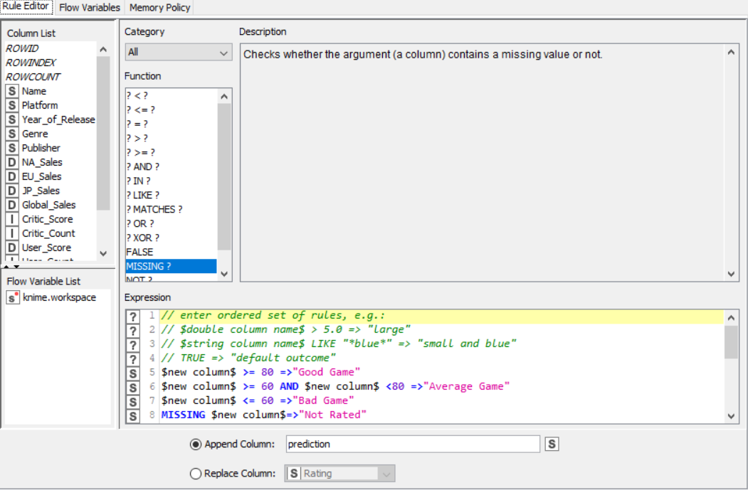
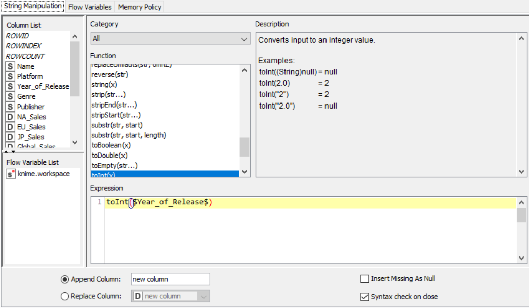
Drag the .csv file into knime to create and initialize the CSV Reader node. Create a column filter, connect it to the CSV reader and filter the other_sales column. Connext said node to a row filter where all rows having genre as misc is removed by using pattern matching. Next, connect it to a Math Formula node where an average score is calculated by finding average of critics score and users score (users score is multiplied by 10 since the rating is out of 100). This is then passed onto a rule engine where a new column describing the rating is appended to the table (data) where the description is based upon the average rating. Then, a String Manipulator node is added to convert the values in the year_of _release column to proper integers. Finally, pass the processed data to the pie chart node where it is segregated by genre, the stack area chart node where the average rating is displayed, and the interactive histogram where the sales details per platform is displayed.
PROPERTIES SET FOR EACH NODE WITH EXPLANATION:
RESULT:
The CSV data from the file was preprocessed and displayed using various graphical outputs.
Colour and Histogram Node Based Application
AIM: To use a color node and a histogram node to process and display data properly.
THEORY:
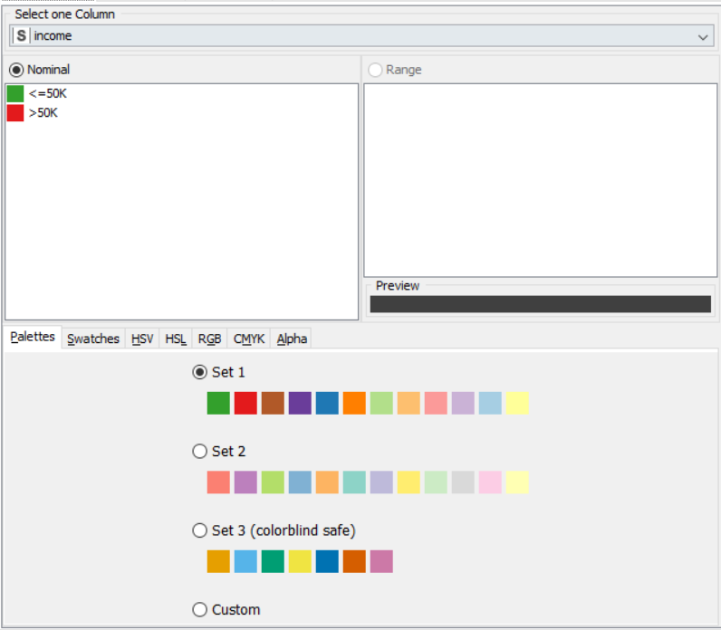
A histogram is a graphical display of data using bars of different heights. In a histogram, each bar groups numbers into ranges. Taller bars show that more data falls in that range. A histogram displays the shape and spread of continuous sample data. Colours can be crucial in displaying data clearly, as the same colour for different types can lead to confusion and unpredictability. A colour node comes with pre-set colours, or can be assigned to each data type for a lucid display.
ALGORITHM:
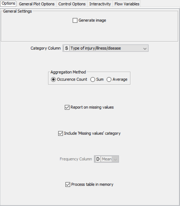
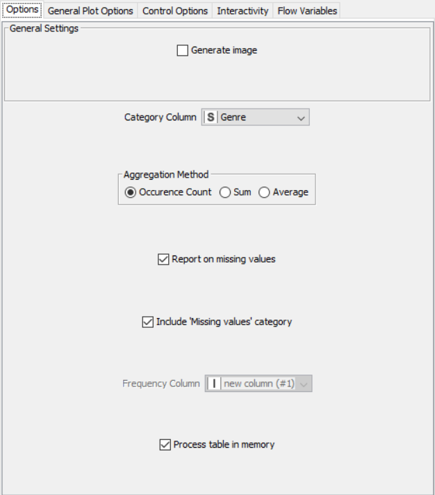
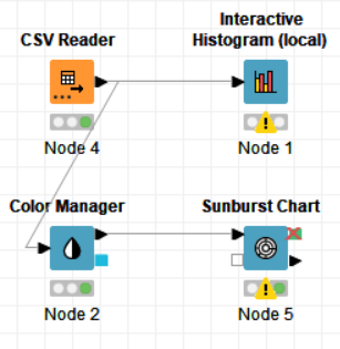
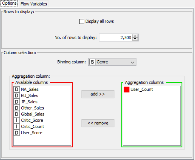
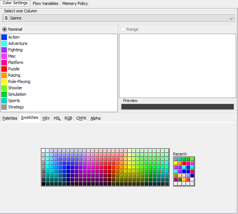
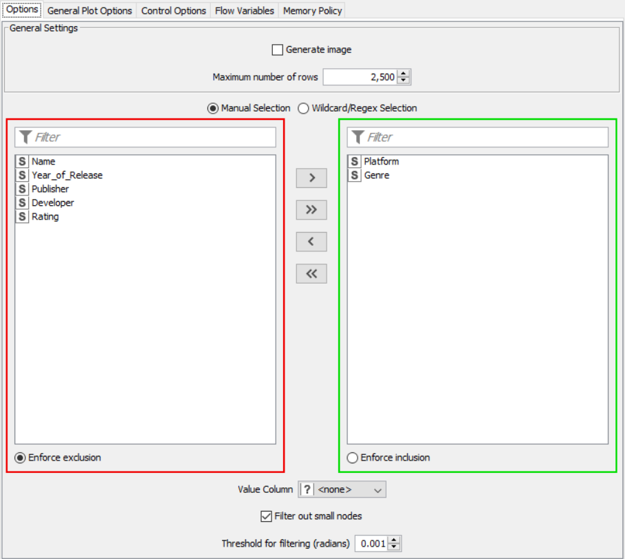
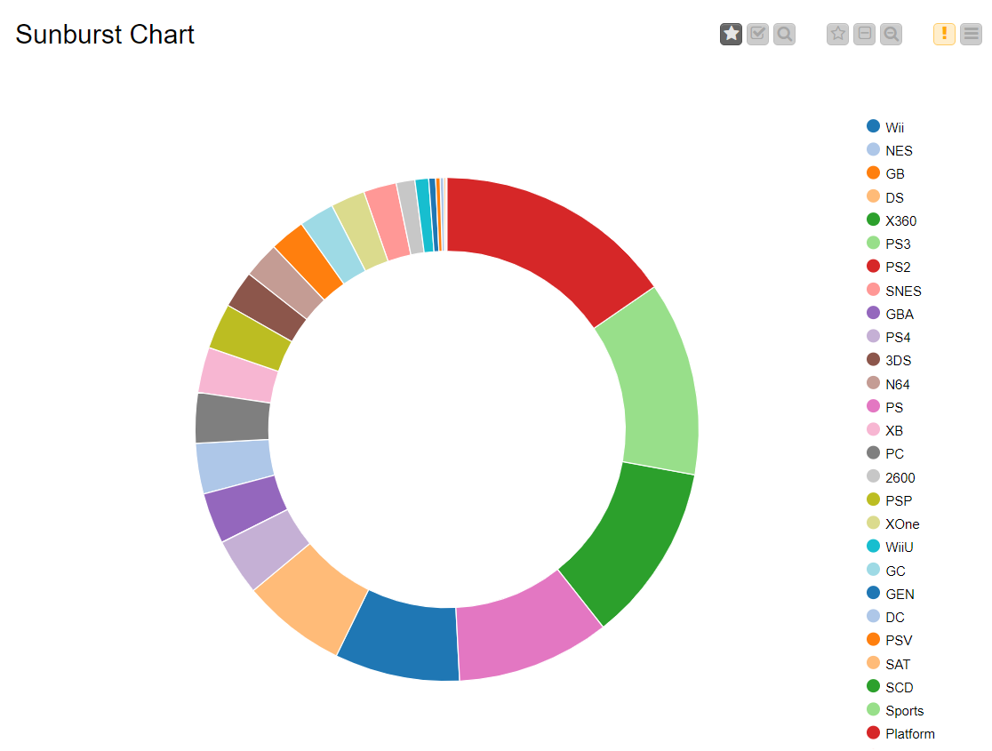
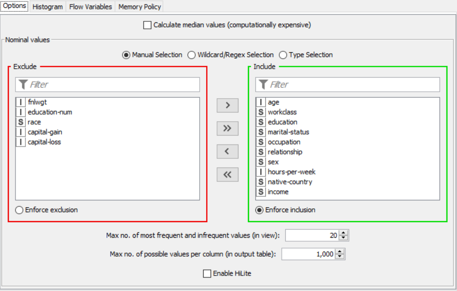
The nodes required here are the csv root node with the .csv file, a histogram node to display the data of user count with respect to the genre, a color manager node to assign each genre a significant color and finally a sunburst node to display the genre and sales side by side.
FLOW DIAGRAM DESIGN:
PROCEDURE:
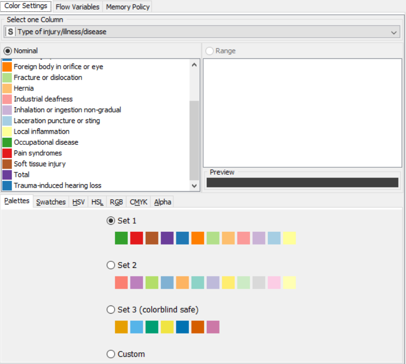
Drag the .csv file into knime to create and initialize the CSV Reader node. Connect it to a color manager, where each genre can be assigned a specific color under swatches or a preset under palettes. A histogram is connected to the CSV reader to display the number of users to have rated a game per genre. Finally, attach a sunburst chart to the color manager node, taking sales and genre are the inputs and displaying the data properly. Compile and execute all the nodes at each stage of connection to get proper outputs.
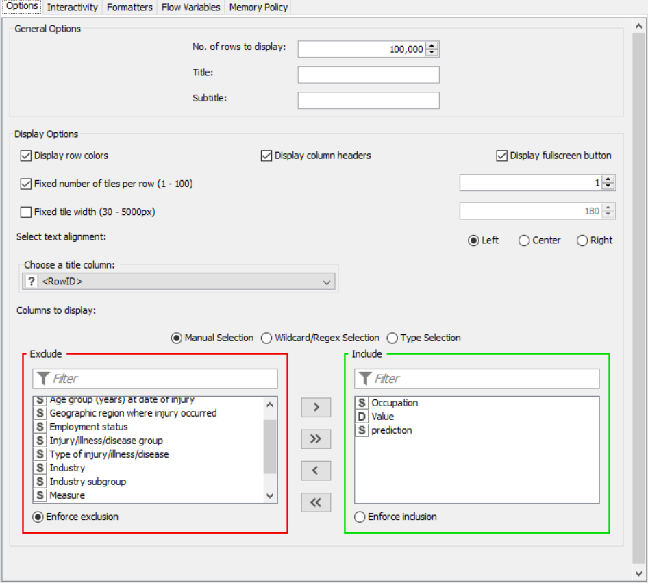
PROPERTIES SET FOR EACH NODE WITH EXPLANATION:
OUTPUT:
SNAPSHOTS:
RESULT:
The color manager node and histogram node were both created, compiled and executed upon a dataset and results were obtained as shown in the output.
Decision Tree Learner and Predictor
AIM: To use a decision tree learner and predictor and perform predictive analysis on given data
THEORY:
A decision tree is a decision support tool that uses a tree-like model of decisions and their possible consequences, including chance event outcomes, resource costs, and utility. It is one way to display an algorithm that only contains conditional control statements. Decision trees are used for handling non-linear data sets effectively. The decision tree tool is used in real life in many areas, such as engineering, civil planning, law, and business.
ALGORITHM:
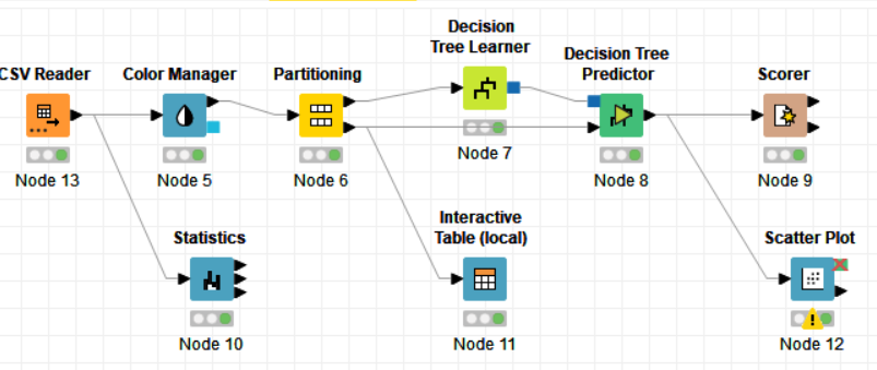
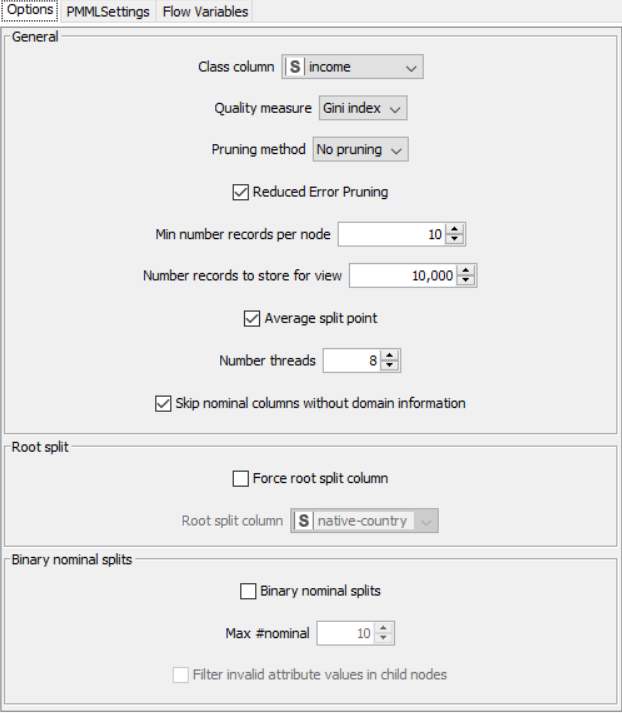
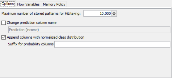
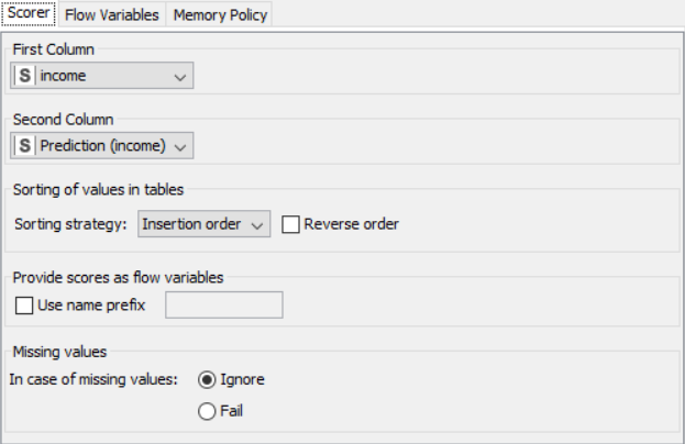
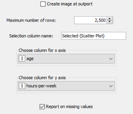
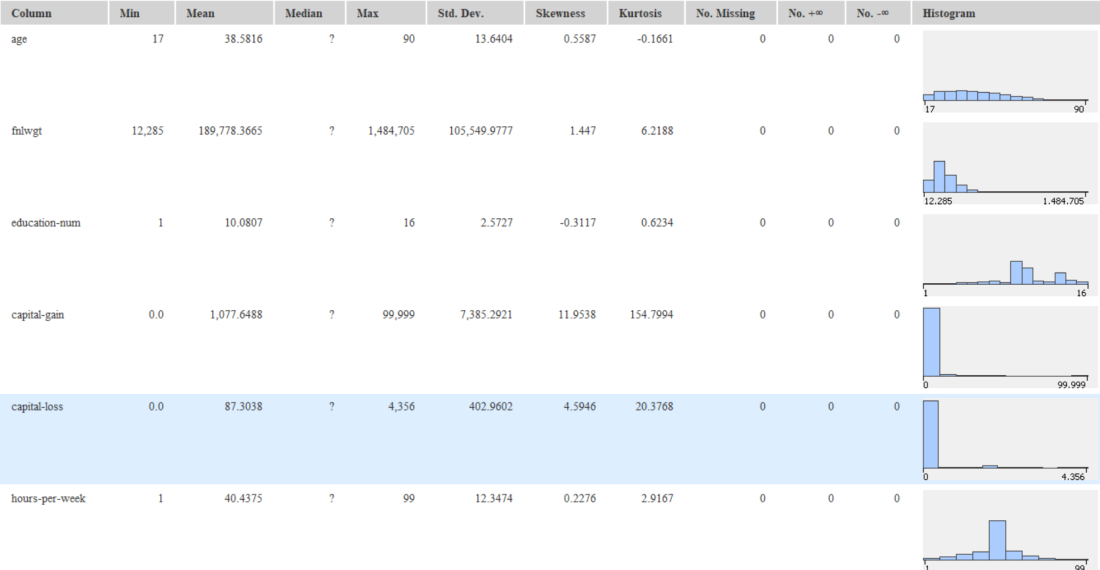
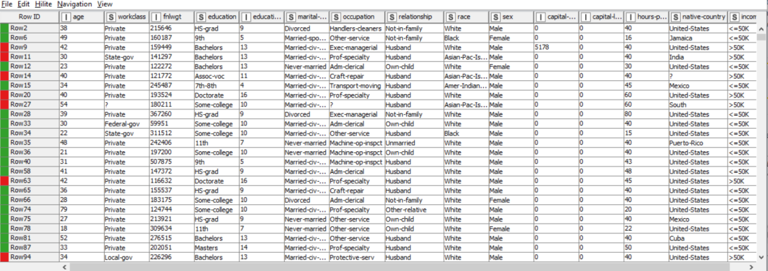
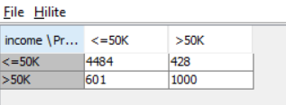
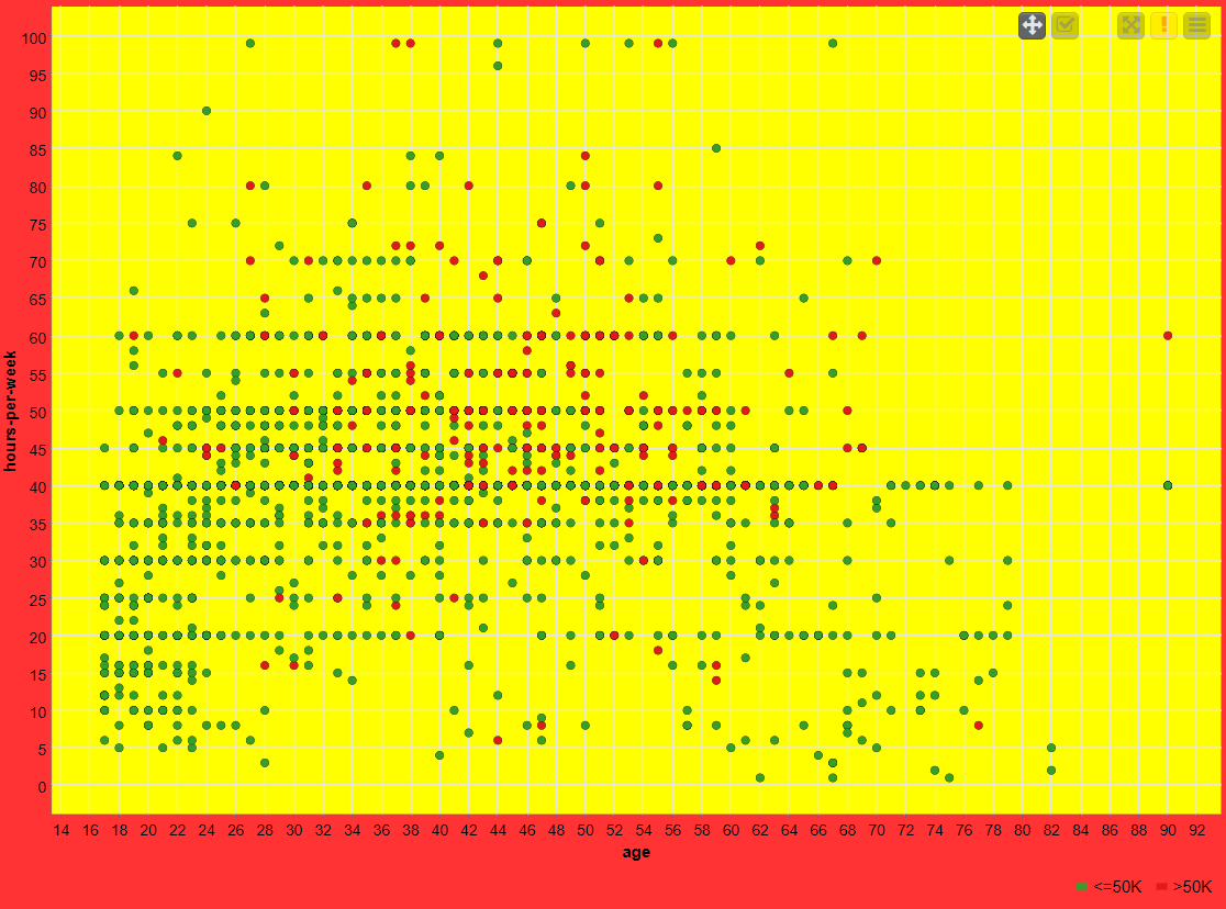
The nodes required here are the csv root node with the .csv file, color manager node to assign colors, statistics node to show the statistical output, partitioning node to partition the data, decision tree learner to work on some sample data to classify the decision tree, decision tree predictor to predict values from the existing pattern, scorer to compare rows and assign a score, interactive table to see how the partitioning works and scatter plot to get output of decision tree prediction
FLOW DIAGRAM DESIGN:
PROCEDURE:
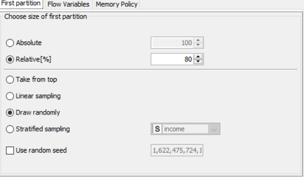
Drag the .csv file into knime to create and initialize the CSV Reader node. Connect it to a color manager, where each genre can be assigned a specific color under swatches or a preset under palettes. Feed the input csv data to a statistics node to obtain a histogram showing the input data. Partition the data at an 80:20 ratio. Send the smaller partition to the decision tree learner, where income is compared against quality measure in order to classify the values, which can then be predicted by the decision tree predictor. Finally, send the output to the scatter plot node. Compile and execute all the nodes at each stage of connection to get proper outputs.
PROPERTIES SET FOR EACH NODE WITH EXPLANATION:
OUTPUT:
SNAPSHOTS:
RESULT:
The decision tree learner, decision tree predictor and scorer were used to perform predictive analysis on the data
K-Means Clustering
AIM: To use k-means and cluster assigner nodes to form and identify clusters from the given data
THEORY:
A K-means clustering is a type of unsupervised, which is used when you have unlabelled data (i.e., data without defined categories or groups). The goal of this algorithm is to find groups in the data, with the number of groups represented by the variable K. The algorithm works iteratively to assign each data point to one of K groups based on the features that are provided. Data points are clustered based on feature similarity.
ALGORITHM:
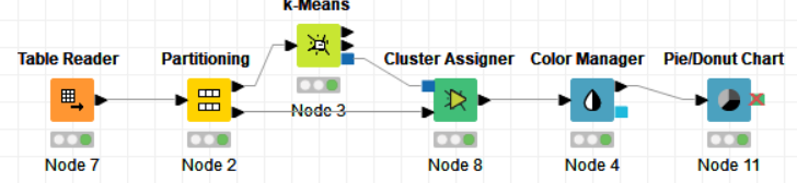
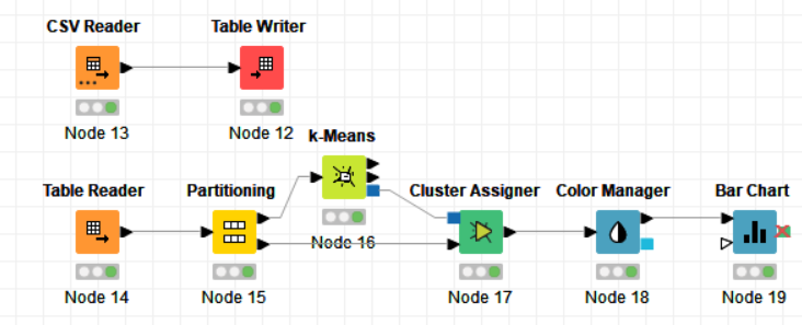
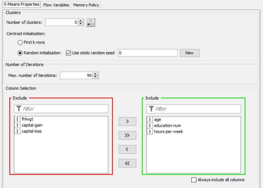
The nodes required here are the csv root node with the .csv file, color manager node to assign colors, partitioning node to partition the data, k-means node to apply k-means clustering, cluster assigner to assign the clusters and pie chart/bar chart to get output of clustering
FLOW DIAGRAM DESIGN:
Flow 1:
Flow 2:
PROCEDURE:
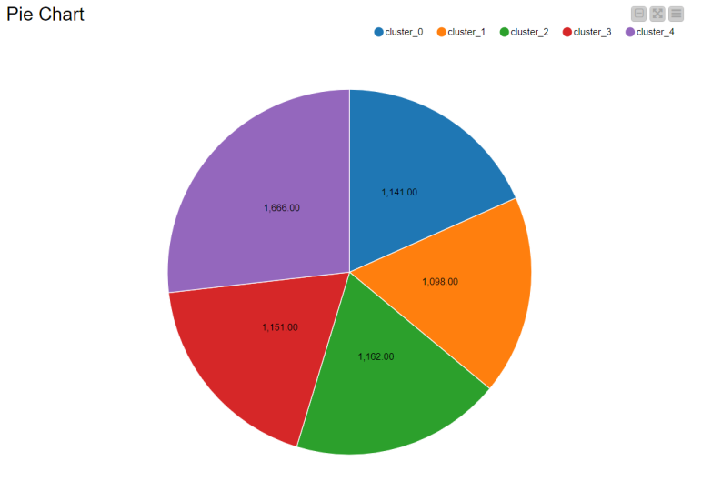
Drag the .csv file into knime to create and initialize the CSV Reader node. Connect to a table writer to create a table, which is then read in by a table reader node OR directly import a table using the table reader node. Connect it to the partitioning node, partition it at a 70:30 ratio. Pass the data to the k-means node where the k-means algorithm is applied according to the columns given. Connect this to a cluster assigner node to assign cluster. Link this to the color manager node to assign colors and finally pass it to the bar/pie chart to get output. Compile and execute all the nodes at each stage of connection to get proper outputs.
PROPERTIES SET FOR EACH NODE WITH EXPLANATION:
Flow 1:
Flow 2:
OUTPUT:
SNAPSHOTS:
Flow:
RESULT:
The k-means and cluster assigner node were used to create data clusters and analyze them
Application with Knime/ World Population Analysis
AIM: To create an application to preprocess and analyze data (population and growth of various countries) using various nodes from Knime.
THEORY:
CSV Files are a very valuable source of untapped data. But they possess data in tabular columns, often with wrong data types (numbers being considered as strings, for example) which is not of much use. In this case, the .csv file taken contains information about the populations of various countries with columns such as population in 2020, latest update population, growth rate, area, population density and index. Graphical outputs such as pie charts and scatter plots give a very good clue about the population growth rate and percentage per countries.
ALGORITHM:
The nodes required here are the csv root node with the .csv file, a column filter to filter out unnecessary values, a string manipulator and string to number to help convert three numbers of string type to double type, a rule engine to classify the countries based on growth, a sorter to sort the table, color manager to assign colors, partitioning node to partition the data, k-means and cluster assigner node for assigning clusters and finally output nodes such as pie chart, scatter plot and sunburst chart.
FLOW DIAGRAM DESIGN:
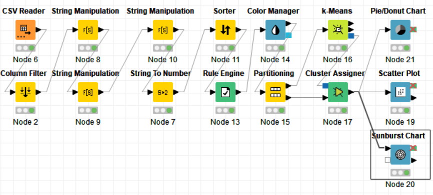
PROCEDURE:
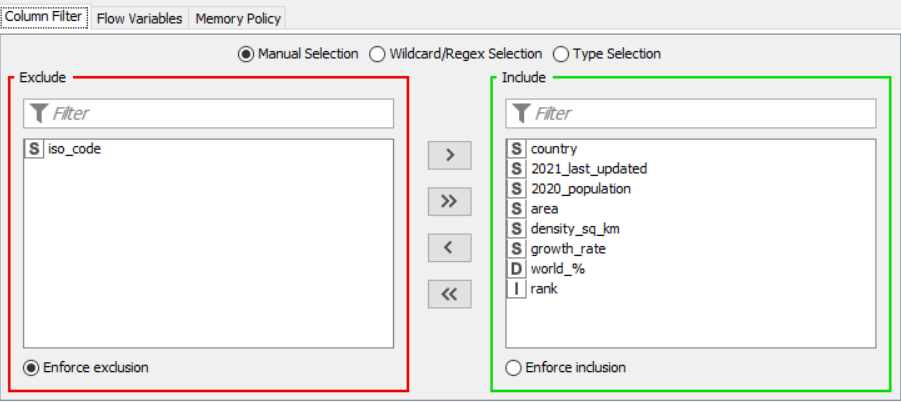
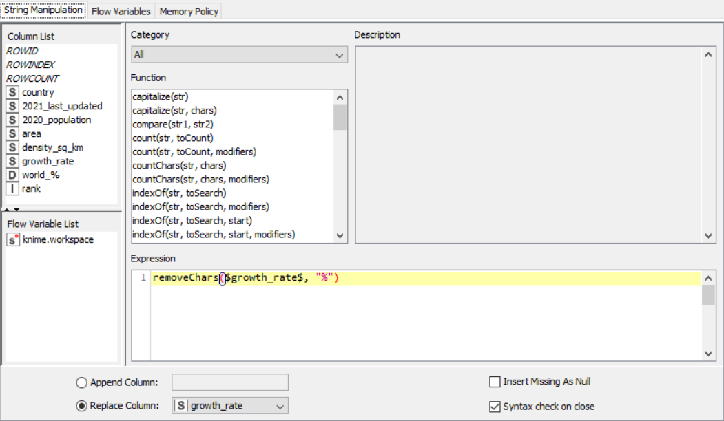
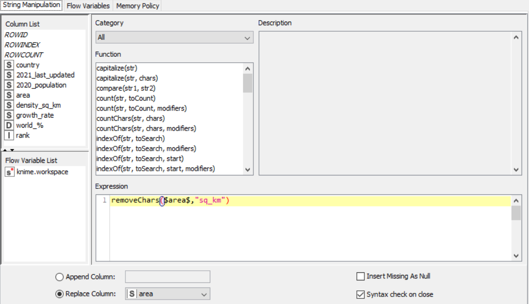
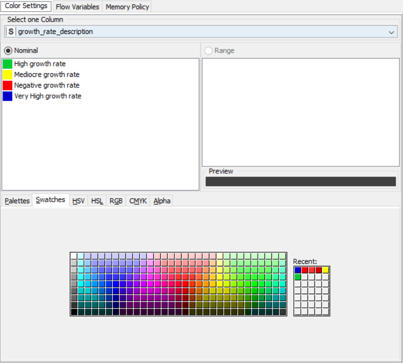
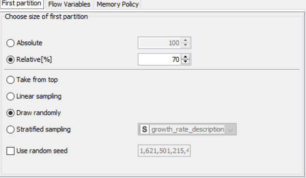
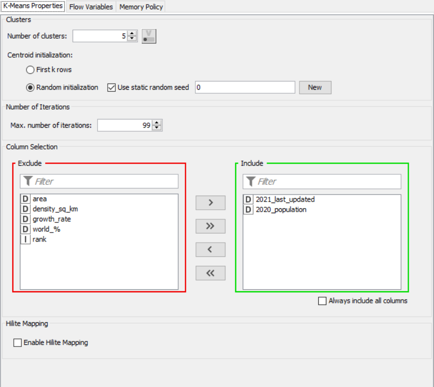
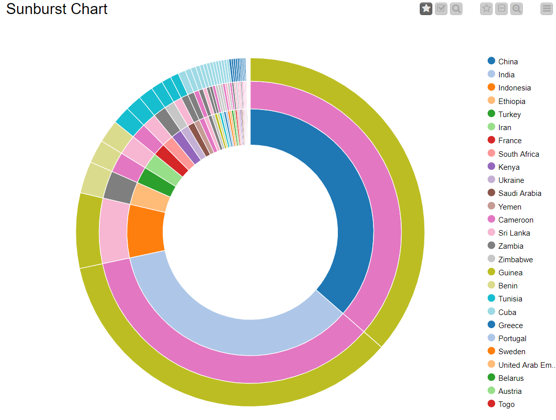
Drag the .csv file into knime to create and initialize the CSV Reader node. Create a column filter, connect it to the CSV reader and filter the iso_code column. Then three String Manipulator nodes are added, each removing the %,sq_km and /sq_km non numerical portions of the growth_rate, area and density_sq_km columns. This is then passed to a string to number node where the above-mentioned columns are all converted to numbers. A sorter node is used to sort the data in descending order with respect to the 2021_last_updated and 2020_population columns. This is then passed onto a rule engine where a new column describing the growth rate is appended to the table (data) where the description is based upon the growth rate parameter. This is then passed onto the color manager where specific colors have been assigned to the values of the newly appended column describing growth rate. Then, a partitioning node is used to partition the dataset to a 70:30 ratio, with the larger partition sent to a k-means node. The k-means node divides the given data into 5 clusters (in this case), which is then assigned using the cluster assigner. Finally, pit is passed to the pie chart node where it is shown as countries by highest population, the scatter plot where the countries are displayed by growth rate, and the sunburst chart where the clusters, population, and country are depicted concentrically.
PROPERTIES SET FOR EACH NODE:
Column Filter
String Manipulator for growth rate
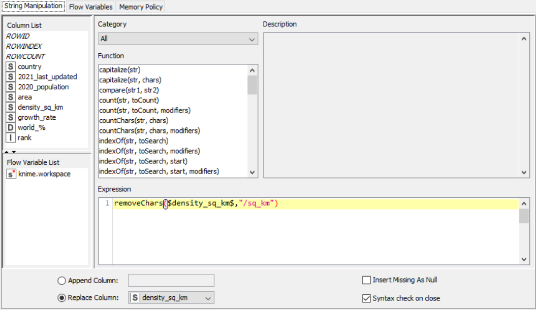
 String Manipulator for area
 String Manipulator for density per square kilometer
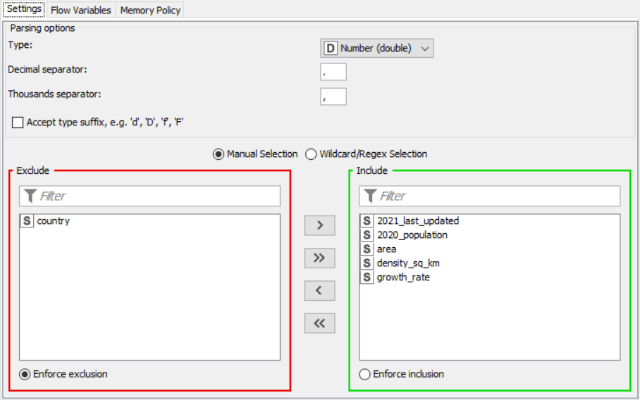
 String to Number
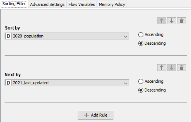
 Sorter
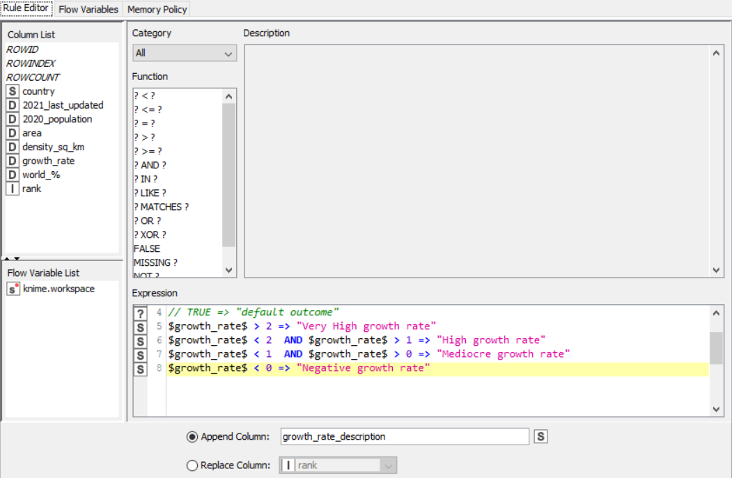
 Rule Engine
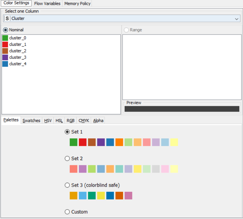
 Colour Manager
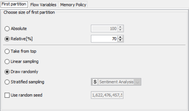
 Partitioning
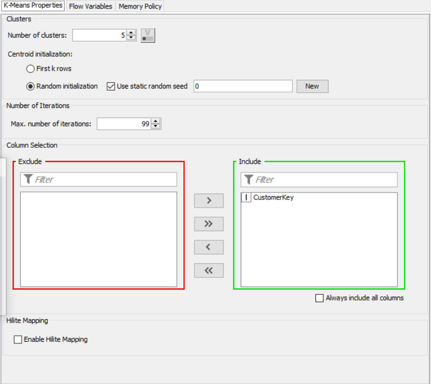
 k-Means
Cluster Assigner
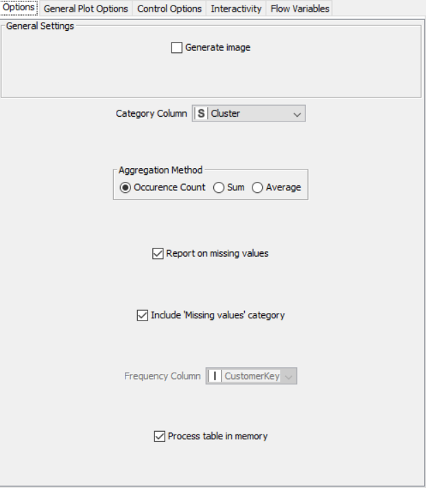
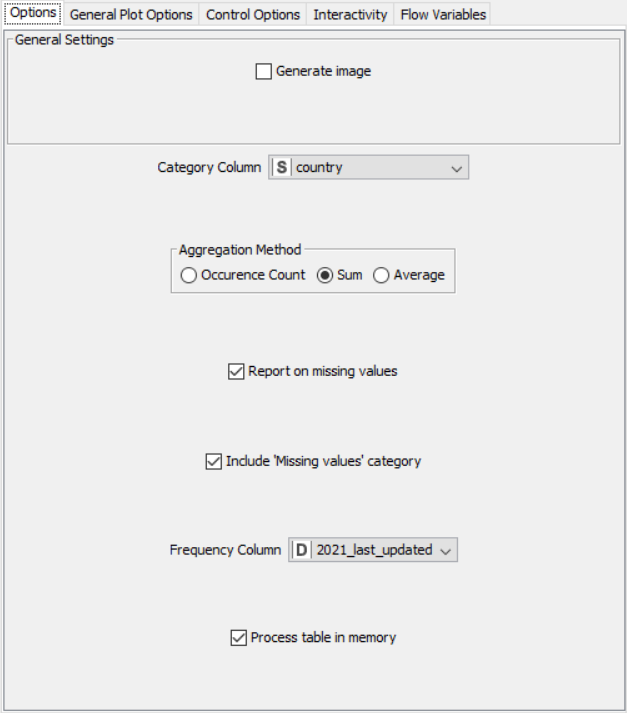
Pie/Donut Chart
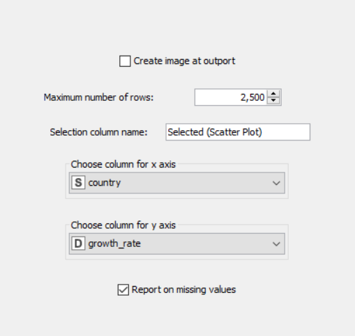
Scatter Plot
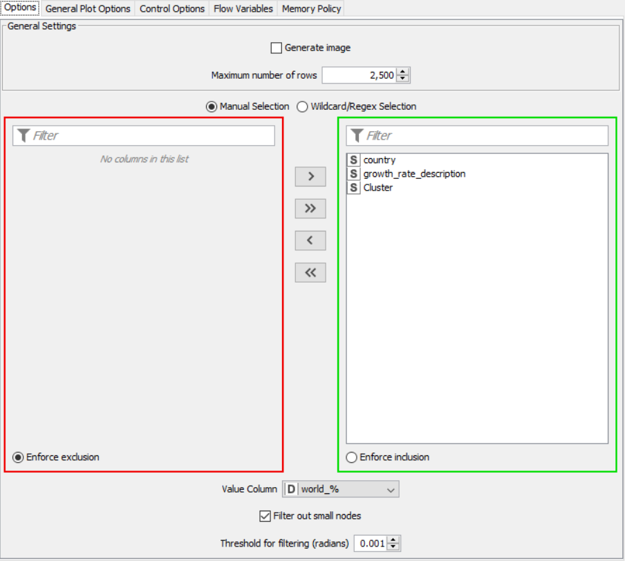
Sunburst Chart
OUTPUT:
SNAPSHOTS: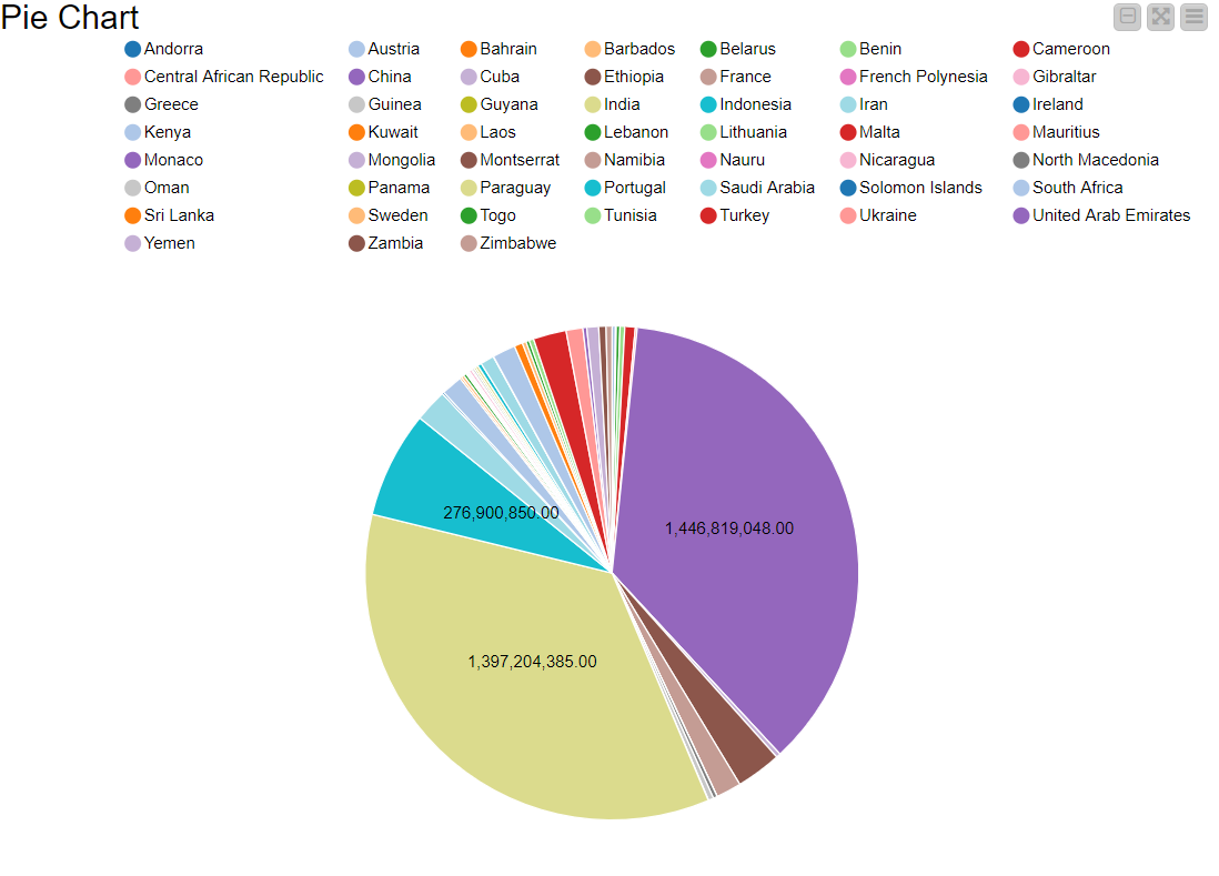
RESULT:
The CSV data from the file was preprocessed and displayed using various graphical outputs.
