6 Knime Analytics Platform
Data Visualization with Knime Analytics Platform
Introduction
KNIME Analytics Platform is an open-source software for working on the analytical aspect of data which helps in understanding data and different machine learning or data science related operations can be done easily on those data without coding. Using KNIME Analytics Platform we can make the virtual flow or workflows with the help of the nodes made available by the software using a very easy, open, intuitive,perceptive, drag and drop style of user interface.
Key Features of KNIME TOOL are -
It is an intuitive and open platform for integrating new developments. This makes its reusable components easily accessible to everyone.
Creating visual workflows without the need of coding and dragging- and dropping style has made it far known to a large part of the audience.
It has a wide number of nodes which makes it easy to model each and every step of the data analysis performed.Knime users can control the flow of their data and can continuously change it.
In Knime Software you can not only work with a variety of different nodes, you can also blend a number of tools from various domains in a single workflow like scripting in R & Python, machine learning, or connectors to Apache Spark.
Knime Hub has already existing workflows which are publicly available. These can be used as tutorials for the new users to provide the overview of the platform and make it understandable for them.
Knime fit in with several other open-source platforms, eg.- machine learning algorithms from Weka, Keras, Spark, the R project and LIBSVM; as well as JFreeChart, ImageJ, and the Chemistry Development Kit.
Blending of data from sources to open and combine various text formats and unstructured data types. This also helps in connecting the host to different data bases and data warehouses to integrate access and retrieve data from a number of sources.
Knime helps its users to perform and modify their data in a number of ways.This includes transforming the raw data into classified, aggregated, sorted and filtered data.
Performing mathematical functions and applying statistical methods to your data is also possible with knime. This makes our model to be tested and verified for hypothesis.
Knime not only helps us in performing various tasks. It also helps us in detecting and rectifying the errors in our model with the help of outlier and anomaly detection algorithms.
Cleaning and extraction of our data is comparatively a lot easier with the help of Knime software.The datasets available can be further prepared for Machine Learning with genetic algorithms.
Building Machine Learning models with Knime Software helps in a low of ways. We can optimize the model performance, validate models along with explaining the models at the same time in the same workflow.
Visualizing the data or the result obtained from the analysis can be done from the vast array of classic as well as advanced charts that can be further customized.
Displaying the summary of the model can also be done using Knime software. Users can also export reports in various formats.It also provides us with options to store our processed data or results in file formats.
Knime provides us the platform to build workflow prototypes to discover, inspect and save intermediate results for quick feedbacks and recovery to create better solutions.
With the help of Knime software we can Scale workflow performance and enhance the power of in-database processing to increase the level of our obtained results.
Start KNIME Analytics Platform :-
When we start KNIME Analytics Platform “KNIME Analytics Platform Launcher” window appears
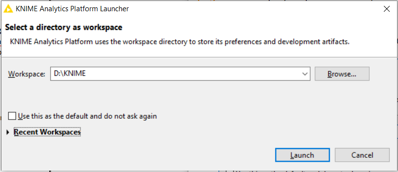
KNIME Analytics Platform uses this workspace address or directory available in users local computer which is stated or given by the user to store its preference and development artifacts which includes node settings, workflows, data produced by the flow, in short user work will be saved to this directory or in KNIME words to this workspace.
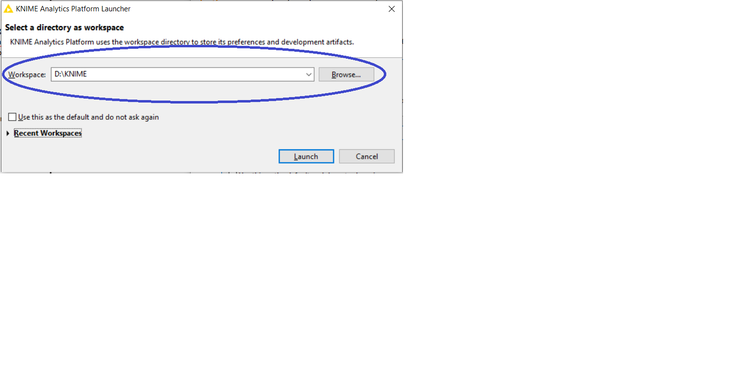
After selecting the desired directory or folder click “Launch” , it will open the workbench where all the hard work is done. Lets move forward and try to get familiar with the components of the KNIME workbench and its interface.
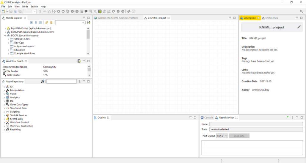
This is how the workbench looks like after clicking on “Launch”. Lets talk denote the components of the KNIME workbench.
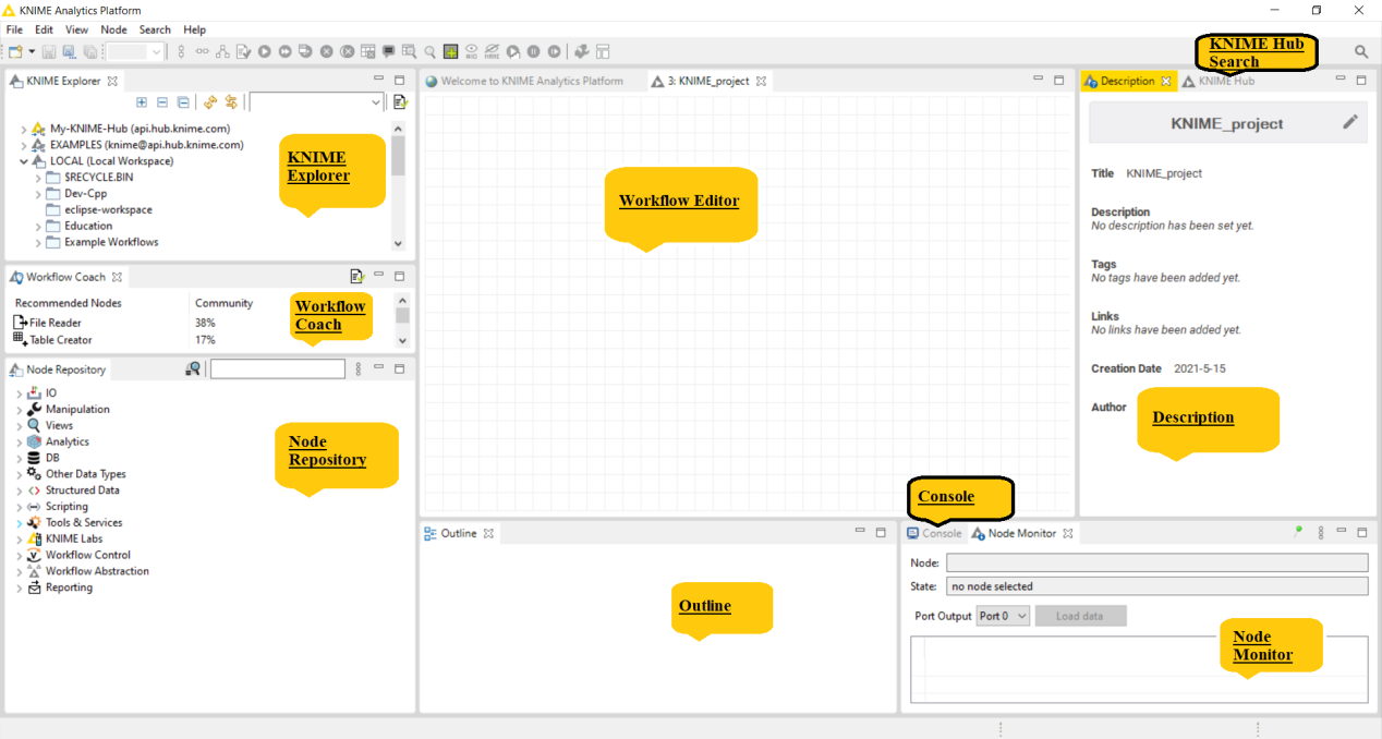
The KNIME Workbench consists of following components:-
KNIME Explorer :- It allows the user to browse their workflows or workflow groups which includes user’s local workspace, KNIME Servers and personal KNIME Hub space thus enables the user to share workflows and collaborate with colleagues using shared resources. In KNIME Explorer user can mount multiple repositories at the same time allowing user to work on workflows from different repositories simultaneously and to copy or move workflows from one repository to another.
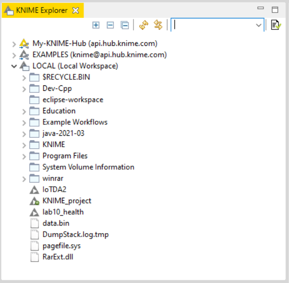
In order to add more content to the view, click “configuration”  icon on the right top corner of KNIME Explorer window.
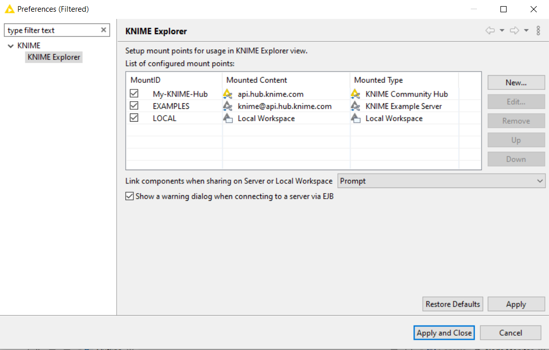
We will talk about the different function available in it further.
Explorer Toolbar
|
|
The (+) expands the selected element showing its content, (-) collapses the element, |
|
|
Refreshes the view, in case it is out-of-sync with the underlying file system. |
|
|
If a workflow located in the Team Space is shown in an editor, this workflow is selected in the Team Space view. |
|
Filter |
If you add text to the field and press Enter , the Explorer will filter to items that contain the text in their name or are in a group containing the text in its name. |
|
|
Opens the Explorer preference page, allowing you to select the content displayed in the view or to add/remove mount points. |
Workflow Coach :- Lists node recommendations based on the workflows built by the wide community of KNIME users. It is inactive if the user don’t allow KNIME to collect user’s usage statistics. If the user selects a node in the workflow editor, the workflow coach shows the most popular nodes to follow the selected node. The recommendations are based on KNIME community usage statistics about workflows built in KNIME Analytics Platform. User can drag and drop or double click to add nodes in workflow editor.
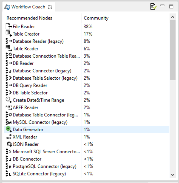
Node Repository:- All nodes available in core KNIME Analytics Platform and in the extensions you have installed are listed here. The nodes are organised by categories but user can also use the search box on the top of the node repository to find nodes.
Search Box
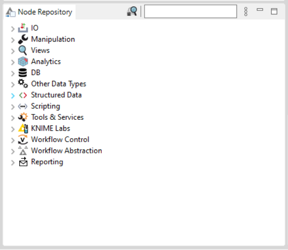
User can add a node from node repository by drag and drop, or by double click. The default search mode is “crisp search”, the interface will return all the nodes that either have the search term in their names, or they are in a subcategory whose name include the search term. We can switch the search mode to “fuzzy search”, the interface will return all nodes that are related to the search term.
Workflow Editor:- It is the canvas where you work or edit the currently active workflow. Workflows are assembled here.
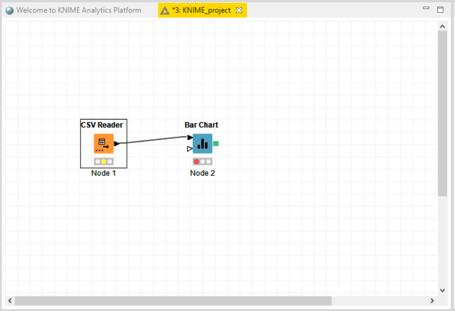
Nodes are dragged and dropped in the workflow editor from the Node Repository then we create the workflow by connecting, configuring and executing them.
Lets talk a little bit about the node status, there are four node status :-
Not configured
Configured
Executed
Error
Not Configured :-  Not configured is represented by “Red” colour, it shows that the node which dragged and dropped in the workspace is not configured, user needs to configure the node to perform the desired function.
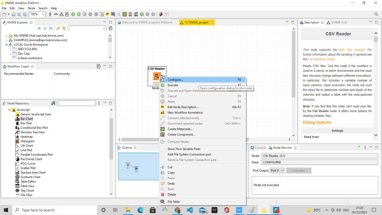
After configuring the node, its status changes to “Configured” which is of yellow colour.
Configured :-  Configured is represented by “Yellow” colour, it depicts that the node is configured and ready to be executed. We need to click “Execute” option after Right click on the node to change the status of the node to Executed.
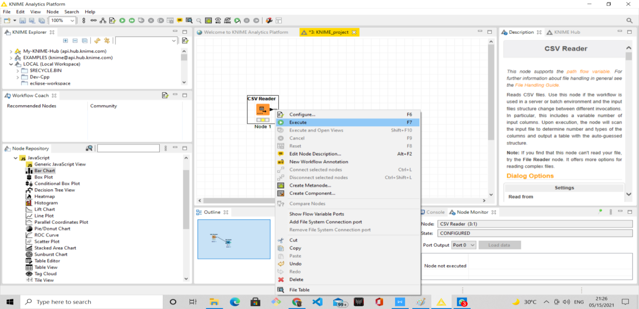
Executed:-  Executed status is represented by “Green” colour, it depicts that the node is successfully executed. If the execution fails, user will see an error sign which shows “Error” status.
Error:-  Error status is represented with a cross inside a red circle it depicts that the node has not executed properly or there is an error while configuring it.
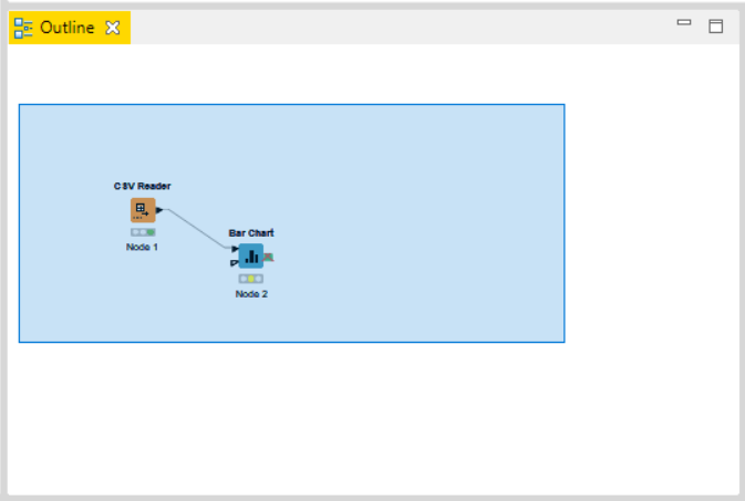
Outline :- User can see an overview of the currently active workflow. Lets consider the workflow does not fit in the workflow edit, user can change the active area by positioning the blue, transparent rectangle.
Console:- Console shows all the warning and error messages if there with the nodes in the workflow execution, in short is shows the execution messages taking place under the hood.
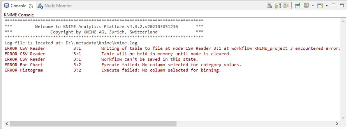
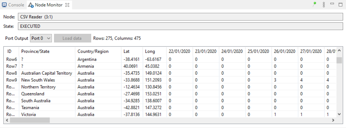
Node Monitor:- Node monitor allows the user to inspect intermediate output tables in their workflow. There many other functions available like Show Variables, Show Configuration, etc which can be performed in Node Monitor
Description :- Description of the selected node or the workflow or the workspace is represented here.
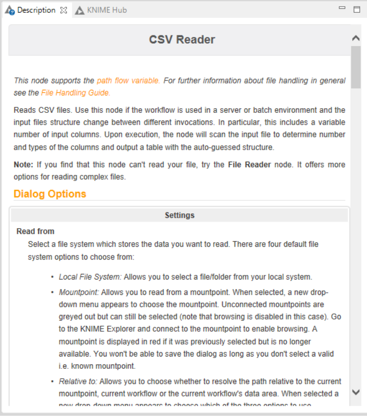
The above image is of “Description” window listing the description of the selected node i.e. CSV READER.
KNIME Hub :- KNIME Hub gives the online support or help or guide if user needs with respect to workflows, nodes and more..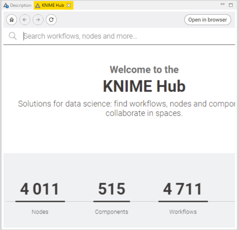
CASE STUDIES: REAL TIME APPLICATIONS
Case Studies 1: Fitness Tracker with Calories Burn Prediction Using Knime Analytics Platform
This exercise aims to perform calorie bum prediction using a random forest predictor through the Knime analytics platform.
List of Nodes Required:
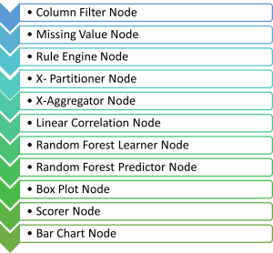
Procedure to build Fitness Tracker flow:
- Download the "FitBit Fitness tracker data" dataset from the following link: https://www.kaggle.com/arashnic/fitbit.
- This data set consists of 15 column attributes namely: Id, Activity date, Total steps, Total distance, Logged activity distance, Very active distance, Moderately active distance, Light active distance, Sedentary active distance, Very active minutes, Fairly active minutes, Lightly active minutes, Sedentary minutes and Calories. All of the first 14 columns determine the individual's overall calories burnt in a day. With this dataset, we can identify if an individual has a high, low, or good calorie bum for the day.
- Drag and drop the CSV file in the Knime platform to get the CSV reader node.
- Connect this with the Column filter and Missing value node for preprocessing the data. In the column filter, exclude the ActivityDate column, as the date doesn't matter for this prediction. In the missing value node, enter all the missing values as the mean of the entire column.
- Connect the Missing value node with the Rule Engine node. Here, give the rules as follows:
- If Calories > 2500 => High calories bum
- If Calories < 2000 => Low calories burn
- If Calories >= 2000 and Calories <= 2500 => Good calories bum Append this data into a new column named "Calories bum".
- Connect this with the box plot, linear correlation and X-partitioner node.
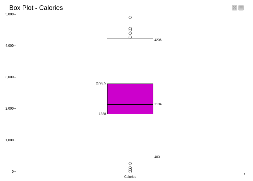
- In the box plot, exclude all the columns except Calories and visualize the plot. We can visualize the robust statistical parameters of minimum, lower quartile, median, upper quartile, and maximum value.
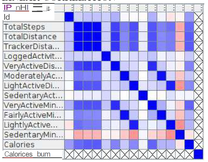
- The linear correlation node calculates for each pair of selected columns a correlation coefficient, i.e. a measure of the correlation of the two variables. Here, all columns are included to calculate the correlation coefficient.
- The X-Partitioner node is used for performing the cross-validation in the dataset. This node is the first in a cross-validation loop. At the end of the loop, there must be an X-Aggregator to collect the results from each iteration. All nodes in between these two nodes are executed as many times as iterations should be performed. We perform 10 validations using random sampling and the best out of these 10 is given as the output.
- Connect the 1st partition with the Random forest learner node. Select the Target column as calories burn and let the rest of the options be the same as the default. Select the split criteria as Information Gain Ratio.
- Now, connect the Random forest predictor node with 2nd partitioning and the Random forest learner node.
- Connect this node with the X-Aggregator node. This node collects the result from a predictor node, compares the predicted class and real class, and outputs the predictions for all rows and the iteration statistics. Select the target column as Calories burn and the Prediction Column as Prediction (Calories burn).
- Connect this node with the scorer and bar chart node.
- In the scorer node, select the first column as Calories bum and the second column as Prediction (Calories bum) and save it.
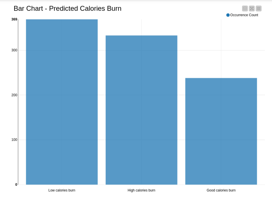
- In the bar chart, enter the column as prediction (calories burn) and name the chart, then save it. Finally, execute all the nodes and view the output.
COMPLETE FLOW:
The complete flow to perform calorie bum prediction using a random forest predictor is presented in figure 1.
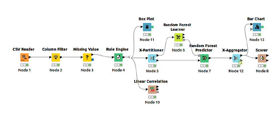
Figure 1: Knime Flow for Calorie Bum Prediction Using A Random Forest Predictor
Node Configurations:
- The configuration window of every node is presented in this section.
- CSVREADER:
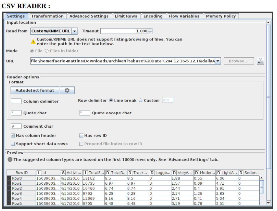
- Figure 2:Configuration of CSV Reader Node
- COLUMN FILTER:
- This column filter node provides three distinct modes for filtering: manually, by name, and by type. Through Add and Remove buttons, you manually choose which columns to retain and which to exclude.- by name, you decide which columns to keep using wildcards and regular expressions.
- By type option, you choose which columns to retain based on their type, such as all Strings or all Integers. The configuration window of this column filter is shown in figure 3.
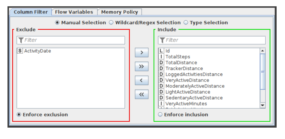
Figure 3:Configuration of Column Filter Node
MISSING VALUE:
- This node aids in handling cells in the input table that have missing values. All columns of a particular kind have default handling options available on the dialog's first tab, "Default." All columns in the input table that aren't specifically listed in the second tab, "Individual," have these settings applied to them. Individual settings for each available column are possible using this second tab (thus, overriding the default). Use the second method by selecting the column or group of columns that requires extra treatment, clicking "Add," and then setting the settings. All covered columns in the column list will be selected when you click on the label with the column name(s). Click the "Remove" button for this column to get rid of the extra treatment and replace it with the default handling. Asterisk-denoted options (*) will produce non-standard PMML. A warning will be displayed throughout the execution of the node if you choose this option, and the caution label in the dialogue will turn red. Extensions used by non-standard PMML cannot be read by any software other than Knime. The configuration window of missing value node is captured and indicated in figure 4.
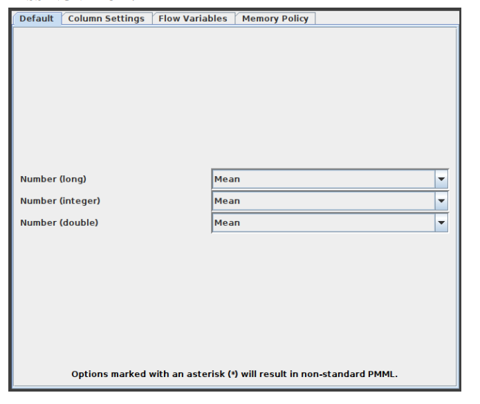
Figure 4:Configuration of Missing Value Node
RULE ENGINE:
This node attempts to match a list of user-defined rules to each row in the input table. If a rule is satisfied, the result value is added to a new column. The outcome is determined by the first matching rule in definition order. One line represents each regulation. To insert comments, begin a line with / (comments can not be placed in the same line as a rule). Anything following / will not be considered a rule. Rules consist of a condition part (antecedent) that must evaluate to true or false and a consequence (consequent, after the => symbol) that is placed in the new column if the rule matches. A rule's output may be a string (between " and /), a number, a boolean constant, a reference to another column, or the value of a flow variable. The type column represents the common supertype of all potential outcomes (including the rules that can never match). If no rule is applicable, the result is a missing value. Columns are denoted by their respective names surrounded by $, while numbers are presented in the customary decimal format. Note that strings cannot contain (double) quotation marks. $$ TypeCharacterAndFlowVarName $$ is used to represent flow variables. The TypeCharacter for double (real) values should be 'D', for integer values 'I', and for strings 'S'. You can manually insert column names and flow variables or use the respective lists in the dialogue. The setup window for the rule engine node is depicted in figure 5.
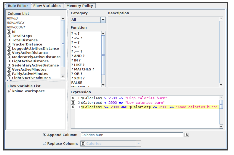
- Figure 5:Configuration of Rule Engine Node
X-Partitioner:
This node begins the cross validation loop. A X-Aggregator is required at the conclusion of the loop to collect the results of each iteration. All nodes between these two nodes are run as many times as required by the number of iterations. Figure 6 shows the configuration window for the X-Partitioner node that is now selected for this application.
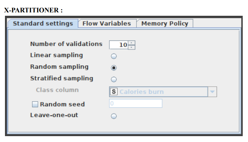
- Figure 6:Configuration of X-Partitioner Node
- Random Forest Learner:
- Minitab, LLC has registered RANDOM FORESTS as a trademark, and its usage is authorised. It is comprised of a predetermined number of decision trees. Each decision tree model is constructed using a unique collection of rows (records), and for each branch, a random set of columns (describing attributes) is employed. Each decision tree's row sets are generated using bootstrapping and have the same size as the original input table. The attribute set for a decision tree split is determined by randomly selecting sqrt(m) attributes from the available attributes, where m is the total number of learning columns. The properties may also be supplied in bit (fingerprint), byte, or double vector formats. The output model is applied to the associated predictor node and defines a random forest. This node provides a subset of the Tree Ensemble Learner's capabilities corresponding to a random forest. The configuration window for the Random Forest node that has now been chosen for this application can be seen in Figure 7.
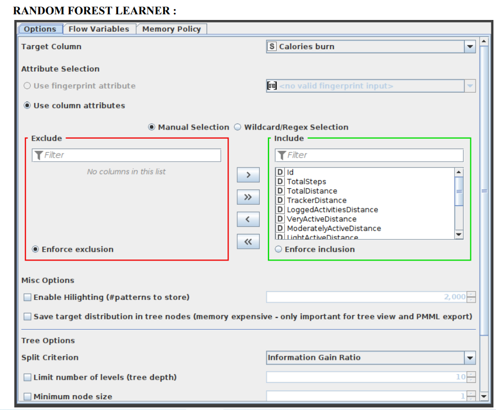
Figure 7:Configuration of Rule Engine Node
Random Forest Predictor:
- In a random forest model, this function makes pattern predictions based on an aggregation of the predictions made by the individual trees. Figure 8 displays the settings window for the Random Forest Predictor node.
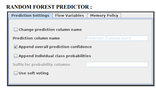
- Figure 8:Configuration of Random Forest Predictor Node
- 5.8 X-Aggregator Node:
- This node must be located at the conclusion of a cross validation loop and must be the node that comes after an X-Partitioner node. It does this by first collecting the result from a predictor node, then comparing the predicted class to the actual class, and finally outputting the predictions for all rows together with the iteration statistics. Figure 9 illustrates the window for the X-Aggregator node's configuration options.
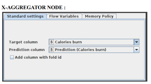
Figure 9: Configuration of X-Aggregator Node
- 5.9 Scorer:
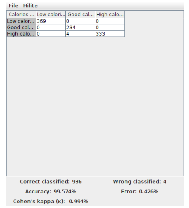
- Displays the confusion matrix (the number of rows that share an attribute with their classification) by comparing two columns based on attribute value pairs. You may also highlight cells in this matrix to reveal the underlying rows. The comparison dialogue lets you pick two columns to compare; the rows of the confusion matrix reflect the values in the first column you pick, while the columns reflect the values in the second column. The node returns a confusion matrix where each cell indicates the amount of matches. Statistics on recall, precision, sensitivity, specificity, F-measure, overall accuracy, and Cohen's kappa are also reported on the second output port. The X-Aggregator node's settings window is shown in Figure 10.
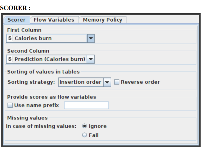
- Figure 10:Configuration of Scorer Node
- 5.10 Bar Plot:
- Custom CSS styling is supported through a bar char node. The node configuration dialogue allows you to easily condense CSS rules into a single string and set it as the flow variable "customCSS." On our documentation page, you can discover a list of the classes that are available as well as their descriptions. Figure 11 exhibits the parameters configuration window for the Bar Plot node.
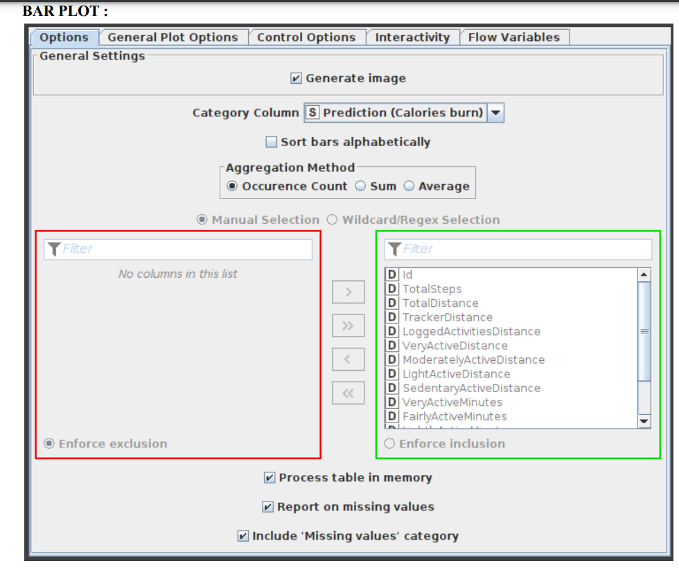
- Figure 11:Configuration of Bar Plot Node
Results Screenshots:
6.1 Scorer Node Results:
The prediction of calories dataset is presented here in figure 12 as the output analysis of scorer node.
- Figure 12:Result Outcome of Scorer Node
6.2 Linear Correlation Output:
The correlation matrix of the linear correlation analysis is presented in figure 13.
- Figure 13: Result Outcome of Linear Correlation Node
6.3 Graphs - Bar Graph:
Appropriate analysis has been made and the bar graph for the predicted calories burn is illustrated in figure 14 interperting the occurrence count of low calories burn, good calories burn and high calories burn.
- Figure 14:Bar Graph Analysis of Calories Burn
6.4 Box Plot:
The box plot for the calories analysis is presented in figure 15.
- Figure 15:Box Plot Analysis of Calories Burn
6.5 Error Rate in Cross Validation:
The error rate in cross validations using X-Partitioner and X-Aggregator or 10 validations is depicted in figure 16.

Figure 16: Error Rate in Cross Validation
RESULT: The final accuracy shown by the random forest model is 99.574% and the error is 0.426%. Knime Analytics Platform was successfully used to perform data analysis operations and random forest algorithm for Fitness tracker dataset.


