1 Introduction
The term “data visualization” refers to the process of displaying information and data in a graphical style, typically through the use of charts, graphs, and maps. Analytics refers to the scientific method of converting data into insights for the purpose of improving decision-making.
The most important objective of data visualization is to convey information in an understandable and efficient manner through graphical representations. The process of representing data in a manner that makes it simple to comprehend as well as manipulate and, as a result, makes the information more useful is known as “information visualization.” The information can be made more understandable through the use of visualisation by assisting in the discovery of linkages within the data and supporting (or disproving) views about the data.
Data Type
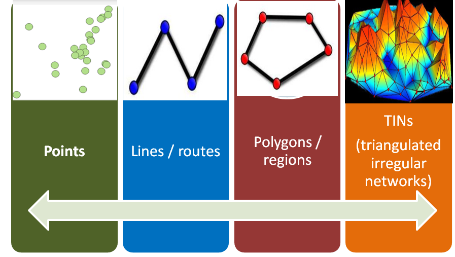
Spatial Data : The data or information that specifies the geographic location of structures and boundaries on Earth, such as natural or constructed features, oceans, and more, is referred to as spatial data. Spatial data can be either data or information. Data that can be mapped is referred to as “spatial data,” and it is typically recorded in the form of coordinates and topology.
Types of Spatial Data :
There are 2 basic spatial data types namely Vector and Raster.

Vector Data:
In the GIS environment, vector data provide a means to represent real-world features. The shape of a vector feature is depicted geometrically. The geometry consists of multiple interconnected vertices. A vertex uses an x, y, and optionally z axis to characterize a position in space. The vector data model represents geographical features as shown in figure.
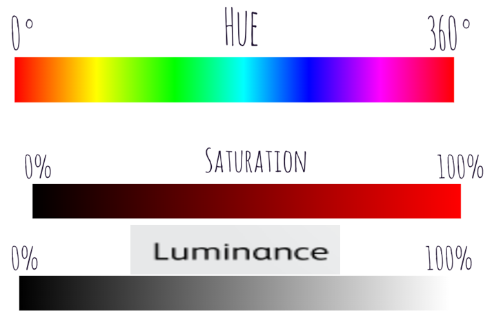
Color:
The best way to comprehend the color is through three distinct channels:
- Luminance
- Hue
- Saturation
The hue channel is an identity channel, while the other two channels, luminance and saturation, are magnitude channels.
Colormaps
A colormap is a visual encoding that uses colour, and it specifies a mapping between different colours and different data values. The primary design decision that must be made before constructing a colormap is determining if the goal is to encode ordered qualities or to differentiate between categorical attributes. Colormap design offers numerous traps for the unwary, but it is a powerful and adaptable design choice. Colormaps can be ordered or categorised, and ordered colormaps can be sequential or divergent. In a categorical colormap, classifications and groupings are encoded through the use of colour. Segmentation is a common feature of categorical colormaps, they are also referred to as qualitative colormaps.
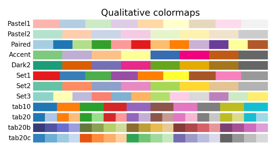
A colormap that is ordered is suitable for conveying ordinal or quantitative attributes. A sequential colormap varies in value from a minimum to a maximum. A diverging colormap has two hues at its extremities and a neutral or high-luminance colour, such as white, grey, or black, as its midpoint.
2. Chart Types for Data Visualization
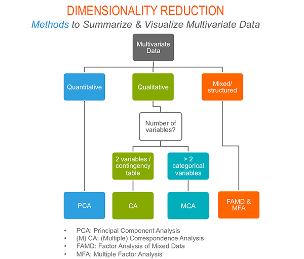
Multivariate Analysis
Multivariate data analysis is a type of statistical analysis that involves more than two dependent variables, resulting in a single outcome. The variables in multivariate data analysis could be dependent or independent. It is important to verify the collected data and analyze the state of the variables. In multivariate data analysis, it is very important to understand the relationship between all the variables and predict the behavior of the variables based on observations.
Objectives of multivariate analysis
Multivariate data analysis (MVA) helps in the reduction and simplification of data as much as possible without losing any important details.
As MVA has multiple variables, the variables are grouped and sorted on the basis of their unique features.
It is tested to create a statistical hypothesis based on the parameters of multivariate data. This testing is carried out to determine whether or not the assumptions are true.
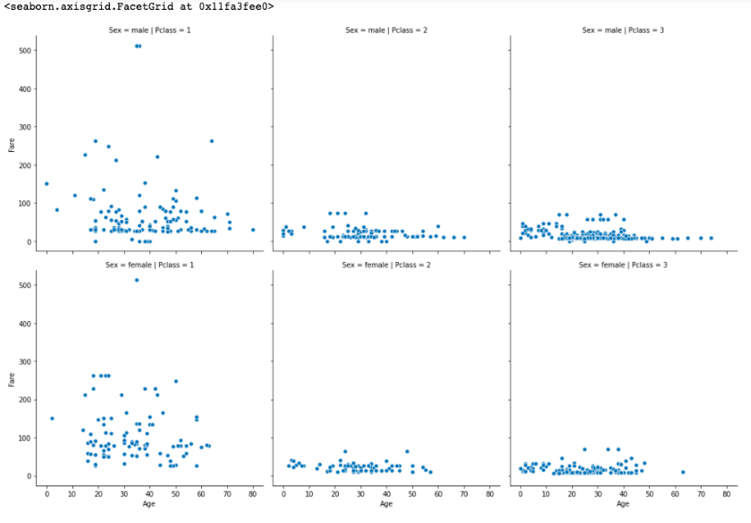
Example of multivariate data with case study:
A famous Kaggle dataset is the Titanic: Machine learning from disaster dataset [link]
When researchers analyzed the titanic dataset using bivariate data analysis, it was found that the results are presumptuous since bivariate analysis assumes that the relationship between a variable X and the target variable Y is independent of the rest of the variables, (i.e) f(X, Y) doesn’t depend on a third variable Z. For instance, “Women and children first” is a naval code of conduct followed since 1852, whereby the lives of women and children were to be saved first in a life-threatening situation. As we already know, “Survival” is highly correlated with “Gender”. But a third variable “Age” (child) influences the relationship between “Survival” and “Gender”. This is where multivariate data analysis comes into play.
Approach to visualizing multivariate data:
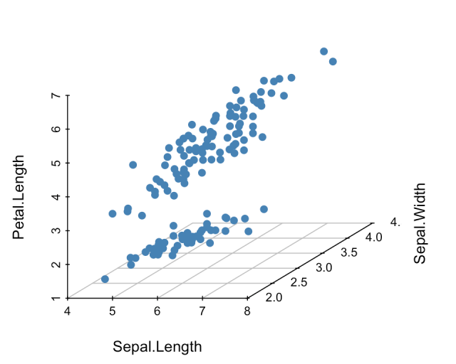
Scatter Plots / 3D Scatter plots:
Scatterplots are a way to visualize multivariate data to help classify and understand the relationships among the variables. A scatter plot (aka scatter chart, scatter graph) uses dots to represent values for two different numeric variables. The position of each dot on the horizontal and vertical axis indicates values for an individual data point. Scatter plots are used to observe relationships between variables.
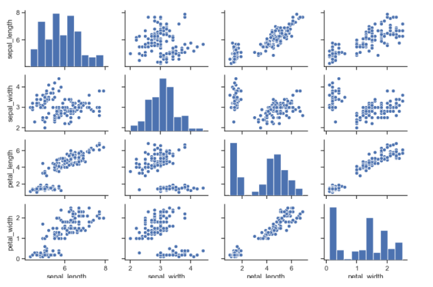
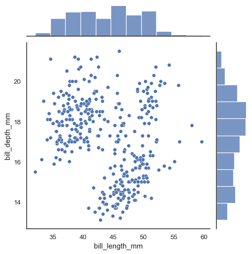
Pair Plot
A pairplot plot a pairwise relationships in a dataset. The pairplot function creates a grid of Axes such that each variable in data will by shared in the y-axis across a single row and in the x-axis across a single column.
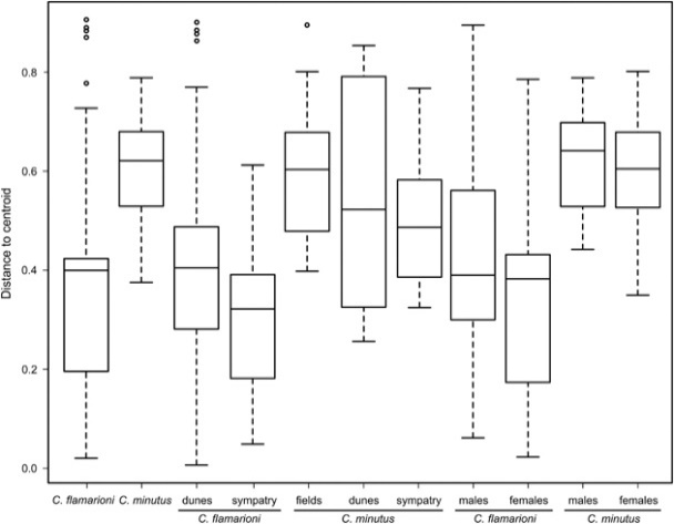
Boxplot:
Boxplots are a relatively condensed technique to visualise and summarise the primary qualities of a quantitative attribute. They do this through the utilisation of the median, the interquartile range, and any potential outliers. Two different characteristics are plotted against one another in a scatter plot. It is expandable in terms of its colour, shape, and size, among other characteristics. It works well with a limited number of points but does not perform well with a huge number of points. Add some Jitter, which is a little random value to each point, so that the points can hide one another.
Box plots for multivariate outlier detection
Multivariate outliers are typically examined when running statistical analyses with two or more independent or dependent variables. One of the first methods that can be used as a baseline for being able to detect outliers from multivariate datasets is that of boxplots and Tukey fences. They form a solid baseline for comparison against univariate and bivariate outlier analysis
Histogram:
The frequency distribution of a numerical characteristic can be depicted using a histogram. The range of the numerical property is partitioned into a predetermined number of intervals known as bins. These bins are typically the same size. The height of a bar indicates the (absolute) frequency of values that fall into each interval, and this is represented by the interval itself.
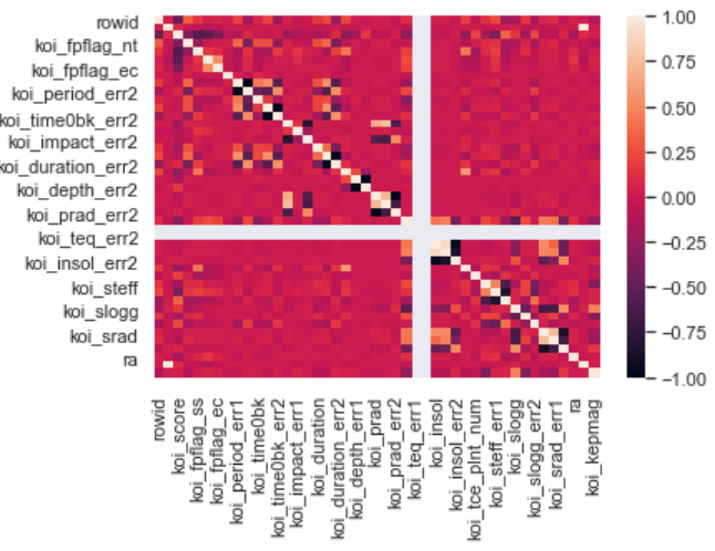
Correlation HeatMap:
A correlation heatmap is a heatmap that shows a 2D correlation matrix between two discrete dimensions, using coloured cells to represent data from usually a monochromatic scale. The values of the first dimension appear as the rows of the table while of the second dimension as a column.
Violin Plots
- A violin plot is a method of plotting multivariate numeric data. It is similar to a box plot, with the addition of a rotated kernel density plot on each side. They show the probability density of the data at different values, usually smoothed by a kernel density estimator.
Joint Plots
A Jointplot usually comprises of three plots. Out of the three, one plot displays a bivariate graph which shows how the dependent variable(Y) varies with the independent variable(X). Another plot is placed horizontally at the top of the bivariate graph and it shows the distribution of other influencing variables.
- Relational Plots
Relational plots are used for visualizing the statistical relationship between multiple data points. These plots can be used to identify the statistic relationship between all the factors considered for multivariate data analysis.
Due to the inherent nature of the two-dimensional nature of a display or plot, there is a limit of no more than two axes that can be included. Utilising 3D methodologies allows for the incorporation of three axes, or qualities.
4. Forecasting
Almost any business that deals with numerical data uses time series forecasting.
Qualitative Methods vs Quantitative Methods
|
Qualitative Methods |
Quantitative Methods |
|
Used when situation is vague & little data exist New products New technology |
Used when situation is ‘stable’ & historical data exist Existing products Current technology |
|
Involve intuition, experience |
Involve mathematical techniques |
|
e.g., forecasting sales on Internet |
e.g., forecasting sales of color televisions |
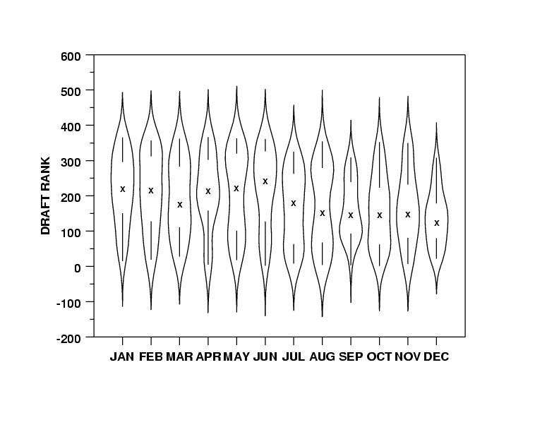
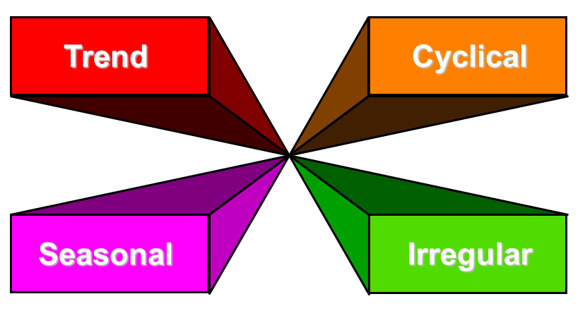
Time Series Components
Tools for Data Visualization Experiments, Case studies and Real Time Applications
- Tableau
- Python
- R programming
- Knime Analytics Platform
TABLEAU
Problem and Solutions:
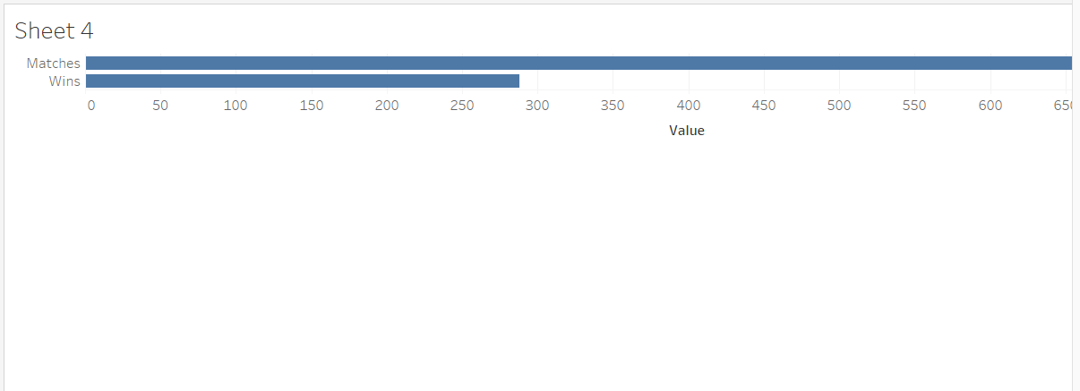
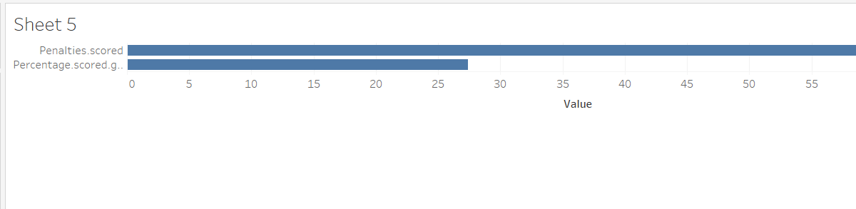
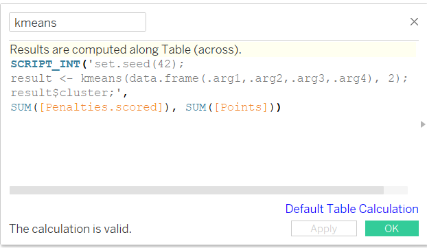
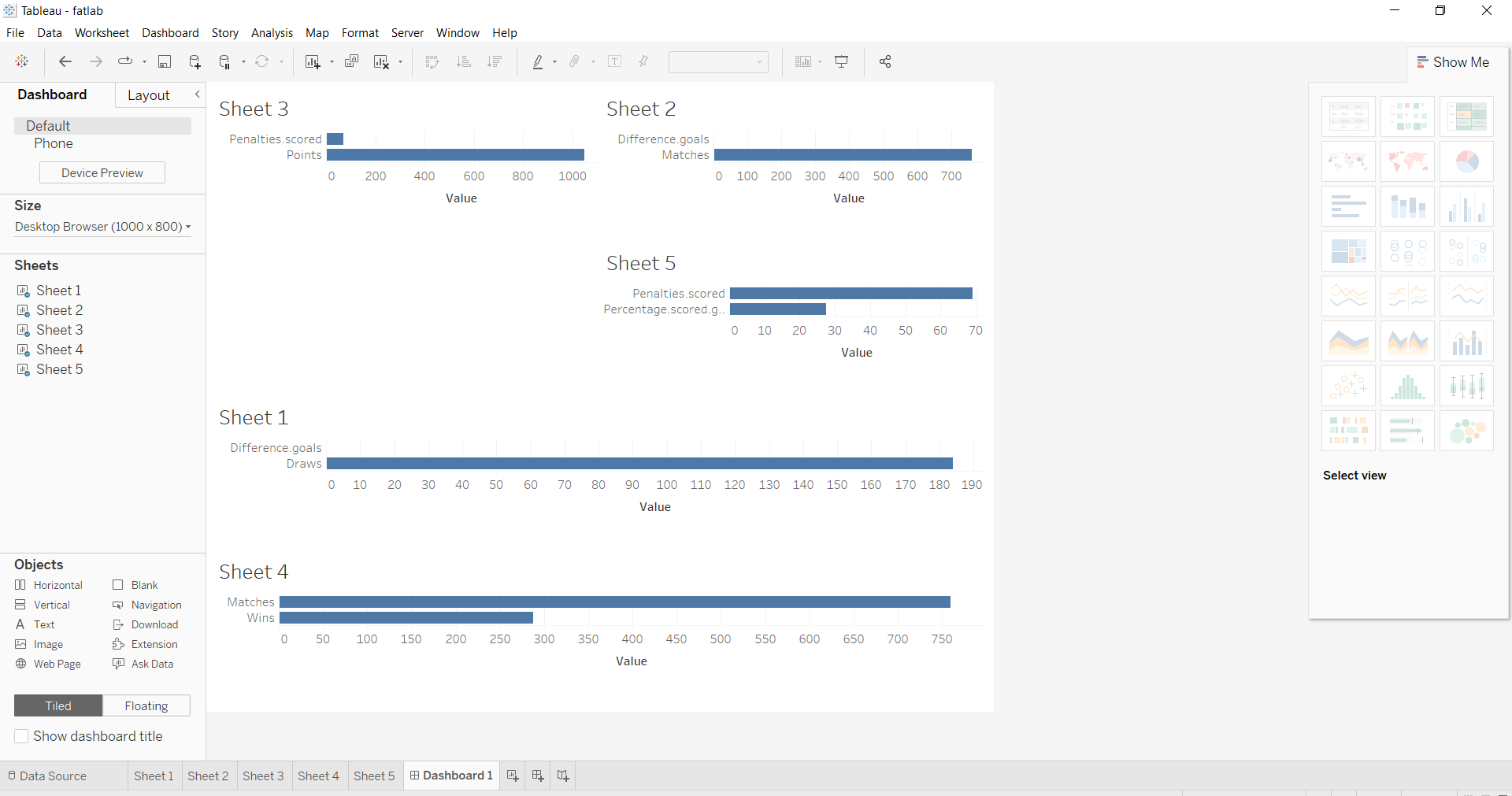
Create Sheets (different charts) with one Dashboard in tableau using the la_liga-2015-2016 dataset. Apply K means clustering also (integration of R and Tableau)
Kmeans
Do it Yourself -Practice Problems
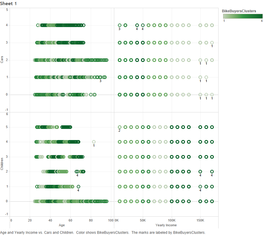
Exercise: You need to group or classify the given dataset based on the age, yearly income, cars and No. of children using R and integrate with tableau to visualize your output.
Analysis of Bike Buyer Data:
Cluster based on age, yearly income, cars and children or Classify: Use R script and integrate with tableau.
Sample Scripts for cluster:
SCRIPT_INT(‘kmeans(data.frame(.arg1,.arg2,.arg3,.arg4),4)$cluster;’,SUM([Age]),SUM([Cars]),SUM([Children]),SUM([Yearly Income]))
Sample results:
.
